Text color and contrast
Accessible Color Palette: Test Foreground and Background Pairs

A palette of attractive colors is not enough to tell you whether a paragraph will be readable. The same amber can work as decoration and fall short when used for normal text on ivory. Evaluate a foreground against its actual background and intended text size.
We made a fictional Juniper Studio style proof in Ciyo on November 21, 2026, then separately calculated three exact sRGB color pairs. The generated image demonstrates a visual direction; the measurements come from specified hex values in an editable HTML companion. This is a limited text-contrast exercise, not a whole-site accessibility assessment.
Quick answer: assign colors to roles after measuring pairs
For our intended values, charcoal #252525 on ivory #F7F2E8 measures about 13.74:1. Amber #C27A1B on ivory measures about 3.09:1, and charcoal on amber about 4.45:1. The latter two are below 4.5:1 for normal text; meeting a 3:1 comparison applies only when the relevant large-text conditions are satisfied.
Follow five steps: define the exact colors and roles, make a visual proof, calculate pairs, record the permitted uses, and check the actual implementation. Keep the raw values and compare unrounded ratios with thresholds.
| Foreground / background | Ratio | Normal text at 4.5:1 | Large-text contrast at 3:1 |
|---|---|---|---|
| #252525 / #F7F2E8 | 13.74:1 | Meets the numeric threshold | Meets the numeric threshold |
| #C27A1B / #F7F2E8 | 3.09:1 | Below the threshold | Meets the numeric threshold |
| #252525 / #C27A1B | 4.45:1 | Below the threshold | Meets the numeric threshold |
1. Define exact values and the text they will carry
Our fictional palette uses ivory #F7F2E8, charcoal #252525 and amber #C27A1B. The first practical question is where each will be used: normal body text, a larger heading, a background or decoration. A color by itself is not a foreground/background relationship.
W3C's explanation of WCAG 2.2 SC 1.4.3 gives 4.5:1 for normal text and 3:1 for large-scale text. Its large-scale definition includes at least 18 point regular text or 14 point bold text. Do not decide that a heading qualifies just because it looks large beside a small caption.
Keep the scope clear. The table checks numeric text contrast for three opaque sRGB pairs. It does not evaluate every exception, interaction state, non-text control, image or other accessibility requirement.
2. Use Ciyo to compare the visual direction
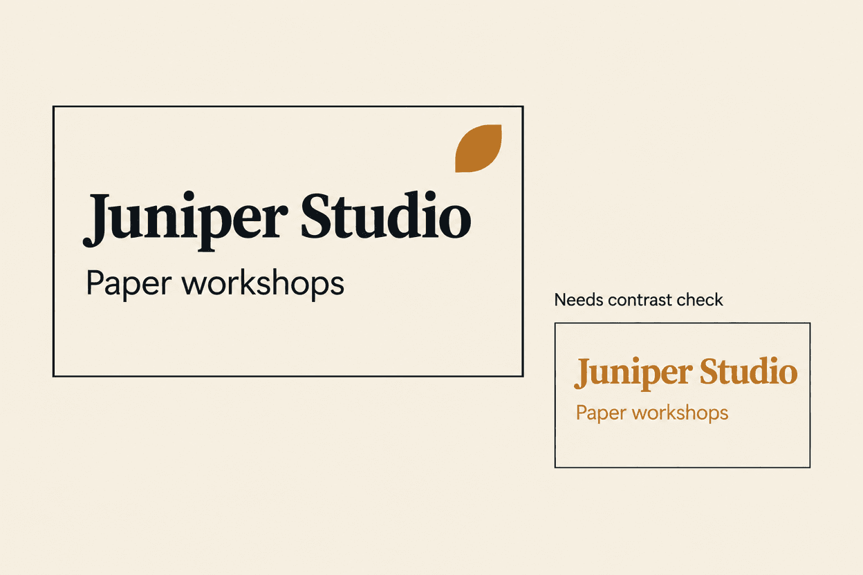
We asked Ciyo for a flat style proof with charcoal heading and body text on ivory, a small amber decorative shape, and a separate amber-on-ivory comparison labeled Needs contrast check. The actual output shows those two treatments using the sample text Juniper Studio and Paper workshops.
Inspect the image to discuss hierarchy, balance and how the accent participates in the design. It is a raster proof, so intended hex values in a prompt are not a verified stylesheet or a certification of the generated pixels.
The copyable prompt below keeps that boundary explicit. It asks for a visual comparison and reserves exact contrast calculation for the separate source values.
Create a flat style proof for [fictional or approved brand] using these intended colors: [exact hex values]. Show [foreground] heading and normal body text on [background], plus a small [accent] decorative shape with no text. Include a separate comparison using [pair that needs checking], labeled Needs contrast check. Preserve the approved sample wording. Save the image and distinguish intended colors from actual generated pixels. Do not claim WCAG conformance or a whole-site test; exact pair measurements will be done separately.3. Calculate the pairs from exact sRGB values
We used the WCAG 2.2 sRGB relative-luminance calculation and the contrast ratio of lighter luminance plus 0.05 divided by darker luminance plus 0.05. The calculation used the current 0.04045 transfer threshold. Sanity checks returned 21:1 for black against white, 1:1 for an identical pair and matching ratios when foreground and background were reversed.
The unrounded charcoal-on-amber result is approximately 4.44780075:1. It remains below 4.5:1. Rounding it for display does not authorize rounding it upward into a pass. The table's decisions use the unrounded results.
These numbers describe the intended hex pairs, not the Ciyo image. A textured background, transparency or a different actual color changes what needs to be checked in the final design.
4. Write usable color-role rules beside the swatches
For this example, charcoal on ivory is the default normal-text pair. Keep amber decorative unless a particular foreground/background combination and text size have been checked. Amber-on-ivory and charcoal-on-amber meet the 3:1 numeric comparison here, but that does not make them approved for arbitrary small text.
Record the pairing, intended role and measurement together. A row of isolated swatches loses the relationship that made the contrast result useful. If a designer changes either color, the old ratio no longer documents the new pair.
The linked English HTML companion presents the exact values, visual samples and calculated results. Its CSV retains the unrounded values and comparisons. Both are static editorial files: changing a hex value does not automatically recalculate the displayed ratio.
5. Check the actual application and keep the scope honest
Apply the chosen values in the actual design and inspect the text against its real background. Check whether a component adds opacity, an image, a gradient or another state that changes that relationship. Keep labels and meaningful content distinguishable by more than an unexamined decorative color choice.
We reviewed the companion's browser render and the three-pair table. We did not audit a complete website, all hover or focus states, every visual need or a printed output. The result is a documented starting point for those broader checks.
After a revision, preserve a new measurement record with the exact values and date. A generated style image can remain useful as visual direction, while the implementation record explains what was actually measured.
Choose a practical division between exploration and validation
A solo designer can explore the palette in a visual proof and keep a short approved-pair table beside the source. A team should agree on color roles so the same amber is not reused for small text without another check. A handoff should include exact values and scope rather than the unqualified phrase accessible palette.
This method makes a useful design decision explicit: which text pair can carry which role under the checked conditions. It does not turn a three-color sample into a universal accessibility guarantee.
Accessible color palette questions
Can a color be accessible by itself?
A text-contrast result describes a foreground/background pair under particular conditions. A palette needs role and pairing rules; isolated swatches do not establish those relationships.
Can I round 4.4478 up to a 4.5:1 pass?
No. Compare the unrounded value with the threshold. Our charcoal-on-amber result is below 4.5:1 even though it is close.
Does a 3:1 ratio approve the pair for all text?
No. The lower text-contrast threshold applies to the relevant large-scale text conditions, not arbitrary normal text. Other requirements and exceptions also need their own assessment.
Did the Ciyo image establish WCAG conformance?
No. It is a visual style proof. We separately measured three exact intended sRGB pairs and reviewed a companion sheet, not a complete site or printed design.
Explore the style and document the exact pairs
Use Ciyo to compare visual directions, then measure the intended foreground and background values. Keep the color roles and the limits of the check with the source.