Color · Palette from a photo
Pull a Color Palette from a Photo for Your Social Posts

A good product photo already contains a palette: the background, the product and a few accents. Pulling those colors into your post templates makes the whole feed look planned. The risk is choosing colors that look good together but are hard to read as text.
This guide pulls a palette from a fictional café's latte photo with GPT-6 Astra in Ciyo on September 19, 2026, then checks which pairs are readable. We recalculated Astra's contrast numbers ourselves.
Choose a photo that represents the brand
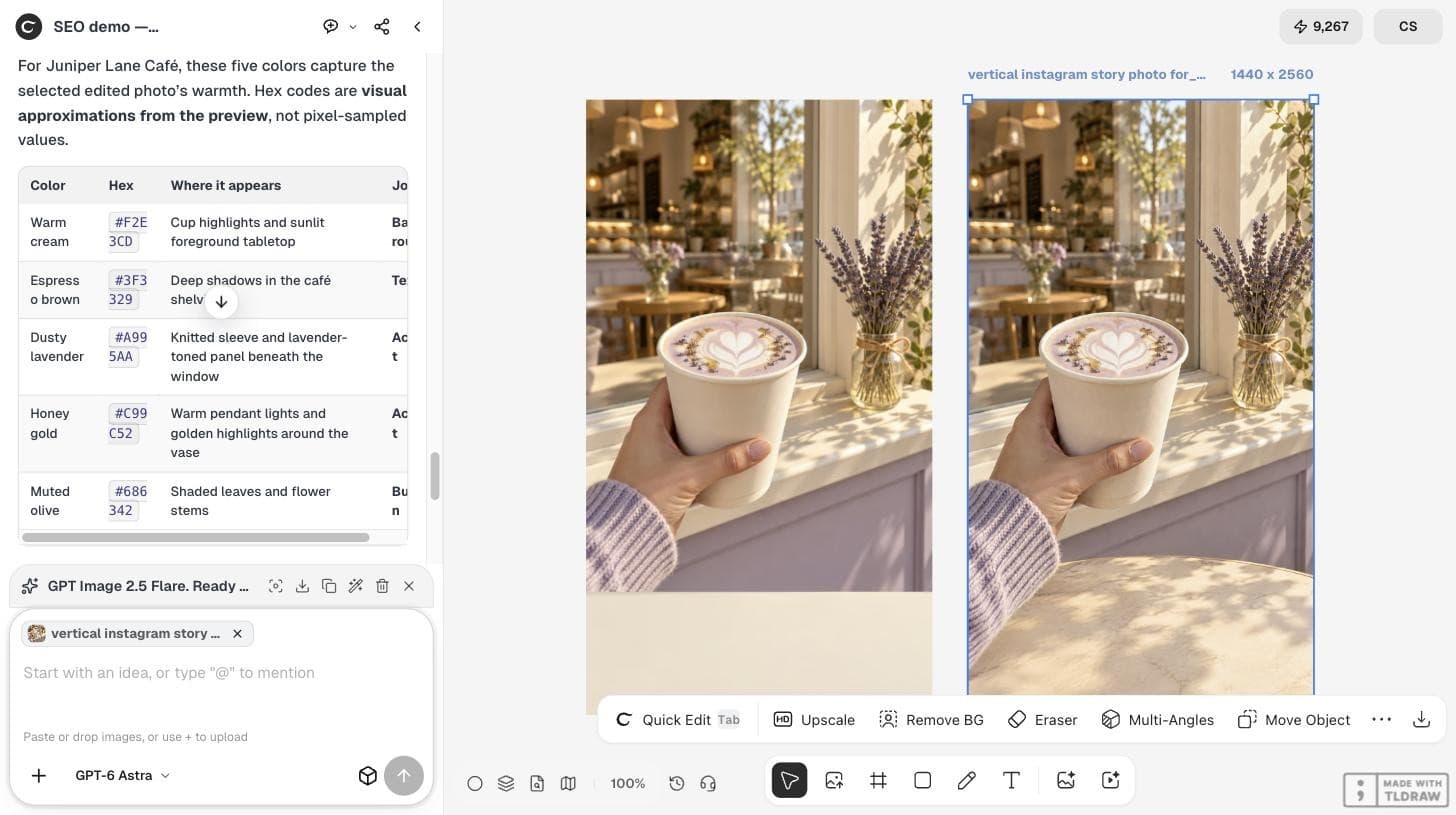
Use a photo you will actually post, with the product, the light and the setting you want people to remember. We used a vertical story photo of a honey-lavender latte in a café window.
Ask for colors with jobs
A list of hex codes is not a palette until each color has a job. We asked Astra for five colors, where each appears in the photo, and one role: background, text, accent or button. We also asked which pair is safest to read on a phone.
Pull a five-color palette from the selected photo for Juniper Lane Café's social posts. For each color give a hex code, where it appears in the photo, and one job: background, text, accent, or button. Then say which text-on-background pair is safest to read on a phone, and flag any pair that would be too low in contrast. Do not generate anything.Read the palette and its limits
Astra returned warm cream #F2E3CD for backgrounds, espresso brown #3F3329 for text, dusty lavender #A995AA and honey gold #C99C52 as accents, and muted olive #686342 for buttons. It said the hex codes were visual approximations from the preview, not pixel-sampled values.
That note matters. If you need exact values, sample them with an eyedropper in an image editor and compare.
Check contrast before you design
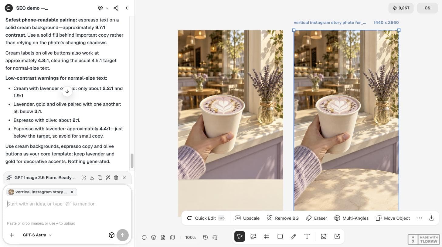
Astra named espresso on cream as the safest pair at about 9.7:1 and cream on olive buttons at about 4.8:1, above the common 4.5:1 target for normal text. It flagged cream with lavender or gold, and espresso with olive, as too low.
We recalculated each pair with the WCAG contrast formula and got the same results within rounding. Lavender and gold are accents, not text colors.
| Text on background | Ratio | Use for normal text? |
|---|---|---|
| Espresso #3F3329 on cream #F2E3CD | 9.69:1 | Yes |
| Cream on olive #686342 | 4.82:1 | Yes, for buttons |
| Espresso on lavender #A995AA | 4.41:1 | Large text only |
| Cream on lavender | 2.20:1 | No |
| Cream on honey gold #C99C52 | 1.99:1 | No |
Turn the palette into a post template
Build one template with the roles fixed: cream background, espresso headline, olive button, and lavender or gold only for small decorative shapes. Put text on a solid color area rather than directly on the photo, where light and shadow change the contrast.
Save the five hex codes in your brand notes so the next post uses the same values.
Compare with a manual method
Design tools can also sample a palette from a photo. On September 19, 2026, @MONABLIZUIUX posted a short tutorial on creating a color palette from a photo in Adobe Illustrator. A manual sampler gives exact pixel values; Astra adds roles and contrast advice. Using both is a good check.
A video tutorial for Adobe Illustrator, not an AI tool and not Ciyo.
Photo palette questions
Are Astra's hex codes exact?
No. In our run Astra said they were visual approximations from the preview. Sample the photo with an eyedropper if you need exact values.
Which contrast ratio should text meet?
A common target is 4.5:1 for normal-size text. Espresso on cream in our palette measured 9.69:1.
Did this cost credits?
The palette request is a chat with GPT-6 Astra. In our run chat turns did not change the balance.
Find your palette
Select a photo in Ciyo and ask GPT-6 Astra for five colors with jobs and a contrast check.