Festival identity · Production guide
Festival brand identity guidelines: a poster and stage-card example
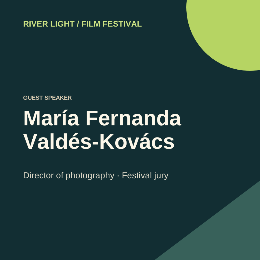
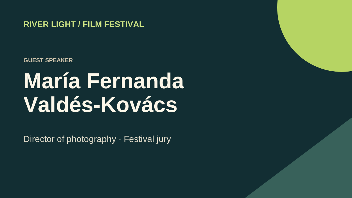
River Light uses deep teal for the field, pale type for names and a lime disc as the recurring mark. Set the role label above the name on both the screen and square card.
Input and decision
Use a title, guest name and sponsor as different levels of information. Give the festival mark a consistent corner, then design the stage and social compositions separately.
Set up the comparison
Replace one short guest name with the longest approved one. Preserve the two-line surname block and note which rules survive the narrower placement.
Make the comparison
Duplicate the square layout before moving the lime disc. In the stage copy, insert the longest name and mark the exact line break for the operator.
Worked record
The downloadable worksheet includes the records below and a blank row for your own project.
| Element | Fixed rule | Allowed variation | Stress case | Approved example |
|---|---|---|---|---|
| Guest name | Approved roster | Line break | Longest compound surname | Two-line stage SVG |
| Festival mark | Original artwork | Scale by placement | Small social preview | Square card |
| Background | Lime disc | Position within crop | Long job title | Keep clear of text |
Check the result
Try the rules with both Aya Moss and María Fernanda Valdés-Kovács. Solve the line break in the source rather than shrinking the entire festival system.
Hand off the revision
Deliver both editable layouts with the approved line breaks and logo corner marked.
Review question
Which festival identity rules need testing in both square and stage formats?
Test the guest-name break, the logo scale and where the lime disc falls in the crop. Try the longest approved name in both the square card and the wide stage composition.
Use the task on your own brief
Use a copy of the worksheet to keep the project’s source files, reviewed options and decisions together.