GPT-6 Astra · Creator workshop
GPT-6 Astra Infographics: Keep the Facts Outside the Pixels

A convincing infographic can make an incorrect number look authoritative. The safest production habit is simple: establish the facts before designing the picture, and keep the data in a form you can inspect.
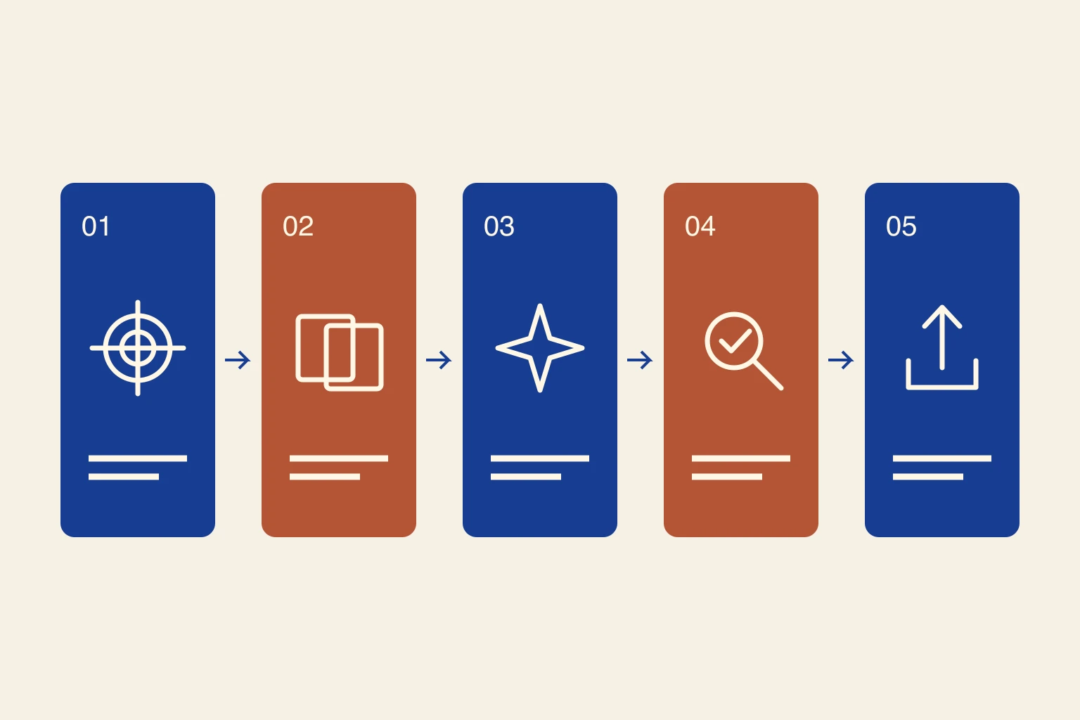
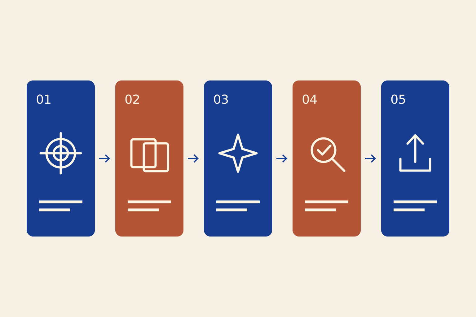
This workshop uses a process diagram rather than invented market statistics. It explains how a reference becomes a reviewed visual asset.
Separate the evidence from the layout
Give Astra the approved source material and ask it to list the claims, units and missing information before proposing a layout. A visual outline is ready for design only when you can trace each factual statement to its source.
Maintain a small claim ledger outside the artwork: claim, source, date and approved wording. If two sources use different denominators or periods, resolve the difference before making a comparison. Keep the production file connected to that ledger.
Choose the structure that fits the claim
Use a sequence for a process, a comparison for alternatives and a chart for quantitative relationships. Do not turn a small difference into a dramatic illustration merely because it looks more engaging.
| Information | Useful structure | Check |
|---|---|---|
| Ordered process | Numbered steps | Is the order meaningful? |
| Alternative methods | Comparison table | Are the criteria consistent? |
| Measured quantities | Chart from source data | Scale, units and denominator |
| One concept | Annotated illustration | Labels match the object |
Write a fact-preserving design brief
Ask for an outline before requesting art. Approve the headline, labels and source placement. This reduces the temptation to accept invented supporting claims because they fit the first attractive layout.
Plan a process infographic about creating a visual from a reference. Use exactly these steps: define the goal, assign reference roles, generate one concept, inspect the result, revise and export. Add a short explanation for each. Do not add statistics or success rates. Propose a clear reading order and space for editable labels and a source note.Build the visual layers in Ciyo
Create supporting illustrations or simple shapes, then place the approved labels separately. Use a consistent visual treatment across the sequence. If the graphic needs precise numerical comparison, make the chart from the underlying data in a charting tool and import the finished visual.
A generated bar chart is an illustration until its values and geometry have been checked. Never infer measurements from the height of a generated bar.
Proofread the final exported file
Check every label, number, unit and source against the approved material. Inspect the file at its intended display size. A source note that is technically present but unreadable does not help the reader verify the claim.
Ask a second reader to explain the graphic. If they infer a causal claim or ranking you did not intend, revise the layout and wording before publication.
Keep an editable record for updates
Save the facts, source URLs, retrieval dates and text alongside the final image. If a number changes, the next editor should not have to extract it from pixels. The included process illustration is original explanatory artwork with no measured performance claims.
For a longer visual essay, reuse the same hierarchy and spacing across pages. Let the evidence determine the length, rather than stretching a small fact set into a larger-looking report.
Create infographic visuals in Ciyo
Create supporting illustrations in Ciyo while keeping the approved facts and labels separately editable.