GPT-6 Astra · Creator workshop
GPT-6 Astra Mood Boards: Turn References into Art Direction
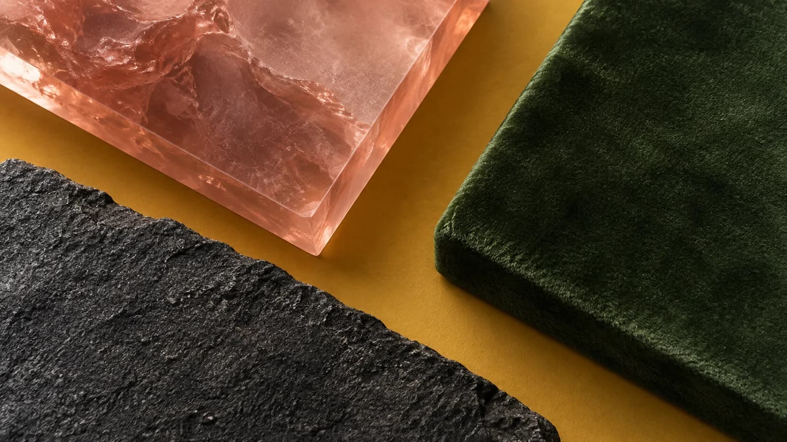
A mood board should help a designer make decisions. A page of attractive pictures can still leave the client unsure about the palette, materials, lighting or composition they are approving.
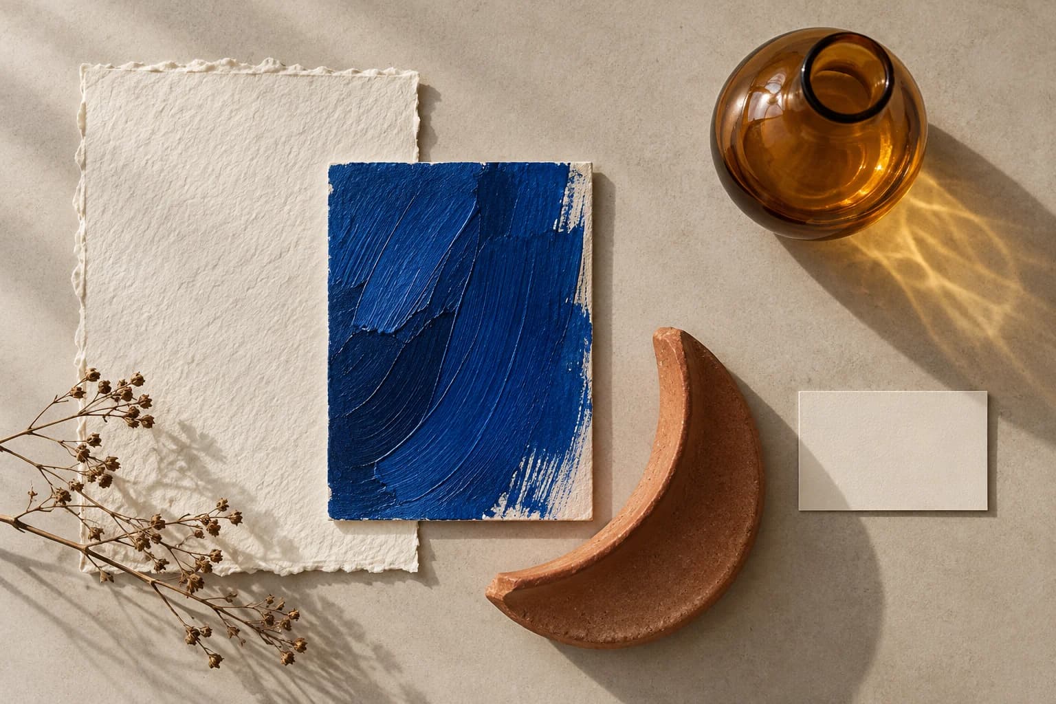
Choose references for specific reasons and explain those reasons. This workshop develops a fictional studio direction from ivory paper, cobalt brushwork, terracotta ceramic and amber glass.
Start with the job the visuals must do
Give Astra the audience, deliverable and desired impression. Ask it to compare the references in terms of palette, material, light and composition. Treat those observations as a starting point for discussion, rather than an objective verdict on taste.
Select a direction that solves the brief. A cozy paper palette could fit a small art workshop, while a technical product launch may need sharper contrast and different materials. The purpose determines which references belong on the board.
Assign a role to each reference
Choose a small set with distinct responsibilities. One image may define material, another color, and a third composition. If two references disagree, decide which one controls that part of the design.
| Reference | Borrow | Avoid copying |
|---|---|---|
| Ivory paper | Texture and warm neutral base | The original page layout |
| Cobalt brushwork | Accent color and energy | An identifiable artwork |
| Terracotta ceramic | Material warmth and curved form | A specific product design |
| Amber glass | Translucency and side lighting | The complete original scene |
Translate taste into usable instructions
Replace broad adjectives with observable decisions. “Premium” might mean restrained color, generous space and tactile materials for this project. On another project it could mean something entirely different. Tie each choice to the intended audience.
Review these references for a fictional creative studio. Separate palette, material, light and composition. Propose one coherent direction using warm ivory, cobalt accents and tactile surfaces. Explain which reference controls each decision. Do not copy a reference’s identifiable subject or brand. End with a short brief for a new original campaign image.Make the board actionable in Ciyo
Arrange the references and add short notes stating what each contributes. Generate one original concept using the selected references and the written brief. Put the result beside the board so the client can compare intention with execution.
A useful board includes exclusions too. If glossy gradients or dense typography contradict the agreed direction, write that down before producing the full asset set.
Review the direction with a real deliverable
Apply the board to one demanding format, such as a social cover or campaign hero. This reveals whether the reference set can guide an actual composition. A direction that only works as a collage may need another round of decisions.
Check legibility, subject recognition and space for copy. A material palette should support those needs rather than become a decorative requirement that every asset must carry.
Save the approved decisions with the references
Record which direction was selected and which experiments were rejected. Include the source links for external references and use images you have permission to include in the deliverable. Do not present someone else’s example as your own output.
The original material study in this guide is an editorial sample. Replace it with your project’s real constraints and references, then carry the approved direction into a carousel or poster.
Build a visual direction in Ciyo
Arrange a small set of references in Ciyo and generate one original concept to test the proposed direction.