Campaign workflows
How to organize campaign assets on a review board

A campaign canvas gets confusing when the reference image, two competing ideas, and the chosen direction all look equally important. Before making another version, give each item a clear job and a place on the board.
This walkthrough uses a fictional Juniper Cafe weekend promotion. The goal is to choose between a quiet latte concept and a coffee-and-pastry concept, while keeping the visual references and the next action visible. You will arrange six illustrated demo cards in Ciyo using selection, alignment, and grouping. The cards are planning examples, not finished advertisements or evidence of campaign results.
Start with the decision the board needs to support
For Juniper Cafe, the audience is local customers considering a weekend visit. The channel is an Instagram feed post, the proposed offer is a coffee-and-pastry pairing, and the desired action is an in-store visit. The business still needs to confirm the offer terms. The review question is specific: which concept makes the pairing easier to understand?
A September 15 Reddit discussion offers a useful reminder about viewing images together. The original poster asked for feedback on their own Instagram mood-board page; a commenter questioned whether the images communicated a common theme. That is an observation about that page, not a test of Ciyo. For this exercise, ask what connects your campaign assets before arranging them into a neat grid.
Published September 15, 2026. The author seeks feedback on their own Instagram page; u/mentallyiam8 raises theme and composition concerns. Our campaign-board workflow is an original adaptation. Neither participant is presented as a Ciyo user or endorser, and the thread supplies no measured growth result.
1. Give every asset a role before moving it
Create a separate Ciyo project for the campaign. Use the Upload control in the canvas toolbar, choose Upload Image, and select the images you want to compare. Bring a small, relevant set: references that explain the direction, actual alternatives, and a note recording the current decision.
Our six cards use visible labels so their roles remain clear when you zoom out. In your own project, use descriptive filenames and a nearby text note where an asset needs context. A reference should explain something useful, such as color, framing, or type treatment. It should not be mistaken for a deliverable you own or have approved.
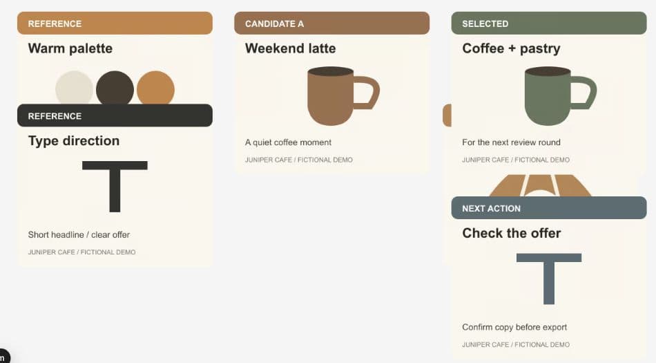
The starting board below has overlapping cards. Before refining the spacing, identify which items belong together. The labels are part of these fictional demo images; they are not automatic Ciyo approval statuses.
| Board area | Items | Question it answers |
|---|---|---|
| References, left | Warm palette; type direction | What should the campaign feel like? |
| Candidates, middle | A: weekend latte; B: coffee and pastry | Which concept communicates the proposed offer? |
| Decision, right | Selected direction; next-action note | What are we taking forward, and what still needs checking? |
2. Separate references, alternatives, and decisions
Collapse the agent panel if you need more working space. Open the Zoom menu and choose Zoom to Fit to locate the full board. Drag the body of each card into its intended column, leaving space between cards so that labels and important content remain visible. Dragging a corner handle changes the size, so use the middle of the image when you only want to move it.
In this example, the palette and type cards sit on the left. The two competing concepts sit in the middle, one above the other. The selected-direction card and the outstanding offer check sit on the right. Keeping the two candidates next to the same references gives the review a consistent point of comparison.
Do not let position silently make the decision for you. Write down which direction is selected and why. Here, the pairing concept is a proposed choice because it represents both parts of the offer. That is a planning judgment; the simplified selected card still needs a real image that shows the pairing.
3. Align a related pair
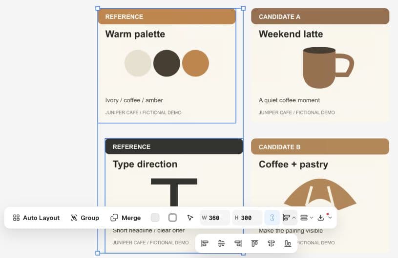
Click the palette card, then hold Shift and click the type-direction card. With both selected, open Align in the multi-selection toolbar and choose Align left. This gives the reference column a common edge without changing the images' dimensions.
Apply alignment to the set you actually mean to organize. Selecting every card and choosing Align left would put unrelated columns on the same edge. Work on one column or row at a time, then zoom out to check the whole board.
The demo images remain 360 × 300 pixels. They appear larger or smaller on screen as the canvas zoom changes; that does not mean the underlying image was resized.
4. Group the references so they travel together
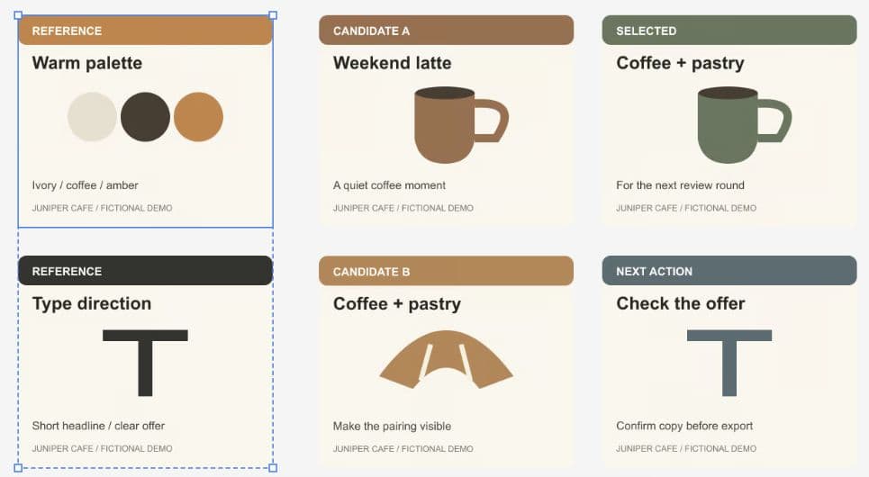
Keep the two reference cards selected and click Group. Select the resulting group and drag it a short distance to confirm that both cards move together. In the walkthrough, we moved the reference pair slightly left to give it more separation from the candidates.
A group is useful when a set should retain its internal arrangement as you move it around the canvas. Keep separate alternatives outside that group so you can replace or reposition them independently. This walkthrough uses Group and leaves the original images as separate items within it.
5. Review the board at the size someone will actually read it
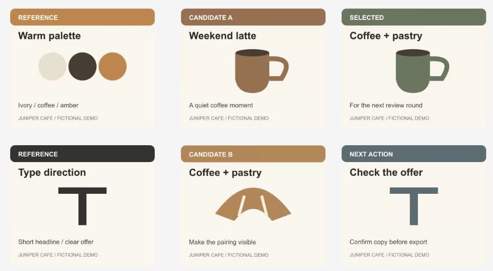
Click an empty area to clear the selection, then inspect the whole board. Can you identify the reference column, the two alternatives, and the next action without opening each image? Zoom in to check small text, then return to a whole-board view to judge the hierarchy.
In the completed example, the palette and type references are visible together, both candidate labels are unobstructed, and the next-action card stays directly below the selected direction. The board is ready for a focused design conversation. It is not a finished social post: offer terms, final imagery, and copy still need review.
Treat the right-hand column as a record of the current choice. When the choice changes, update that note rather than leaving several unlabeled finalists. Keep a short reason beside the selected version so the next reviewer can understand the decision.
Use a focused review note
A tidy board still needs a clear question. Copy the note below into your review brief and replace the fictional details with your campaign's approved facts. Ask the reviewer to compare the alternatives against the same audience, channel, and intended action.
Record the answer as a choice, a reason, and a remaining task. For this example: take the pairing direction forward; it matches the proposed offer; replace the placeholder with an image showing both coffee and pastry after the owner confirms the terms. This keeps the next production step concrete.
Campaign: Juniper Cafe weekend promotion (fictional example).
Audience: local customers considering a weekend visit.
Channel: Instagram feed post.
Proposed offer: coffee and pastry together; terms still require owner confirmation.
Desired action: visit the cafe.
References: warm ivory, coffee brown and amber; short headline and clear offer.
Compare candidate A (quiet latte moment) with candidate B (visible coffee-and-pastry pairing). Which concept makes the proposed offer easier to understand, and why?
Record one selected direction, one reason, and the next change required. Check whether the final image actually shows both items. Do not invent a price, deadline, discount, or campaign result.Campaign review-board questions
How many assets should a campaign review board contain?
Start with the items needed for one decision. This example uses six cards: two references, two candidates, a selected direction, and a next-action note. Six is an example, not a Ciyo limit. If the board becomes hard to read, separate unrelated decisions into another area or project.
Does grouping resize or merge my images?
The Group action used here keeps the reference images as separate items inside a group so they can move together. We used alignment and dragging to position them, and did not resize their 360 × 300 dimensions or use Merge.
Does a selected-direction card mean the promotion is approved?
Only if your own review process says so. SELECTED is a label inside our fictional demo image, not an approval workflow in Ciyo. Confirm the actual offer, final image, copy, and destination before publishing the promotion.
Make the next campaign decision easier to review
Open a Ciyo canvas, bring the assets for one campaign, and separate the references, alternatives, and next action. Start with a board someone else can understand.