Practical creative workflows
SVG Non-Scaling Stroke: Compare Icons at Three Sizes
A cup icon’s outline may become nearly invisible when you shrink it from a generous illustration size into a toolbar. Keeping the same SVG path does not necessarily keep the same visible line weight.
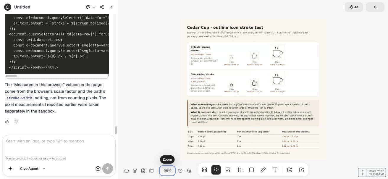
We used a fictional Cedar Cup outline to compare default scaling with non-scaling-stroke at 24, 48 and 96 CSS pixels. Ciyo created the source and a browser-rendered proof. The comparison helps choose a behavior; it does not make a detailed icon automatically suitable for small screens.
Calculate the expected stroke first
Our SVG uses a 100×100 viewBox and stroke-width=2 on each of five paths. With uniform scaling and no additional transform, the default screen width is 2 × rendered size / 100. That gives 0.48, 0.96 and 1.92 CSS pixels.
Applying vector-effect="non-scaling-stroke" to the stroked paths requests a stroke that resists the geometric scaling. For this comparison its target remains 2 CSS pixels. The SVG coordinate-system specification defines this behavior; the table describes our particular sizes.
| Icon size | Default stroke | Non-scaling stroke |
|---|---|---|
| 24×24 CSS px | 0.48 CSS px | 2 CSS px |
| 48×48 CSS px | 0.96 CSS px | 2 CSS px |
| 96×96 CSS px | 1.92 CSS px | 2 CSS px |
Ask for identical geometry in both rows
Create a new Ciyo project and request a comparison HTML page with six inline icons. Keep every path identical between variants and change only vector-effect. If the agent redraws the small icon, you are comparing two design choices at once.
Request the editable SVG and HTML code. In our session those source formats stayed in the agent workspace until it pasted them into chat; the board accepted the PNG proof. The linked examples preserve the supplied icon geometry and browser measurements.
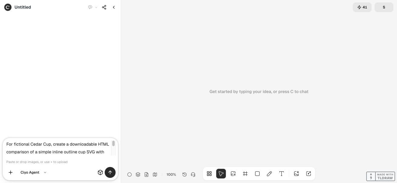
For fictional Cedar Cup, create a downloadable HTML comparison of a simple inline outline cup SVG with viewBox="0 0 100 100" and stroke-width="2" at 24, 48 and 96 CSS pixels. Compare default scaling strokes to vector-effect="non-scaling-stroke" on each stroked path. Use identical path geometry and no fill. Explain that non-scaling-stroke keeps screen stroke width, not a guarantee of small-size optical quality. Deliver the corrected standalone SVG, the comparison HTML and a PNG proof on the canvas. Use code tools only, no paid image/video generator. Programmatically verify geometry and sizes. This is a fictional UI icon demonstration.Judge the small icon in the actual proof
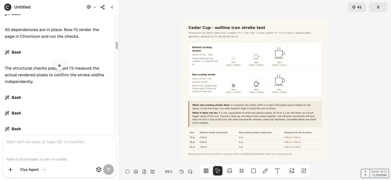
The actual proof shows the default row with increasingly visible lines and the non-scaling row with a heavier outline at 24 pixels. At that smallest size the steam detail crowds together. A constant line width can be too heavy for the available space.
Ciyo rendered the comparison in Chromium and reported the expected screen widths. We retained the HTML and separately checked the six SVG boxes and five path geometries. The calculated values describe geometry; antialiased edge pixels need visual interpretation.
Use a small-size drawing when detail collapses
For a toolbar, simplify details that close up and inspect the icon at its actual CSS size. Keeping a two-pixel line cannot create more room between steam strokes. Consider fewer paths or a dedicated small-size variant after deciding on the scaling behavior.
Inspect optical weight at 24 pixels
Keep interactive meaning separate from line weight. Provide an accessible control name and enough contrast in the real theme. The proof is a visual comparison, not an accessibility audit of a finished interface.

Recheck after placement and export
Place the icon in its actual component, with its actual CSS size and transforms. Inspect both light and dark themes. Test whether the receiving editor or exporter preserves vector-effect before using its result as the final asset.
This example compares uniform scaling in a retained Chromium page. It does not establish behavior in every vector editor, printer or browser. Choose the variant that serves your component, then keep that source with the design handoff.
Practical questions
Does non-scaling-stroke keep every detail readable?
No. It controls stroke behavior. Small counters, tight spacing and antialiasing can still make details hard to read.
Why is the default line only 0.48 px at 24 px?
The two-unit stroke scales by 24/100 in this example’s uniform 100-unit viewBox.
Should every icon use non-scaling strokes?
Choose after inspecting actual sizes. A fixed line can be too heavy for a small icon.
Compare the icon where it will be used
Start with one checked example in Ciyo. Keep the source and inspect the exported result before using it in your own project.