Maker artwork
Acrylic Keychain Design: Keep Both Sides Readable

A charm can look correct from the front and show a backward word when turned over. Transparency adds another question: a clear area, a white background and an opaque white-ink layer do different jobs.
We built a fictional GLOW lantern charm in a live Ciyo project and reviewed Vograce’s file guidance. The demonstration produces front and back artwork, an intended white-ink-area proof and editable sources. No acrylic charm was manufactured or ordered.
Quick answer: review both sides as the wearer should see them
Prepare separate front and back designs when wording must remain readable. Keep the silhouette aligned, identify the intended clear and opaque areas, and ask the manufacturer how it wants the actual print layers oriented.
The example proposes a 60 mm longest finished dimension. Its 1.4 mm clear rim and 3.8 mm hanging hole are design proposals for review, not instructions that apply to every maker. The SVG canvas is 46 × 60 mm; the illustrated cut shape is narrower than that canvas.
| Step | Prepare | Question |
|---|---|---|
| 1 | Maker requirements and finished size | Does the size include the border and hole? |
| 2 | Separate right-reading front and back | Is the word readable from each viewing side? |
| 3 | Clear, white and color review | Which areas are intended to receive ink? |
| 4 | Editable sources and raster previews | Are format and font dependencies clear? |
| 5 | Manufacturer proof | Are orientation, cut and white ink confirmed? |
1. Read the actual manufacturer’s file instructions
Vograce’s guide says its selected keychain size includes the acrylic border and hanging hole. It also distinguishes a mirrored default back from separate artwork for designs with readable text on both sides. Use the appropriate product option and file setup for the result you intend.
Its current guidance accepts transparent RGB PNGs and recommends CMYK in supported editable formats. A PNG with transparency is not therefore a CMYK file. Check the accepted format and color instructions for the actual product instead of applying a universal conversion rule.
The demonstration’s proposed rim differs from Vograce’s approximately 2 mm standard border. That is an unresolved design choice for maker review, not evidence that a thinner border is approved.
2. Brief the two viewing sides explicitly
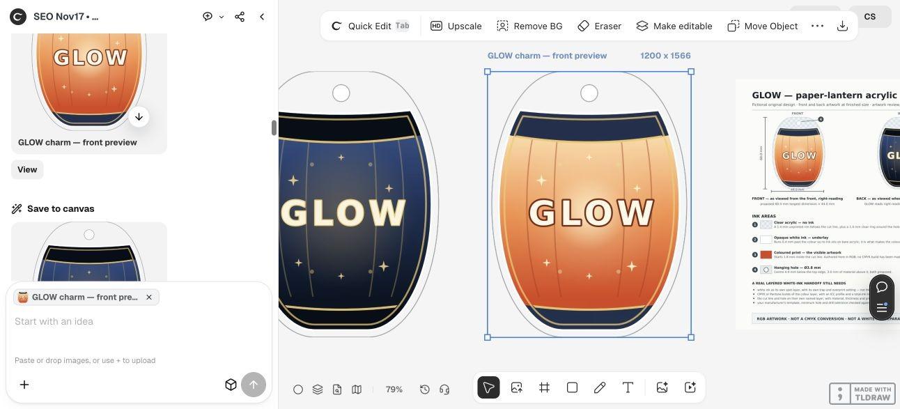
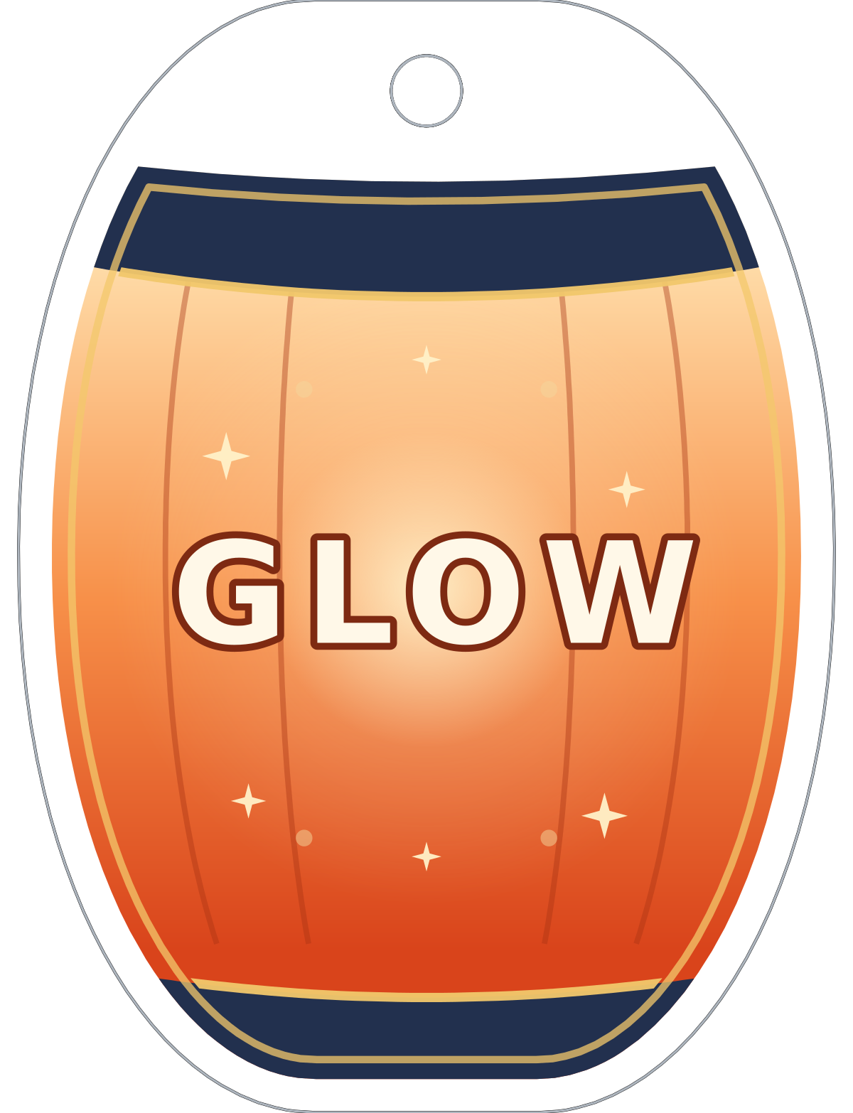
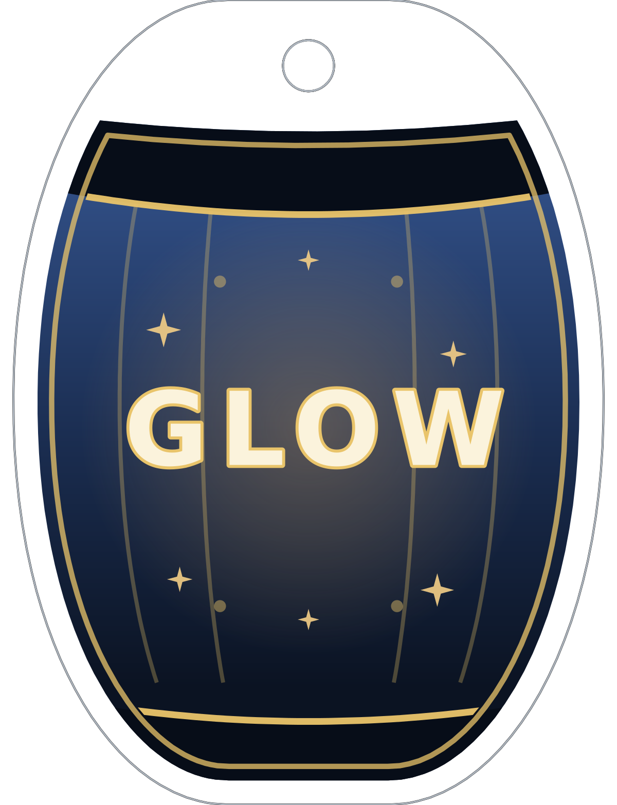
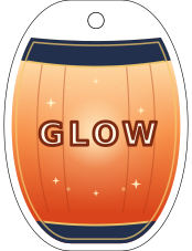
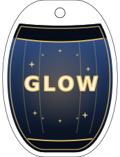
The fictional charm uses GLOW on both sides, with a warm orange front and a dark blue back. The word stays right-reading in each viewing-side preview; the back is not simply the entire front flipped.
Ask Ciyo to keep the same cut silhouette while drawing and typesetting each side separately. Name which file is a viewing preview and leave the manufacturer’s print-orientation convention as an explicit confirmation.
The actual run used vector geometry and live lettering rather than an image model. It revised the lantern shape and layer review before delivering the set. Design agent reasoning remains billable usage.
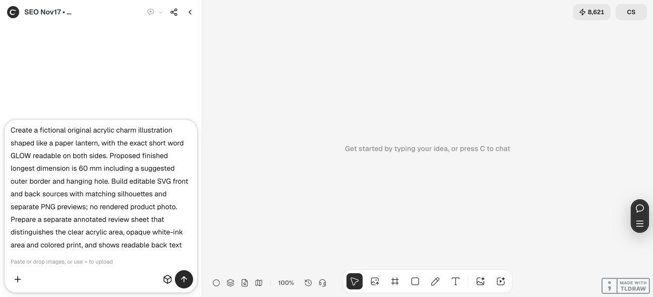
Create original artwork for fictional [charm name] at a proposed longest finished dimension of [size including border and hanging hole]. Put the exact word [wording] right-reading on both viewing sides. Provide separate editable front and back SVGs with the same cut silhouette and separate PNG previews. Make an annotated review distinguishing intended clear acrylic, opaque white ink and color print. State font dependencies. Keep size, rim and hole as proposals for the chosen manufacturer. Do not call RGB previews CMYK or spot-white separations, and do not place an order.3. Compare the front and back before discussing print layers
The downloaded front and back previews are each 1200 × 1566 pixels with an alpha channel. Both show GLOW in the intended reading direction. We also checked that the SVG cut groups match exactly between the two sources.
That establishes consistency in the supplied artwork, not a manufactured alignment tolerance. Ask the maker how it maps each viewing side onto its printing process, especially when artwork is viewed through the acrylic.
Keep the front and back clearly named throughout revisions. If you change the silhouette or hole position, apply the intended change to both sources and repeat the comparison.
4. Distinguish transparency from the intended white-ink area
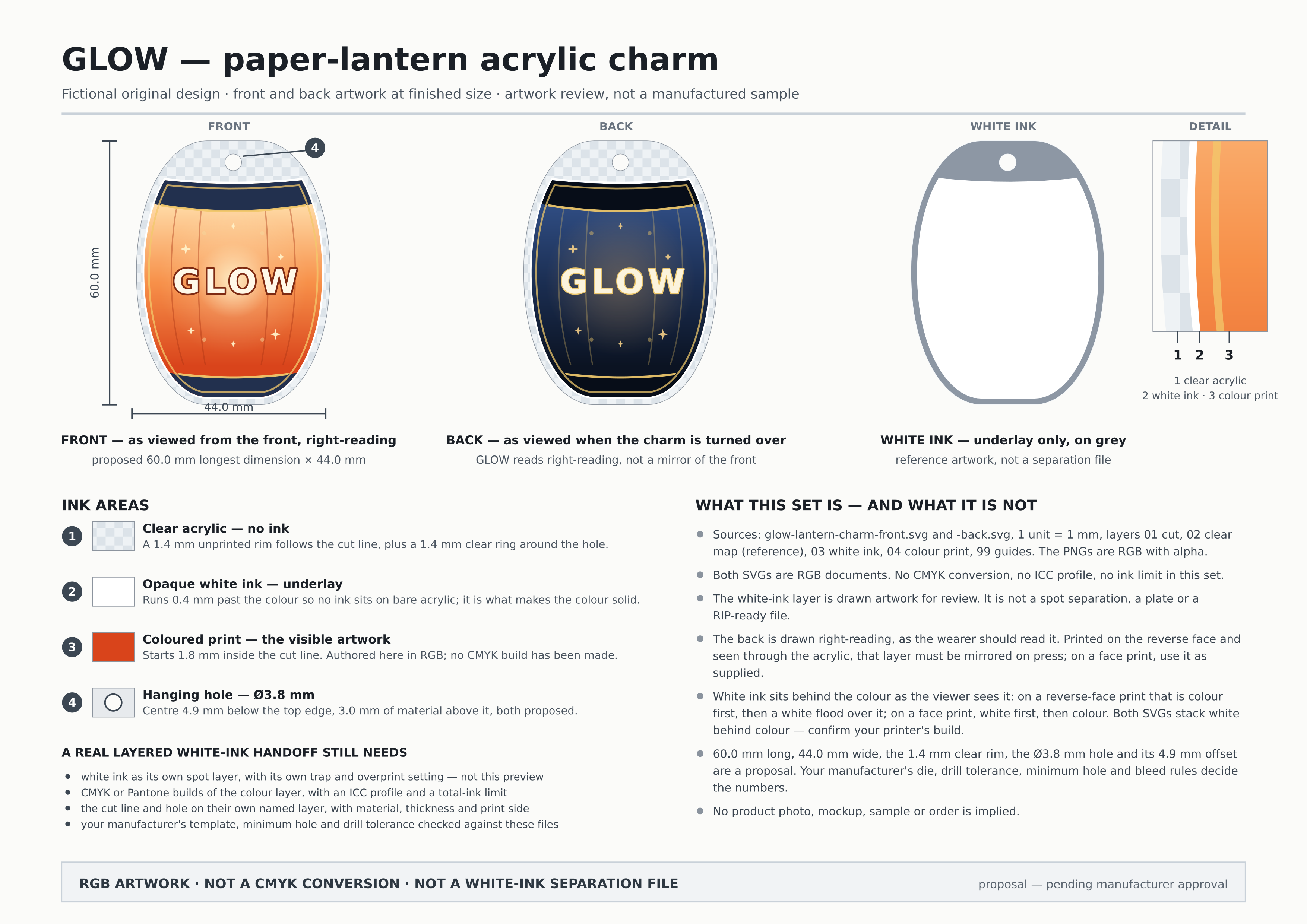
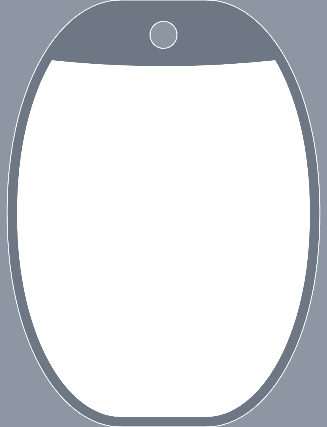
The annotated sheet separates an unprinted clear rim, an intended opaque white underlay and the visible color artwork. The white-area proof shows where white is proposed to sit; it is a review illustration.
Neither that proof nor a transparent RGB PNG is a spot-white production separation. A layer named white ink in the SVG also does not create a printer-specific spot color, trapping rule or output plate by itself.
For a layered handoff, ask the maker how it wants white ink, cut and hole information, color mode and orientation supplied. Some accepted workflows use RGB PNGs; others ask for particular editable layers. Follow that workflow rather than assuming every supplier needs the same package.
5. Use the source for review, then obtain the maker’s proof
The two linked SVGs preserve separate cut, reference, white-area, color and guide groups. They retain live GLOW lettering in DejaVu Sans Bold, so confirm that font or prepare an outlined version before expecting an exact appearance in another editor.
This run’s canvas delivered PNG previews rather than native SVG attachments. For this article we retrieved the complete sources through a separate source-handoff image and verified their byte counts and SHA-256 hashes before saving them as SVGs. The linked files are the recovered review sources, not a claim that the canvas has a general SVG-download feature.
Before production, confirm the physical size, border, hole, color handling and both viewing orientations in the maker’s proof. Keep guide and reference groups out of printable artwork according to that supplier’s instructions. A physical sample remains necessary to judge the finished object.
Acrylic keychain artwork questions
Should I mirror the entire front for the back?
That can make text read backward. Prepare the intended viewing sides separately when wording must remain readable, then confirm the manufacturer’s required print orientation.
Is transparent white the same as white ink?
No. Transparency describes an image area without opaque pixels. White ink is a physical opaque print area that needs the maker’s accepted handoff method.
Can a PNG be CMYK?
The transparent PNG workflow discussed here uses RGB, as Vograce’s guide explicitly notes. Use supported editable formats when a maker requests a particular CMYK setup.
Are the sample rim and hole approved dimensions?
No. The 60 mm longest dimension, 1.4 mm rim and 3.8 mm hole are proposals. The manufacturer must confirm its own border, hole and tolerance requirements.
Was a physical keychain tested?
No. The demonstration produced artwork, source files and review images. No manufacturer proof, sample, order or physical alignment result is claimed.
Brief both viewing sides before production
Give Ciyo the wording, intended size and front/back relationship. Review clear and opaque areas separately, then confirm the accepted file setup and physical proof with your maker.