Product image workflow
How to adjust product-photo exposure without losing the finish

Brightening a product photo can make it easier to read, but pushing every slider can erase the surface that makes the product recognizable. Start with a small tonal correction and compare the important areas against the original.
For the fictional Juniper Pottery mug, we want the body and handle to read clearly while retaining the warm glaze and bright rim. This is a visual editing example, not a color-calibrated reproduction of a real ceramic finish.
1. Choose a reference before moving sliders
Upload and select the image. Examine the darkest part of the handle, the brightest rim highlight, and the transition across the mug’s body. Decide which area needs help. A brighter background alone is not evidence that the product looks better.
Our source has a cool background and an amber mug. We keep that relationship. The objective is modest separation between the body and shadow, not a new glaze color.
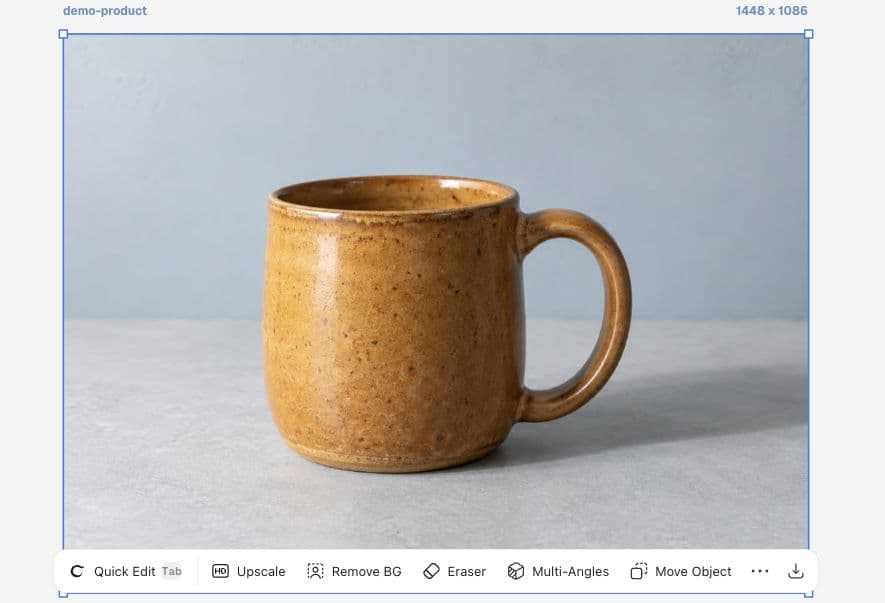
2. Make a restrained adjustment in More → Adjust
Open More, then Adjust. For this input, we set Exposure to 8, Highlights to -15, and Shadows to 10. The screenshot records the actual settings. These are Ciyo slider values for this example; they are not exposure stops or a universal recipe.
Change one control, inspect the result, and then continue. We left the other controls at their defaults. Increasing exposure and reducing highlights together can be useful here, but it does not recover reliable surface information from a source that never captured it.
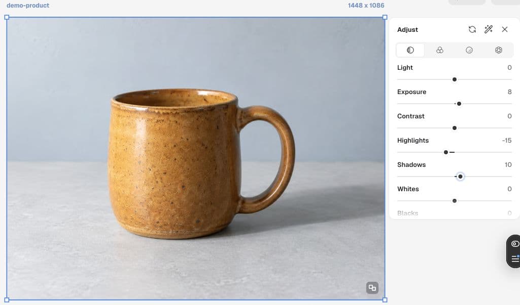
3. Compare the surface, not just the brightness
Use the available Compare with original control when judging the change. Look at the glaze speckles, the inside edge of the handle, and the rim. Keep the edit only if these details remain believable and useful.
Close the panel and review the image at its intended display size. In our result the body is slightly brighter and the dark handle area is easier to read. We have not measured color accuracy, and the generated input cannot serve as a physical color reference.
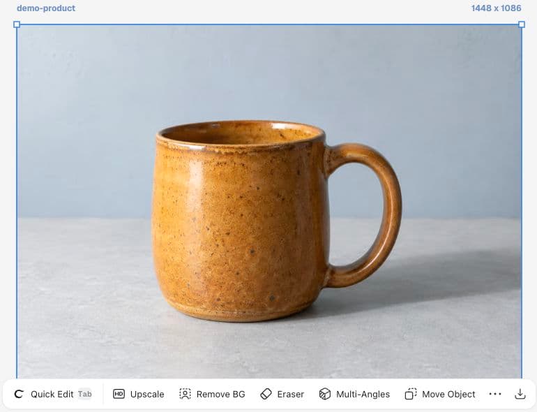
Separate exposure choices from color approval
A product catalog needs both readable images and honest color. For an actual SKU, compare against a trusted reference under controlled viewing conditions. If the reference is uncertain, ask for a better source photograph before treating a slider adjustment as final approval.
| Check | What to do | Decision |
|---|---|---|
| Highlights | Check the rim and light-facing surface | Keep shape and finish visible |
| Shadows | Inspect inside the handle | Avoid flat, washed-out dark areas |
| Color | Compare with the approved product reference | Do not approve color from this fictional demo |
Review this tonal edit against the original. Check the rim highlight, glaze texture, handle opening, and base shadow. Identify any detail that became less credible. Keep product-color approval separate from brightness preference.A recent question about consistent product color
A product photographer recently described using a gray card and color checker while still struggling with images that felt too bright or dark. The discussion highlights the need to judge lighting, exposure, and viewing conditions together. Our small adjustment test applies that discipline without claiming the same equipment or calibration.
Published September 14, 2026. The author describes Lightroom, a gray card, and a SpyderCHECKR. This Ciyo workflow is our adaptation, not the poster’s recommendation.
Practical questions
Are these settings a reusable preset?
They are the settings demonstrated on one fictional image. Start from the original and judge each product rather than applying the numbers automatically.
Can Adjust guarantee accurate product colors?
This walkthrough does not establish calibrated color accuracy. A real product needs an appropriate reference and viewing process.
What should I do if the highlights have no texture?
Return to the original capture or a better-exposed photograph. Lowering a slider is not evidence that missing physical detail has been restored.
Bring your next product image into Ciyo
Open a canvas, upload the image you want to review, and make one clear decision before preparing the final asset.