Character poster design
Set a reusable grid for individual character posters
Lay three sheets side by side and a tiny shift in title height becomes conspicuous. A grid makes the next portrait quicker to place, but a rigid portrait box can cut off a distinctive costume. Use the tallest and widest drawings to set the limits.
Mark four positions
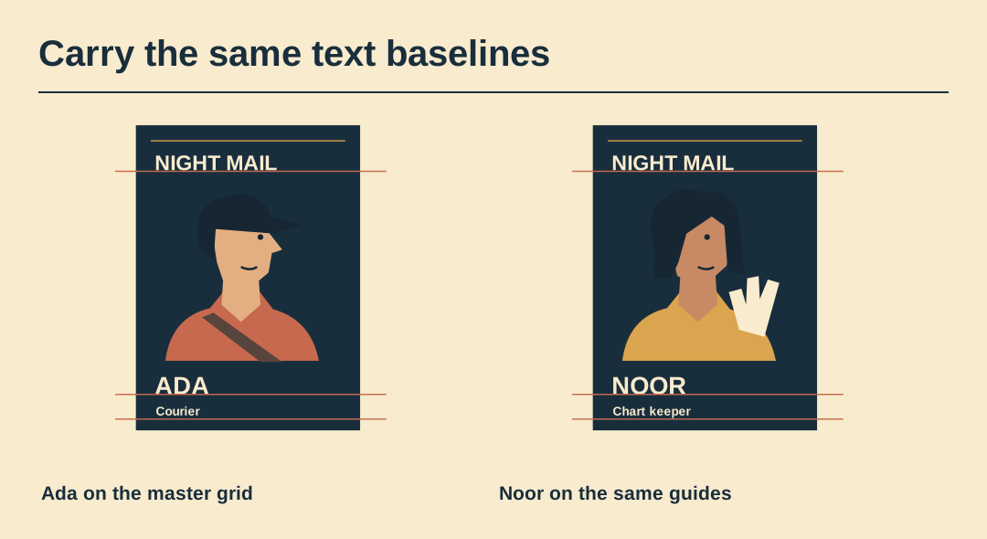
On a 300 by 420 working sheet, try 24 units of side margin, a series line at 36, a name baseline at 362 and a role beneath. These are the starting coordinates for this exercise, not printer specifications.
Test the extremes
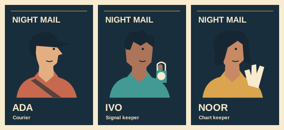
Place Ada’s wide cap and Noor’s tall chart fan on separate copies. Inspect the top corners first. An empty area on the shortest portrait is easier to handle than a lost prop on the tallest.
Keep the type live
Set the title and name in editable text. Use guides for their baselines rather than nudging by eye. Leave the actual portrait on its own layer so a pose change cannot move the lettering.
Measure the gutters
Print a strip containing the bottom of all three cards. If the space between a name and the edge looks unequal, check the text baseline before moving the whole portrait.
Allow a drawn exception
Let a chart tip project into the portrait margin only where it has room. Keep the show title clear and record the exception on the master so another designer can reproduce it.
Deliver a blank
Remove the character art from a copy and leave the editable guides and text. Rebuild one card from this blank. If rebuilding needs undocumented offsets, put those values on the guide layer.
Work with the original cards
The SVG contains all three original cards as separate editable groups. Save a copy to try the layout yourself.