Blender workflow
GPT-6 Astra + Blender: compare product material variations
A GPT-6 Astra Blender material study is easier to review when the object stops changing. Keep one model, one camera, and one light rig, then produce named finish variations. You can compare the material rather than three unrelated images.
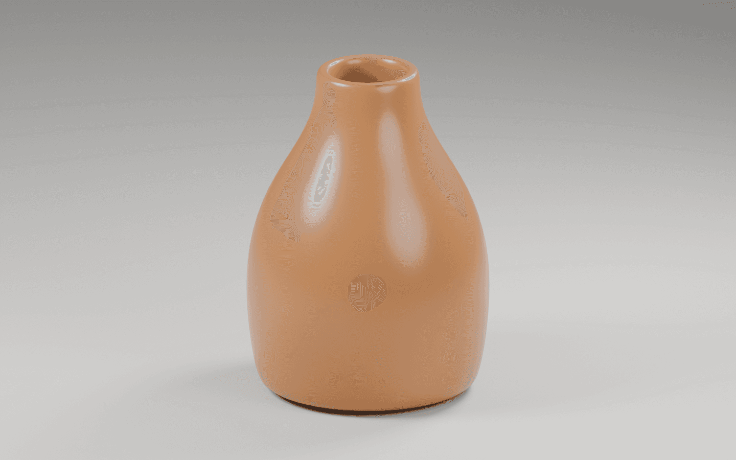
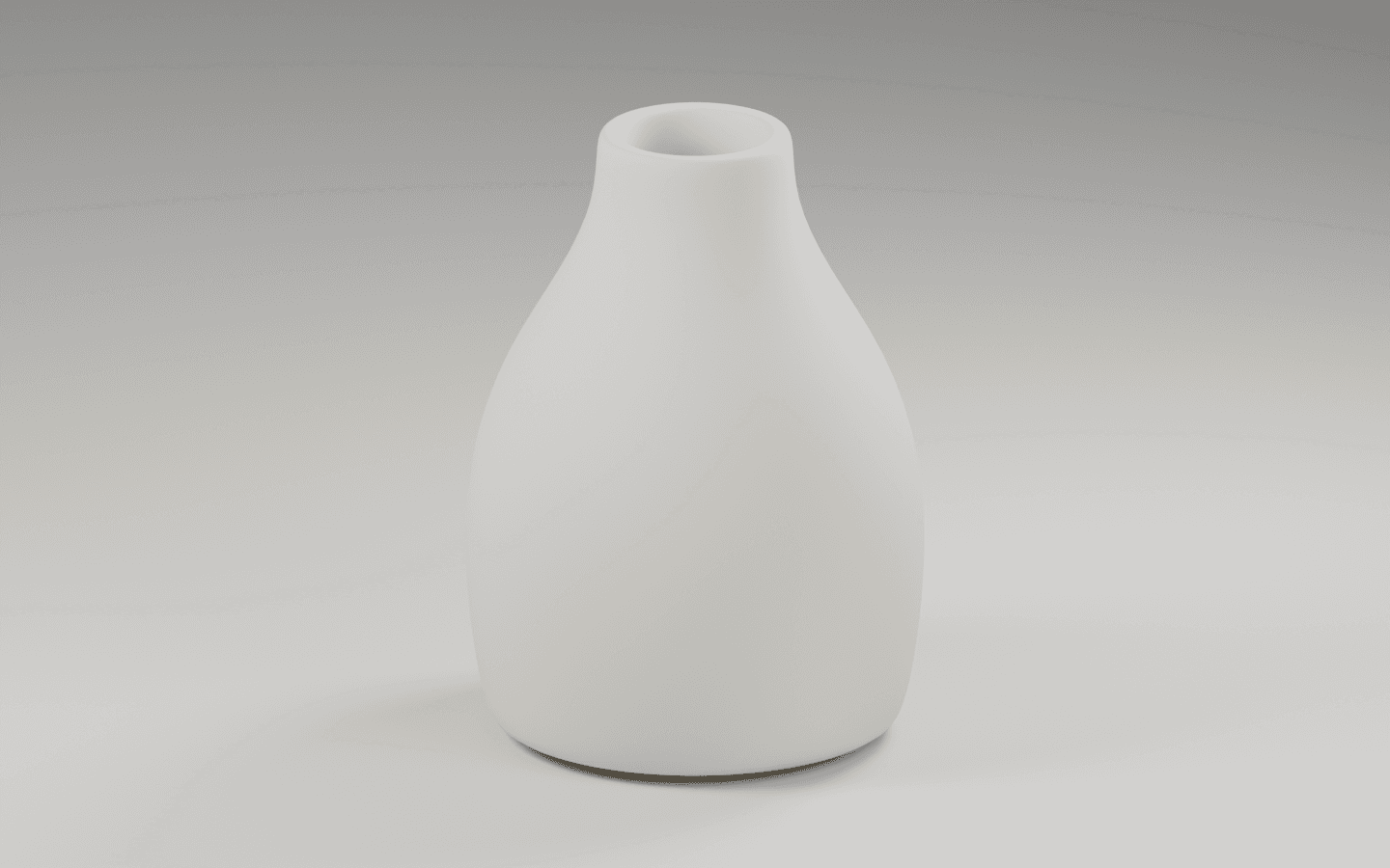
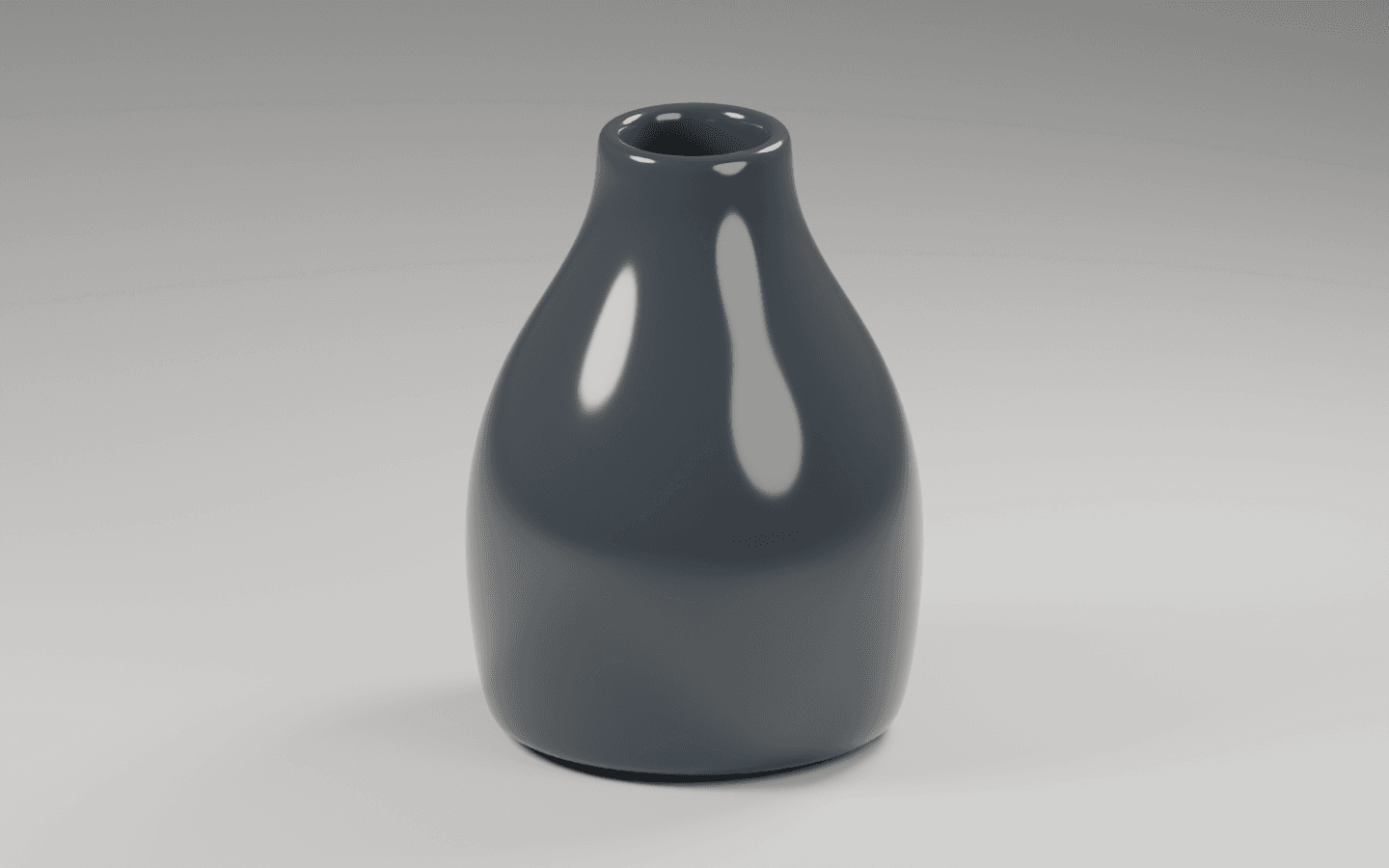
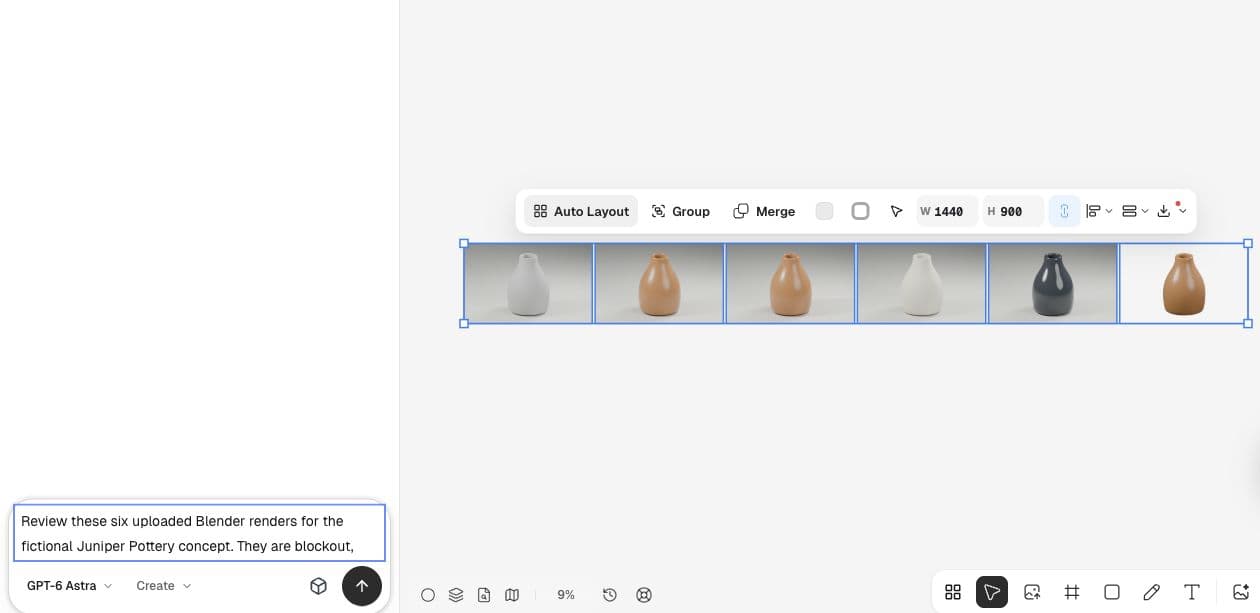
For the fictional Juniper vase, we rendered amber satin, ivory matte, and charcoal gloss. These are concept directions with specified shader values. They are not calibrated samples of real glazes or proof that a factory can produce them.
1. Define what changes and what stays fixed
Start with the tested vase scene. Keep its geometry, lights, camera, AgX view transform, output size, and render samples fixed. Ask Astra to change only the named material assignment between renders.
Use descriptive material names and separate filenames. A reviewer should be able to connect material-ivory.png to Ivory matte in the scene without guessing which experiment produced it.
Using the Juniper vase Blender scene, render three material directions on the same object: amber satin, ivory matte, and charcoal gloss. Keep geometry, lights, camera, view transform, and output settings fixed. Name the materials and files. Record Base Color and Roughness values. Treat them as illustrative concepts, not measured ceramic glazes.2. Establish the amber reference
The amber version uses Base Color (0.42, 0.16, 0.045) and Roughness 0.28 in the script. The rendered surface has broad highlights and a warm body color. Judge the image alongside the values; a numeric color alone does not describe its appearance under a complete light rig.
The supplied RGB values are Blender shader inputs, not hexadecimal website colors or measurements from a physical sample. Keep that distinction in the handoff to a designer or maker.
3. Compare the matte ivory version
Ivory matte uses Base Color (0.72, 0.68, 0.56) and Roughness 0.72. Inspect the shoulder, opening, and brightest side. A pale finish can lose shape if its highlights blend into the background.
Blender’s Principled BSDF documentation describes roughness as controlling the spread of surface reflection. Our material comparison changes both color and roughness, so it is a comparison of complete finish directions, not an isolated roughness experiment.
4. Inspect the charcoal gloss version
Charcoal gloss uses Base Color (0.032, 0.038, 0.046) and Roughness 0.12. Its bright reflections contrast strongly with the darker body. Inspect the opening and the shaded edge at the intended display size; a dramatic reflection is not enough if the form becomes hard to read.
Our three directions give a reviewer a concrete choice. If the next question is specifically how roughness affects amber, make another pair that changes roughness only. Do not infer that relationship from a comparison that also changed color.
5. Keep the approval decision precise
Upload the variations into Ciyo for a shared visual review. Record whether you are choosing a concept direction, approving a real product color, or checking a website treatment. Those are different decisions with different evidence.
A recent product-photography discussion asks why color-checker workflows still need exposure and viewing judgment. The same caution applies here: our fixed scene makes comparisons easier, but it does not make the result a physical color standard.
| Check | What to do | Decision |
|---|---|---|
| Concept direction | Compare the three fixed-scene renders | Choose a finish to develop |
| Physical match | Compare an approved sample and measured reference | Do not infer from this concept alone |
| Website use | View at the intended size and background | Check readability and contrast |
Published September 14, 2026. The source discusses physical product photography and Lightroom. Our Blender material study is a separate adaptation, not a color-calibration method endorsed by the author.
Practical questions
Are the RGB values exact product colors?
No. They are shader inputs in an illustrative scene. Lighting, color management, displays, and the real material all affect appearance.
Why did both color and roughness change?
The goal was to compare three complete finish directions. To isolate roughness, make a new comparison with the color and every other setting fixed.
Can I edit the materials later?
Yes. The downloadable .blend retains named materials. Save a separate iteration and keep its settings with the exported image.
Bring your next product image into Ciyo
Open a canvas, upload the image you want to review, and make one clear decision before preparing the final asset.