GPT-6 Astra · Website design
GPT-6 Astra Website Design: Plan the Images a Landing Page Needs
Landing pages often stall on images. The layout is ready, but the hero is the wrong shape, the feature rows reuse the same photo three times, and the social card crops the product in half. Each image was made before anyone decided what the section needed.
This walkthrough asks GPT-6 Astra for an image plan before any image is generated. The example is a one-page launch for a fictional Fold ivory notebook, planned in Ciyo on September 18, 2026. Astra could see two concept images already on the canvas and said which could be reused. We did not build the page or generate new images for it.
List the sections before the images
Write the page outline first: a hero, three feature rows and a social share card. Give each feature row one topic. For Fold we chose paper feel, cover material and size in a bag, because those are the questions a buyer asks before ordering a notebook online.
Also list the facts you do not have. We kept price, page count and binding as unknown, so no image or caption could quietly promise them.
Reference material matters. On September 16, 2026, Prajwal Tomar (@PrajwalTomar_) described Astra's first landing page as "typical AI slop", then asked it to study a large set of real websites and critique its own page. It proposed 28 changes before rebuilding. An image plan applies the same idea earlier: decide what each image must do before anything is generated.
Creator's account of Astra critiquing and rebuilding a landing page; the quality judgement is the poster's. Our image-plan step is an original adaptation.
Ask for one line of decisions per image
For each section, ask for the image's purpose, aspect ratio, what must be visible, where the page text will sit and whether an existing image can be reused. Ask Astra not to generate anything. The plan is a decision document, so it should stay short enough to review in one pass.
Plan the images for a one-page landing page for the fictional Fold stationery ivory notebook launch. Sections: hero, three feature rows (paper feel, cover material, size in a bag), and a social share card. For each image give: purpose, aspect ratio, what must be visible, where the page text will sit, and whether an image already on this canvas can be reused. Keep price, page count and binding as unknowns. Under 190 words. Do not generate images.Review the plan Astra returned
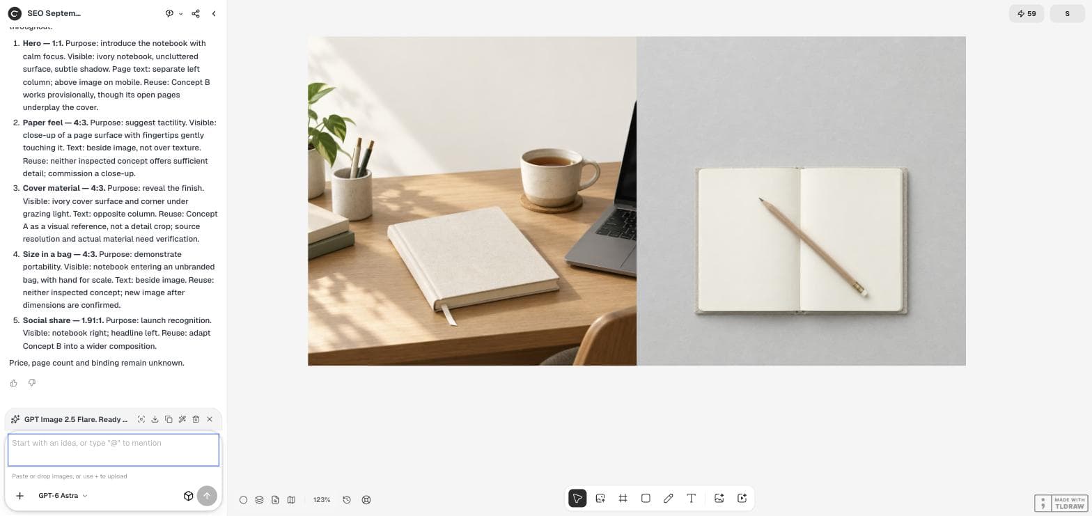
Astra planned a 1:1 hero with the text in a separate column, three 4:3 feature images with the text beside them, and a 1.91:1 social card with the notebook on the right and the headline on the left. It suggested soft daylight, ivory and grey tones and unbranded props across the set.
Check the ratios against your page template before you accept them. A 1:1 hero suits a two-column layout; a full-width hero needs a wide image instead. Change the plan now, when changing it costs a sentence.
| Section | Ratio | Must show | Reuse decision |
|---|---|---|---|
| Hero | 1:1 | Ivory notebook on an uncluttered surface | Concept B provisionally; it underplays the cover |
| Paper feel | 4:3 | Close-up of a page with fingertips | New close-up needed |
| Cover material | 4:3 | Cover surface and corner in grazing light | Concept A as reference only; verify material |
| Size in a bag | 4:3 | Notebook entering an unbranded bag | New image after dimensions are confirmed |
| Social share | 1.91:1 | Notebook right, headline left | Adapt Concept B to a wider composition |
Take the reuse decisions seriously
Reusing an image saves time only when it fits the section's job. Astra accepted the flat-lay concept for the hero only provisionally, and it refused to reuse either concept for the paper close-up because neither shows enough detail. Enlarging a small area of a wide image usually produces a soft, unconvincing texture shot.
Two sections depend on facts: the cover material needs verification, and the bag image needs real dimensions. Mark those images as blocked until the owner answers. A placeholder is better than an image that shows the wrong size.
Generate the missing images in plan order
Use the plan's ratio and required content as the fixed part of each image prompt. Generate the hero first, because its light and props set the style for the rest of the page, then the feature images, then the wide social card.
Keep the text areas empty in every image. Add headlines and captions in the page or as editable text, so a copy change never requires a new image.
Check the set on one board
Place the finished images on the Ciyo canvas in page order. Look for a set that feels like one shoot: consistent light direction, the same notebook colour and no prop that appears in one image and disappears in the next.
Then check each image at its real size in the page. A 4:3 feature image often shows at about half the screen width on a laptop and full width on a phone, so review both before you publish.
Landing-page image questions
Did Astra design the whole landing page?
No. In this example it produced an image plan only. The page layout and the new images were not created.
How did Astra know what was on the canvas?
The two concept images were already on the project canvas, and its answer referred to them by name. Check any reuse suggestion against the image yourself.
Why is the social card 1.91:1?
That is the ratio Astra proposed for a link-share image. Confirm the size each platform currently requests before exporting.
Plan the page's images first
Ask GPT-6 Astra in Ciyo for an image plan, then generate only the images the page still needs.