GPT-6 Astra · Creative workflows
Build a Landing Page with GPT-6 Astra: From Reference to Responsive Design

A convincing landing page needs more than a good screenshot. The headline has to remain readable on a phone, the primary action has to work and the product claims have to survive the design process unchanged. Give Astra those requirements alongside your reference image.
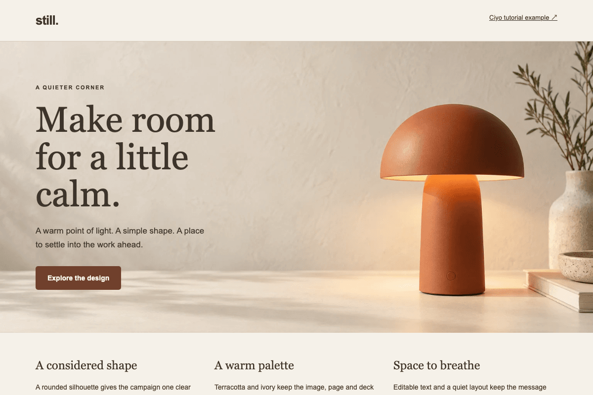
This guide includes an original responsive page for the fictional Still lamp. It uses the editorial image from our image-prompt guide and live HTML text. The example is a locally verified teaching artifact, not a timed or controlled Astra generation test.
Translate the reference into a brief
Describe the hierarchy you want to preserve: brand, headline, supporting sentence, primary action and hero image. Explain whether the reference is about typography, spacing, color or composition. Without that distinction, an agent may copy details that were incidental to the direction.
Give it the approved product facts separately. For Still, we use fictional descriptive copy and a specifications disclosure. There is no checkout, fabricated review score or invented inventory counter. A production page needs real product facts and a real action destination before launch.
| Input | Specify | Verify |
|---|---|---|
| Art direction | Palette, type hierarchy and spacing rhythm | The page follows the intended hierarchy |
| Product image | Subject and crop priorities | The subject remains visible on mobile |
| Copy | Approved headline and factual claims | No invented prices or testimonials |
| Primary action | Destination or exact interaction | Mouse and keyboard behavior |
Keep text and controls separate from the image
The Still hero image leaves room for copy, but the headline lives in HTML. That allows it to reflow, remain selectable and be corrected without rerendering the lamp. The button is a real control with a visible result, not a rectangle painted into the artwork.
A desktop composition can become unreadable if you simply shrink it to phone width. Let the text and image stack when needed. Keep the product's important details inside the crop and check that the first meaningful action remains easy to find.
Ask for implementation and inspection together
Specify a runnable preview and the widths to inspect. Ask the agent to use the project's existing framework and components where appropriate. If you are working in an established site, a new page should not silently introduce a second design system or unnecessary dependency.
A focused prompt also states what the page is allowed to do. For a prototype, an honest details disclosure is enough. For a lead-generation page, connect the form to the intended destination and test that behavior before making it public.
Implement one responsive landing page from the attached Still brief and approved hero image. Keep headline and body copy as editable HTML. Use the existing project conventions. At desktop width, preserve the quiet composition; at 390px, stack content without horizontal overflow or hiding the lamp. The primary control opens product details and can be used by keyboard. Include visible focus states and meaningful image alt text. Inspect both widths and test the control. Do not invent claims, prices, reviews or a checkout.Compare the result at two widths
Start with the reading order. On desktop, can you see the headline and understand the action before scanning decorative details? On mobile, does the order still make sense? Look for overly long lines, clipped text, awkward image crops and buttons pushed far away from their explanation.
A source screenshot can guide appearance, but it cannot answer those interaction questions. The community discussion below captures that uncertainty: frontend quality depends on matching a particular style and delivering working behavior, not merely generating valid HTML.
Test the control and the page's honest boundaries
Use Tab to reach the primary control and activate it with the keyboard. Confirm its visible state and that the content it reveals can be read. Resize the page and repeat. Check that focus remains visible against the chosen palette.
The Still example explicitly identifies itself as fictional and its details as illustrative. That label matters because a polished design can look like a real storefront. When adapting it, replace the sample facts with verified information and wire the action to your actual product flow.
| Check | Evidence |
|---|---|
| Responsive layout | Desktop and mobile screenshots without clipping |
| Image delivery | Image loads; subject survives the crop |
| Keyboard | Visible focus and working primary control |
| Claims | Every product statement has an approved source |
| Handoff | Runnable files and known unfinished integrations |
Improve the weakest part in the next revision
If the layout is sound but the visual lacks identity, revise the image brief. If the image is strong but the headline hierarchy is weak, fix the page. Treating every defect as a reason to regenerate the entire design makes it harder to preserve what already works.
For a campaign with several landing-page variants, keep the approved asset set and copy decisions in a shared brief. Ciyo can help create the visual variations; responsive behavior and conversion tracking belong to the implementation and should be checked separately.
Put your visual brief to work
Use Ciyo to create campaign visuals with the crop, composition and copy space your landing page needs.