GPT-6 Astra · Creator workshop
GPT-6 Astra Poster Design: Composition, Typography and Export
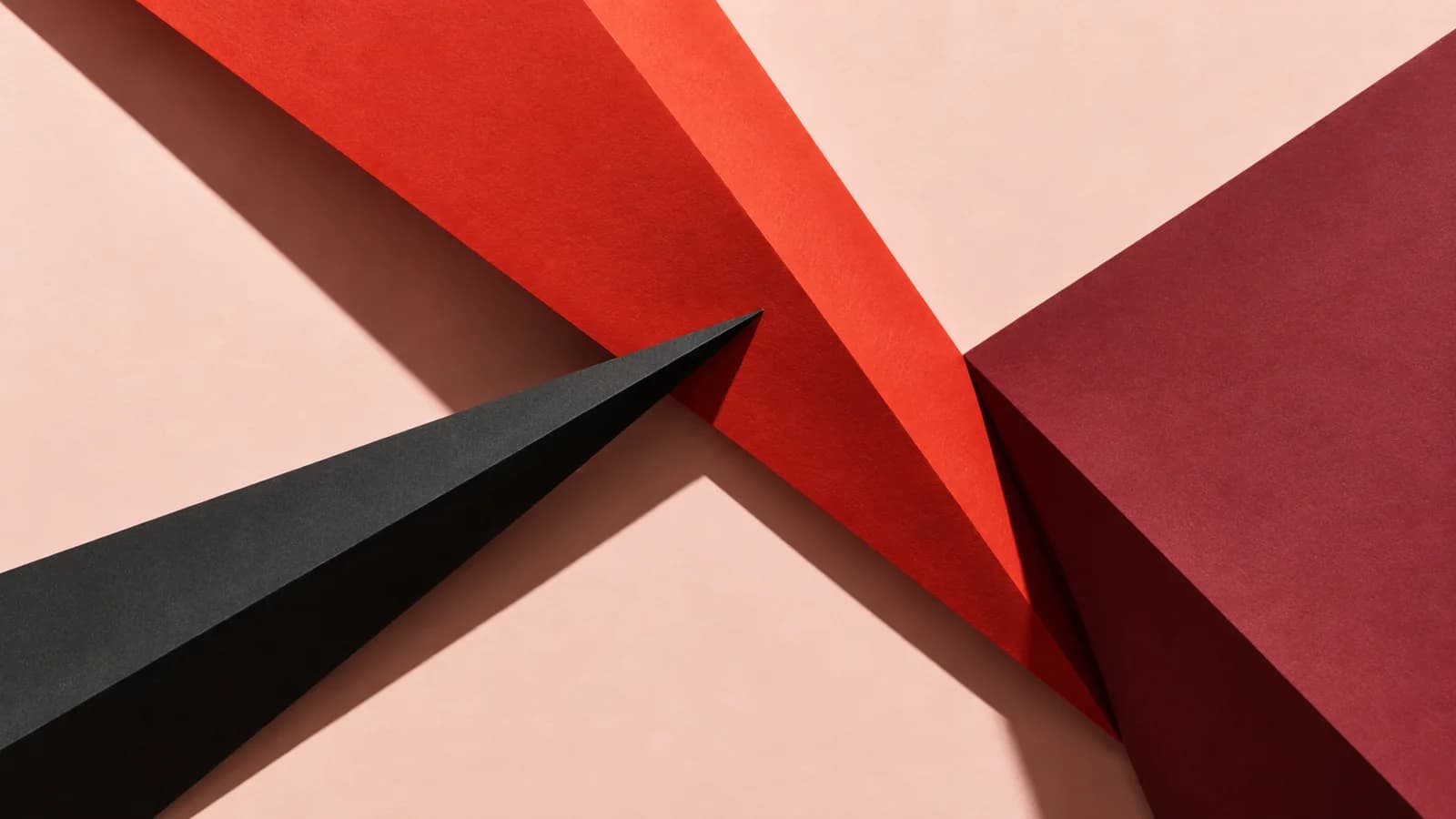
A poster has two jobs: catch the eye and communicate the essential information. An impressive generated image can fail the second job if the date is wrong, the title is unreadable or the venue disappears into the artwork.
For this workshop, imagine a fictional paper-art exhibition. The artwork is original; the event is a design exercise, not an announcement.
Decide the reading order first
Ask Astra to turn the approved copy into a hierarchy: event name, reason to attend, date, place and next action. Sketch the relative sizes before choosing artwork. The viewer should know which line to read first without having to study the entire composition.
Limit the first read to one dominant message. Supporting details can become clear when the viewer comes closer. Giving every line equal weight usually makes the whole poster harder to scan.
Separate artwork from exact copy
Use a generated illustration for atmosphere and a text layer for information that may change. A flattened image cannot offer the same correction path as live text. Do not describe a raster poster as an editable source file.
| Layer | Purpose | Review |
|---|---|---|
| Artwork | Mood and focal point | Does it support the message? |
| Headline | Identify the event | Read at a distance |
| Details | Date, place and practical information | Check against approved copy |
| Call to action | Next step | Verify the destination |
Leave room for the typography
Our abstract paper composition reserves a quiet region. It is easier to place copy in planned empty space than to cover the most interesting part of a finished image. Describe where the type will go without asking the renderer to invent event details.

Create artwork for a fictional paper-art exhibition poster. Use ivory architectural folds, a cobalt ribbon and warm terracotta accents. Put the strongest visual movement in the lower-right region. Leave a calm upper-left area for a headline and separate event details. Do not render words, dates, logos or ticket information.Assemble the composition in Ciyo
Generate the artwork, put it on the canvas and add the approved text with the available text controls. If you explore integrated lettering through image generation, proofread every character and treat the result as raster artwork.
Compare the headline against both the darkest and lightest areas behind it. Move or simplify the artwork if the type needs an outline, shadow and box merely to remain readable.
Check at the size people will see
A poster preview filling a monitor can hide weak hierarchy. Shrink it for a social preview and inspect it at the intended print size before delivery. Look for cramped lines, lost punctuation and information that depends on color alone.
For print work, ask the printer for dimensions, bleed, color and file requirements. A high-resolution image is not automatically a press-ready PDF. Confirm that the final production application supports the required output.
Deliver a version that can be corrected
Keep approved copy outside the flattened export and save the source composition. Include a clean artwork file if another designer will adapt it. Name versions by purpose, such as digital poster and print artwork, rather than “final-final.”
The reusable asset is the relationship between image, hierarchy and copy. For another event, replace the facts and reassess the layout instead of forcing new text into the old spaces.
Build poster artwork in Ciyo
Create the poster artwork in Ciyo, then place your approved event copy on the canvas as separate text.