Crowdfunding artwork
Kickstarter Reward Images: Show What Each Tier Includes

A reward image can create an expectation before someone reads the tier description. A decorative object, missing item or inconsistent scale can make it harder to tell what a backer would receive.
We created a fictional Lantern Market reward-image set in a live Ciyo project and compared it with Kickstarter’s published image guidance. The three compositions are editorial illustrations, not manufactured goods or a live campaign. The useful starting point is a contents matrix.
Quick answer: approve the contents before the composition
Write what each tier includes and excludes, then make the image match that record. Keep shared objects visually consistent and put explanatory wording in the tier text and alt text.
Kickstarter’s guidance asks creators to show rewards clearly, present projects honestly, avoid text in reward imagery and use alternative text for accessibility. The example applies those principles to fictional illustrations; it does not establish compliance or results for a real campaign.
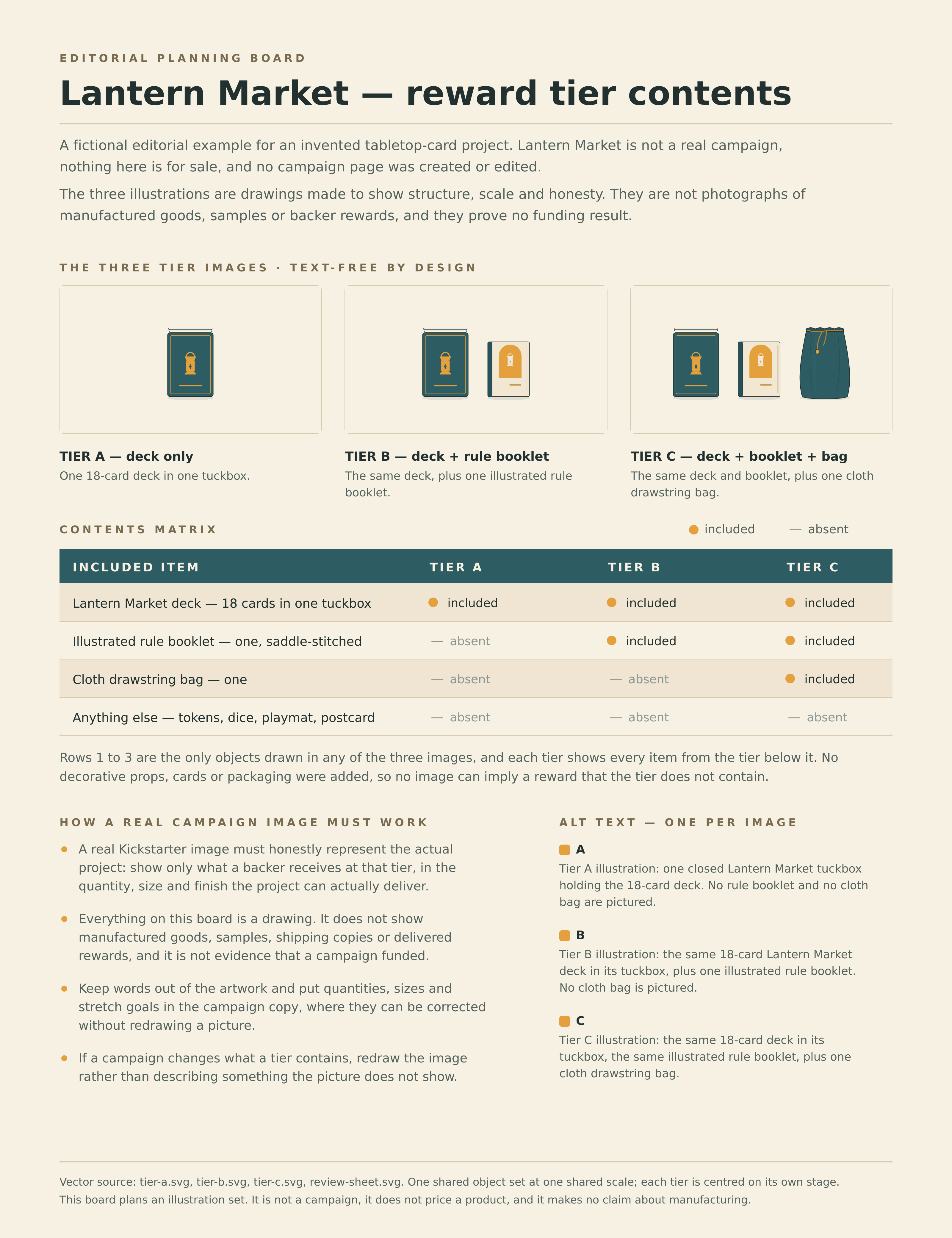
| Item | Tier A | Tier B | Tier C |
|---|---|---|---|
| One 18-card deck | Included | Included | Included |
| One illustrated rule booklet | Absent | Included | Included |
| One cloth drawstring bag | Absent | Absent | Included |
| Other objects | Absent | Absent | Absent |
1. Turn the reward promise into an explicit item list
For this fictional project, Tier A contains a deck, Tier B adds a booklet and Tier C adds a bag. The 18-card count is part of the illustrative brief. A drawing of a stacked deck cannot independently prove its physical contents or card count.
Record variants, quantities and exclusions in plain text before making the images. If an optional add-on is not part of the tier, do not place it in that tier’s composition as decoration.
For a real project, use imagery and disclosures that honestly represent its actual development state and follow Kickstarter’s rules. These made-up illustrations are a teaching example, not evidence that a product exists.
2. Request one shared object set across every tier
Ask Ciyo to reuse the deck, booklet and bag geometry across the compositions. Shared appearance and scale make it easier to see the item added at each tier.
The actual run used vector geometry rather than an image model. It refined the booklet and bag shapes, then created a separate text-bearing review sheet. Design agent reasoning remains billable usage.
The finished tier images have no visible lettering. Keeping labels on the separate sheet lets the image stay useful when the surrounding campaign copy is translated.
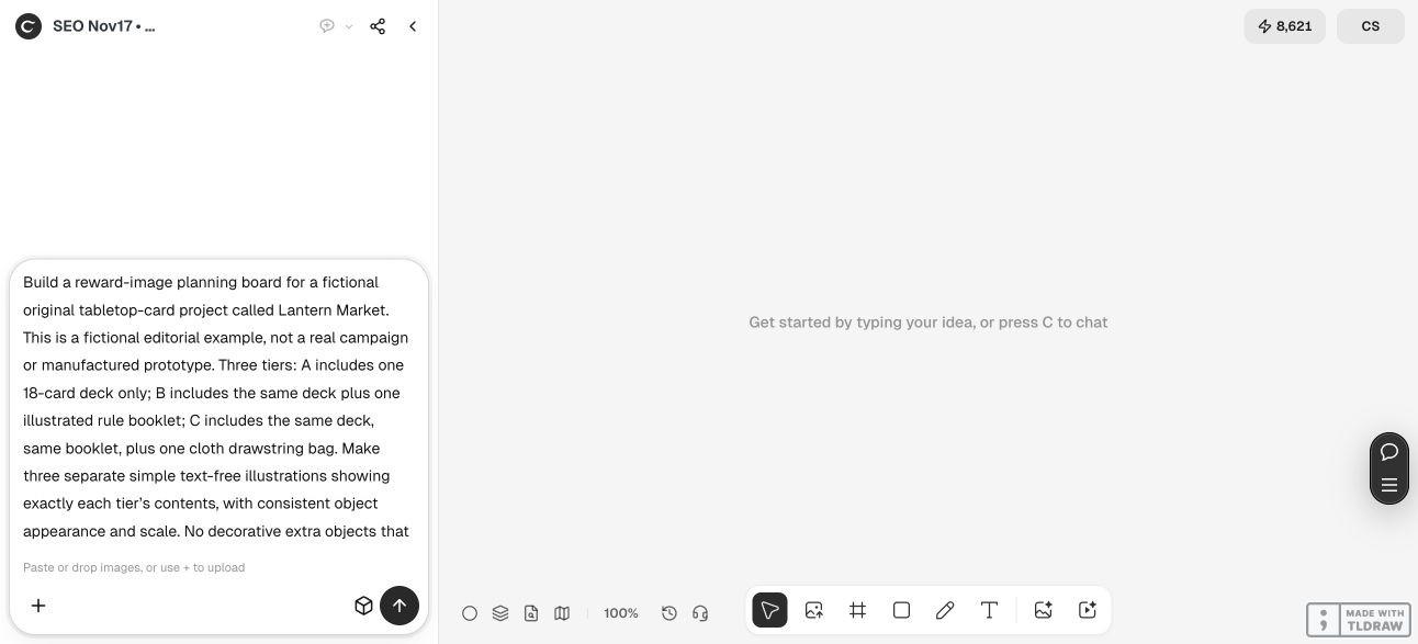
Create original reward illustrations for fictional [project name]. Tier A includes [exact items and quantities]; Tier B includes [exact items and quantities]; Tier C includes [exact items and quantities]. Reuse the same appearance and scale for shared items. Put only included objects in each finished image and keep those images text-free. Provide editable SVGs and PNG previews, plus a separate labelled contents matrix and a distinct alt-text suggestion for each tier. Label these as fictional editorial illustrations, not manufactured goods. Do not create or edit a campaign.3. Compare each image with its own row of promises
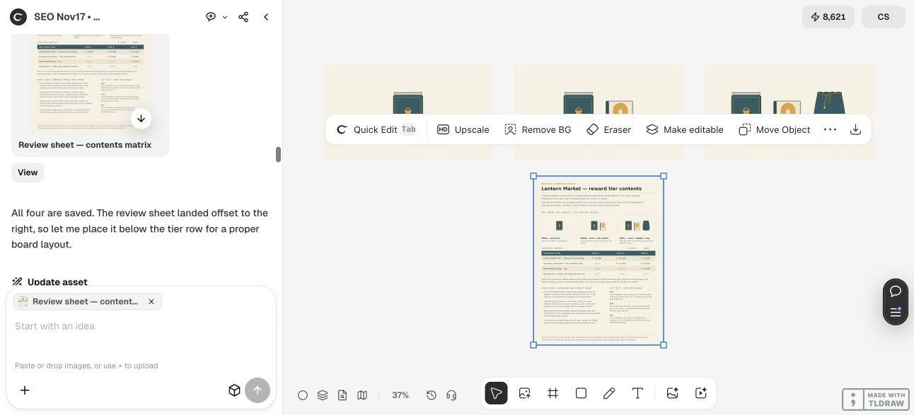
Tier A shows the deck alone. Tier B adds the booklet, and Tier C adds the cloth bag. The shared objects retain the same drawn dimensions and export scale while the groups are repositioned to fit each composition.
Review each image independently. A person may encounter only one tier, so do not rely on another image to explain an omission or an extra object.
The illustrations intentionally avoid lifestyle props. A shadow can ground the objects; an unrelated pen, box or accessory could imply another included reward. If an item changes, change the drawing and the tier description together.



4. Write alt text for the actual tier image
Use separate descriptions that state the meaningful objects in each image. Do not reuse Tier C’s description for Tier A or let a screen reader announce a bag the image and tier do not contain.
For this example, a useful Tier A description is: “Fictional illustration of one Lantern Market card deck; booklet and bag are not included in this tier.” Adapt the wording to the real project and avoid treating this text as a substitute for the full reward description.
The review sheet keeps the matrix, exclusions and proposed alt text together. It also labels the illustrations’ fictional status. Review that sheet internally; do not accidentally replace the clean reward image with a dense planning page.
5. Keep editable sources and the campaign description aligned
Ciyo supplied the three SVGs as copyable source because this run’s canvas handoff did not attach SVG files. We saved those sources separately. The SVG canvas is 1600 × 900; the delivered PNGs render the same composition at 3200 × 1800.
For a real campaign, check the current reward-image controls and preview each tier with its description and alt text. Review whether the images honestly communicate the actual project’s state. This tutorial did not perform that upload or claim platform approval.
Keep the approved item matrix with the source files. When a reward changes, update the affected image, description and accessible text together, then repeat the comparison before publication.



Reward-image planning questions
Can I add lifestyle props to make the image more attractive?
Only if the result still communicates the reward honestly. In this tutorial we omit extras so no decorative object can be mistaken for an included item.
Why keep the images text-free?
Kickstarter’s guidance advises against text in reward and add-on imagery because it cannot be translated. Put the explanation in the tier description and provide appropriate alt text.
Does an illustration prove the reward has been manufactured?
No. These fictional drawings are explicitly editorial examples. A real project needs imagery and disclosures appropriate to its actual development state and the platform’s rules.
Should every tier use the same alt text?
No. Describe the contents of that image and tier. Shared wording should not announce an item absent from a lower tier.
Were campaign results measured?
No campaign was created or edited. The demonstration supports an artwork and contents-review workflow, not funding, conversion or fulfillment claims.
Start with what each tier actually includes
Give Ciyo the exact item list for every tier and ask for consistent, separate compositions. Review the images, descriptions and alt text against the same contents matrix.