Print workshop
Choose a halftone dot size for a wall poster
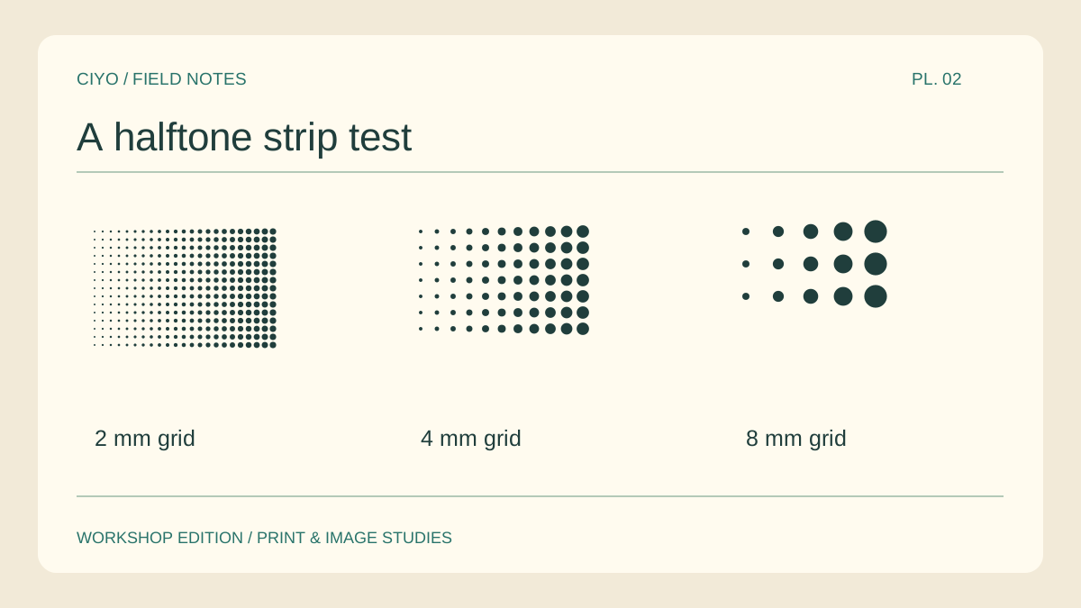
A face built out of dots can read perfectly from the doorway and disappear up close. Choosing the dot spacing is a viewing-distance decision. Make a three-strip print test with one cheek, one eye and one patch of shadow in every strip.
Keep the portrait fixed
Crop a single section of the original. Include a transition from light to dark so the proof contains more than a solid field. Duplicate that crop three times without changing its final printed size.
Change one interval
As an experiment, try grid intervals of 2, 4 and 8 mm. These are distances between dot centres. Within each grid, use larger dots for dark areas and smaller dots for highlights. Mark the actual intervals below the samples.
Keep one light detail
Find a highlight in the eye or a sliver of reflected light on the nose. If the coarsest screen merges that mark into a neighbouring shadow, the expression may change. Check the eye before judging the texture in the hair.
View the proof on the wall
Put the three strips side by side where the final portrait will hang. Back up until the dots combine into a face. Note which strip still gives the intended expression from the closest normal viewing position.
Inspect an actual join
Arrange a pair of sheets so a line of dots crosses their boundary. Slide the overlapping sheets until the pitch between the last two dots matches the rest. Even a small shift can introduce a conspicuous vertical stripe.
Keep the screen settings with the master
Record the dot interval, poster width and printer scale beside the artwork. Once you have generated the halftone image, the tiled poster tool will split that image into pages while preserving the pattern you approved.
Print the chosen halftone
Bring your finished halftone image to the tile planner. It splits the existing dots across sheets without generating a new dot screen.