Maker artwork
Rubber Stamp Design: Check the Gaps at Impression Size
A logo that looks crisp across a laptop screen can close up when it becomes a small ink impression. The useful question is whether its letters, counters and gaps remain understandable at the size you will stamp.
We created a fictional LANTERN STUDIO packaging mark in a live Ciyo project and reviewed a named stamp supplier’s artwork guidance. This tutorial follows the artwork, source and scale-proof handoff. No physical stamp was made, so the example cannot establish how an ink or paper will reproduce it.
Quick answer: review the impression, the source and the scale proof
Use a simple solid-black design with enough open space between its parts. Keep a large review preview for spotting details and a separate actual-size proof for judging the impression. An enlarged preview cannot answer both questions.
The fictional example uses a proposed 38 mm impression diameter. That is our brief, not a universal stamp size or a supplier guarantee.
| Step | Prepare | Review decision |
|---|---|---|
| 1 | Finished impression size and intended surface | How much wording can reasonably fit? |
| 2 | One-color original artwork | Which shapes receive ink and which remain open? |
| 3 | Outlined source and a large preview | Are letter gaps and counters still clear? |
| 4 | A4 proof with a 10 mm scale bar | Does the printout measure as intended? |
| 5 | Maker review and a test impression | Does the actual inked result work? |
1. Choose the impression size before setting the name
Write down the intended impression width and height, the wording that must appear, and the surface you plan to stamp. A packaging mark may need only a recognizable emblem and a short maker name. An address or long message needs a different allocation of space.
The LANTERN STUDIO brief uses a 38 mm circle and two short name lines. Keep the physical size fixed while comparing layouts; otherwise a more spacious option may simply be larger.
Ask the selected maker about the product’s usable impression area and artwork rules. RubberStamps.com’s round-logo page recommends a clear black-and-white version and at least 300 DPI for uploaded raster art. Those are that supplier’s instructions, and changing a file’s DPI label alone does not add detail.
2. Ask for clear ink areas rather than a realistic stamp mockup
For this task, the useful input is flat artwork. A photograph-like mockup can make the design feel finished while hiding whether a narrow gap will survive. Use one solid ink color against a contrasting background and keep texture out of the source.
In Ciyo, state the exact wording and size, then ask for editable geometry, an enlarged review and a separate scale proof. The example was built with vector geometry rather than an image model. Design agent reasoning is still Billable LLM usage; this does not mean the whole task is free.
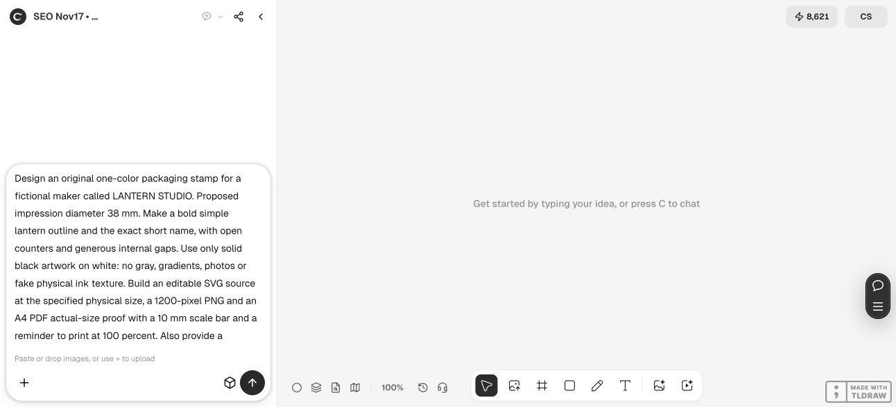
Create original stamp artwork for [maker name] at a proposed impression size of [width × height in mm]. Use only solid black artwork on white, with clear letter gaps and open counters. Include [exact wording] and [simple emblem]. Provide editable SVG source, an enlarged review preview clearly labelled not actual size, and an A4 proof with the design at its intended size and a 10 mm scale bar. Keep guides separate from the artwork. Do not simulate a manufactured stamp, place an order or contact a supplier.3. Inspect the wording and the spaces around it
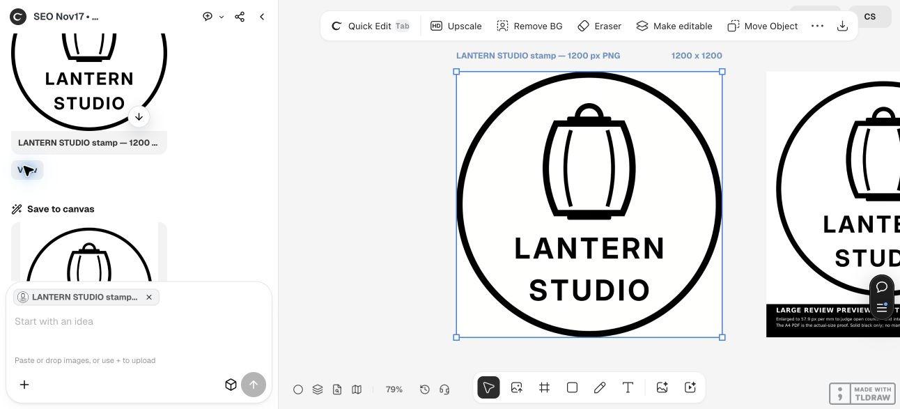
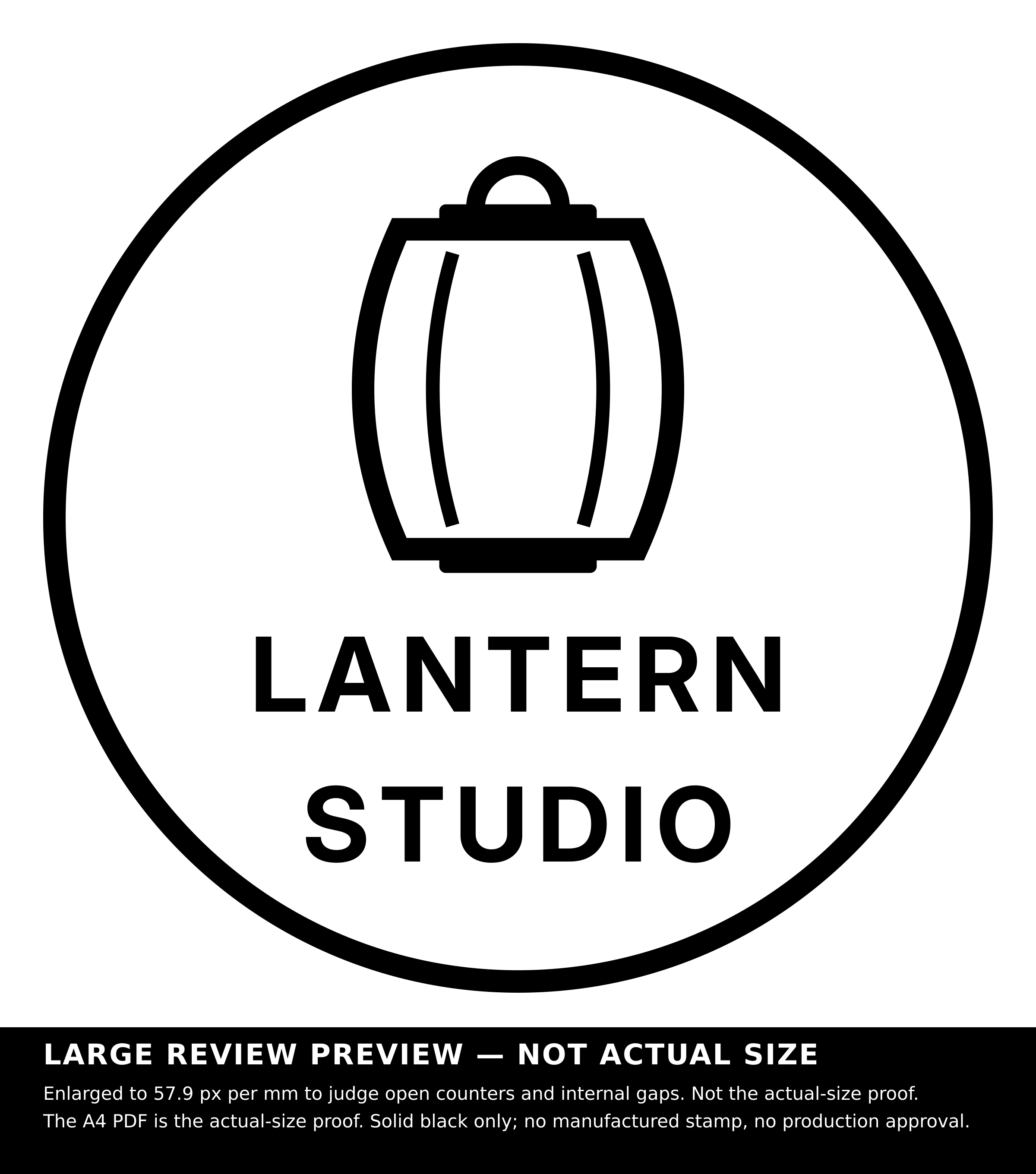
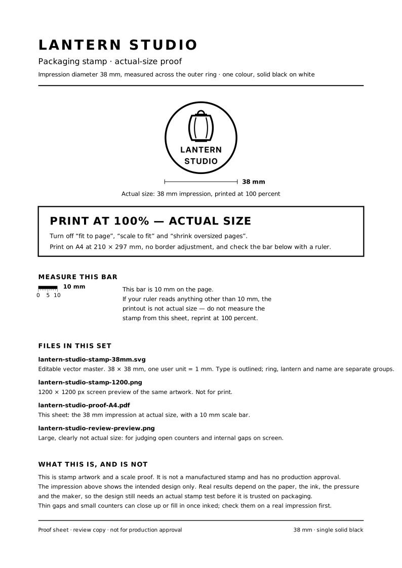
The live Ciyo run first considered the name around a curved ring, then changed to two straight centered lines. The final result is easier to inspect: a lantern above LANTERN and STUDIO, inside a simple circular border.
Check letter interiors such as the A and R, spaces between adjacent letters, and the separation between the emblem and the name. A gap should be a deliberate part of the design rather than an accidental sliver left after squeezing text into place.
The supplied stamp master uses paths for the lettering, so it does not depend on a recipient having the same font installed. Outlining preserves the drawn letterforms; it does not make them immune to filling in during a real impression.

4. Print the scale proof and measure its bar
The example’s proof page is A4, with the proposed 38 mm impression and a 10 mm scale bar. We checked the SVG’s physical dimensions and the exported PDF’s page size. No physical print or ink impression was tested.
Ciyo supplied the SVG and proof source as copyable text because this run’s canvas handoff did not attach SVG or PDF files. The linked PDF was exported locally from that supplied A4 source and visually checked. It is an artwork scale proof, not a native PDF download from Ciyo.
Print on A4 at 100% or actual size, then measure the 10 mm bar with a ruler. If it is not 10 mm, resolve the printer’s scaling before judging the stamp size. Keep fit-to-page and automatic shrinking from silently changing the proof.

5. Let the maker review the real impression conditions
Send the intended dimensions, source artwork and an explanation of what must remain readable to your chosen maker. Have them confirm their accepted file format and any changes they need for the stamp construction.
Ask for a test impression on the intended material before relying on a large packaging run. Inspect whether the small interiors remain open, the border prints cleanly and the wording can be read without excessive pressure or ink.
A paper proof checks layout and size. Ink, paper, pressure and stamp construction still affect the result. If the test fails, make one specific artwork change, keep the previous version for comparison and test again. This is where a physical result becomes evidence instead of a screen preview.
Rubber stamp artwork questions
Can I use a full-color logo?
Prepare a separate one-color interpretation and check it with the maker. Closely related colors or shaded areas may merge when converted to one ink color; a clear black-and-white version makes that decision visible.
Does a 1200-pixel preview prove print quality?
No. Pixel dimensions, intended impression size and the maker’s reproduction process must be considered together. Use the source and an actual-size proof, then judge a real test impression.
Why are there two review sizes?
The enlarged preview helps inspect shapes and counters. The actual-size proof helps judge the proposed impression’s dimensions. Neither replaces testing ink on the intended material.
Is the provided SVG editable text?
The stamp master contains outlined letter paths, so individual shapes can be edited without a font substitution. Changing the wording is a separate revision rather than typing into a live text field.
Was the stamp manufactured?
No. The article demonstrates artwork creation and proof preparation in Ciyo, followed by a local PDF export. No supplier was contacted and no physical impression is claimed.
Start with the size of the impression
Give Ciyo the exact wording, a simple visual idea and the intended dimensions. Review the source and scale proof, then use a maker’s test impression to decide whether the design is ready.