App artwork handoff
Android Adaptive Icon Design: Check the Layers Before Handoff

An app icon can look convincing on a presentation board and still need changes before a developer can use it. A mask can hide the wrong detail, a background can be baked into the foreground, or an attractive symbol can occupy too little of the source grid.
This tutorial follows a fictional Trail Note hiking app through a live Ciyo Design agent run. We checked the supplied SVG geometry, found an undersized first version and requested a correction. The result is an editable artwork handoff with separate layers and review previews. Android Studio conversion and installed-device testing are the developer’s next steps; this example does not demonstrate those steps or a store submission.
Quick answer: approve the source layers, then check their destination
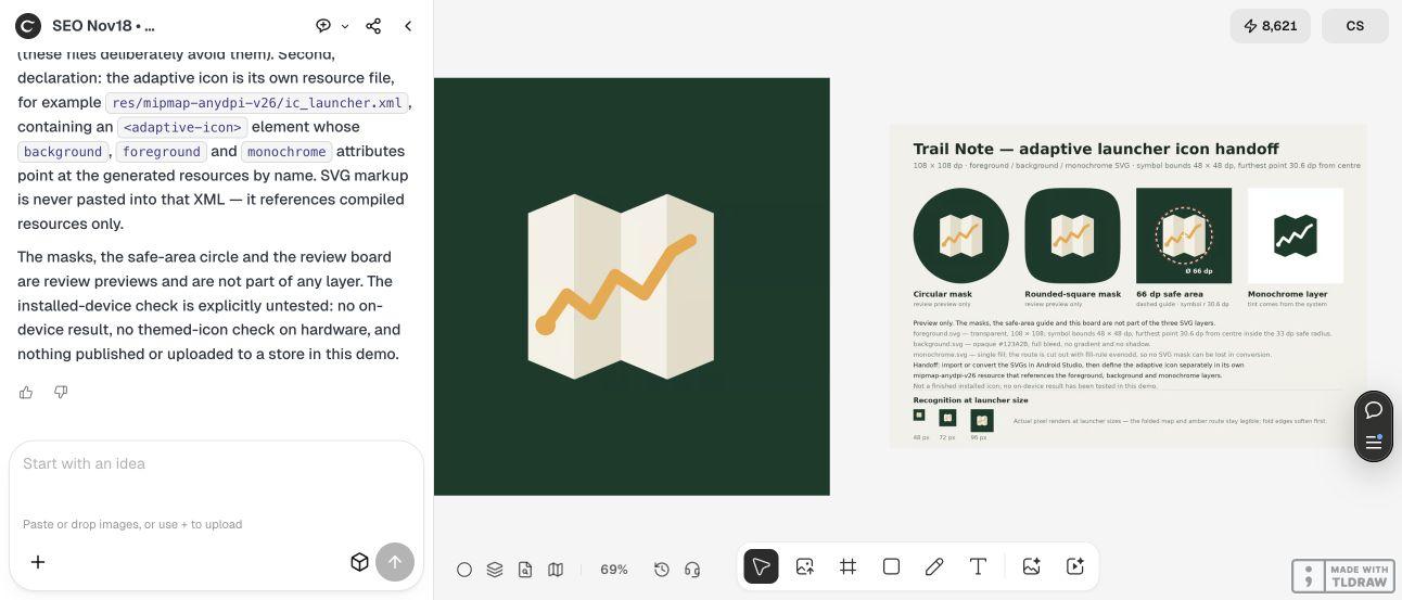
For Trail Note, the useful deliverable is three SVG sources, a clean composite and a separate proof board. The corrected symbol measures 48 × 48 units on a 108 × 108 source grid. The proof shows sample masks and a safe-area guide without adding those shapes to the layer files.
Follow the five steps below. Keep the design review separate from the Android resource conversion so an image that merely looks finished does not become the only file handed to the developer.
| Step | Action | Evidence to keep |
|---|---|---|
| 1 | Identify the launcher artwork task | A layer handoff brief with a named destination |
| 2 | Request separate artwork and review files | Foreground, background, monochrome and a clean composite |
| 3 | Measure and revise the source | Corrected bounds and the exact files they describe |
| 4 | Compare masks and small previews | A guide-free source package and a separate review board |
| 5 | Convert and test in Android tooling | Developer-reviewed resources and actual device checks |
1. Define the launcher artwork you are handing off
Start by naming the destination. This example prepares an adaptive launcher icon, rather than a store-listing graphic or website favicon. That choice determines what the developer needs from the designer.
Android’s current guidance describes separate foreground and background layers, plus a monochrome layer for theming. It specifies a 108 × 108 dp layer space and a central 66 dp safe area, with a symbol at least 48 × 48 dp. The source layers should not include an outer mask or outline shadow. Use the linked platform guidance as the reference when preparing your own handoff.
Trail Note uses a folded map, a short amber route and a dark green field. The app name stays outside the symbol. This gives the review a concrete question: is the folded-map idea still recognizable when its presentation changes? A team with an existing brand should begin with its approved symbol and colors instead of asking for a new identity during export preparation.
2. Ask Ciyo for separate sources and a separate proof
Create an isolated project and describe the identifying shape, palette and source grid. Specify which files should be transparent and which should be opaque. Ask for the complete source rather than relying on a large preview as evidence of editability.
The live example ran in a signed-in production Ciyo project on November 18. Its Design agent built vector geometry and placed raster previews on the canvas. The SVGs were returned as copyable source in the conversation. We saved that source into the three downloads linked below; a canvas preview alone did not provide the entire handoff.
Replace the app and visual idea in the brief, then read the returned source and explanation. An AI-produced explanation still needs checking against the intended toolchain. The Design agent’s reasoning can incur billable LLM usage even when the artwork is constructed from vector paths. Check current pricing before setting a task budget.
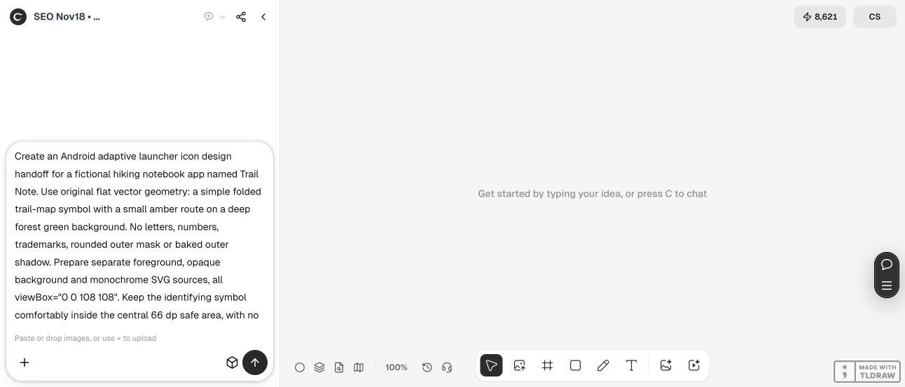
Prepare an Android adaptive launcher icon artwork handoff for [app and purpose]. Use [one identifying symbol] and [approved palette]. Create separate foreground, opaque background and monochrome SVG sources on a 108 × 108 grid. Keep the identifying symbol inside the central 66 dp safe area and check that its bounds meet Android’s current size guidance. Do not bake an outer mask, shadow, labels or guide lines into the source layers. Deliver a clean composite and a separate review board showing sample masks, the safe-area guide and small-size previews. Supply complete editable source. Explain the remaining Android Studio conversion and device checks. Do not publish or upload to a store.3. Measure the symbol before accepting the attractive preview
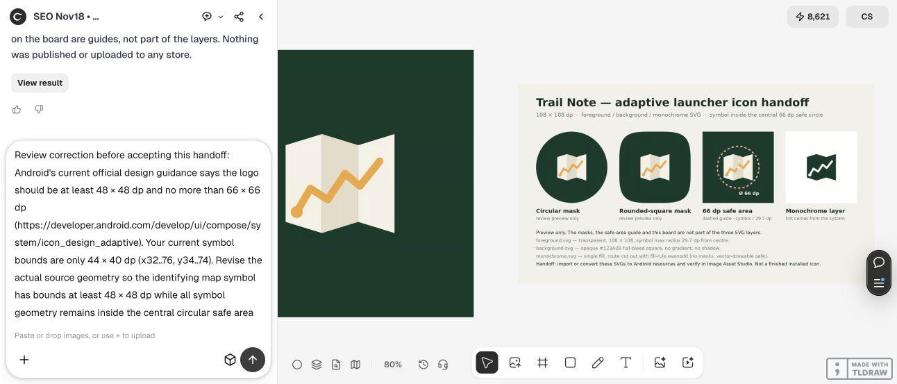
The first Trail Note foreground occupied x = 32…76 and y = 34…74: a 44 × 40 symbol. It fit comfortably inside the reserved area, but it was smaller than the minimum in the platform guidance. Looking only at the enlarged canvas composite would have missed that distinction.
We requested a geometry correction while preserving the map idea and palette. Simply enlarging the original rectangle would have pushed its corners outward. Ciyo rebuilt the silhouette as four folded panels instead. The corrected source occupies x = 30…78 and y = 30…78, giving 48 × 48 bounds. Its furthest polygon corners are approximately 30.61 units from the center at (54, 54), inside the example’s 33-unit review circle.
We independently rendered the saved foreground and monochrome SVGs at 10 pixels per source unit. Both painted bounds measured 48 × 48 units and stayed inside that circle. This checks the supplied artwork, not Android’s runtime rendering. Save the corrected files under clear names so the measurement notes cannot accidentally accompany the earlier version.
4. Review masks and the monochrome shape without changing the layers
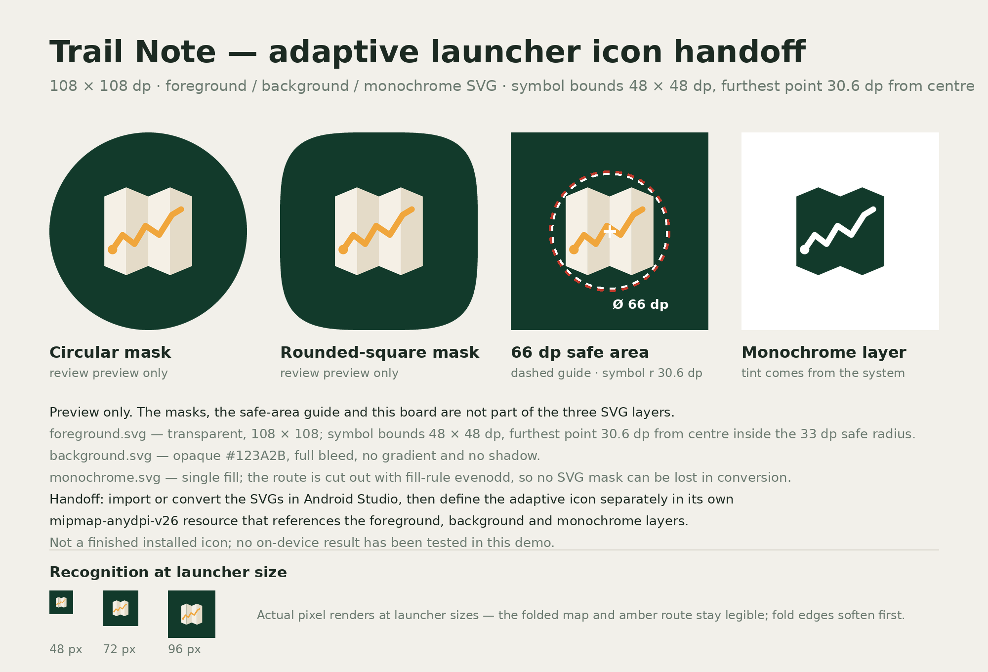
The corrected review board shows the same symbol in circular and rounded-square sample masks, alongside its safe-area guide and monochrome appearance. Those previews make it easier to compare recognition without changing the underlying map every time.
Keep the proof board separate from the files the developer will import. In the supplied sources, the foreground has a transparent surrounding area, the background is a full opaque square, and the monochrome file uses a single filled silhouette with the route cut out. The circular preview and dashed guide are absent from those three files.
Inspect the actual small renders before approving decorative details. The amber route remains distinguishable in our review, while the subtle fold contrast becomes less prominent as the image shrinks. That is a reason to keep the silhouette simple, rather than add fine landmarks that only look good in a large presentation.
The downloaded canvas composite is a 1024 × 1024 raster preview. Its pixel size is a property of that file, not the 108-unit SVG coordinate space or a promise about every Android density. Use the SVG sources for further artwork editing and treat the raster as a visual reference.




5. Hand the checked artwork to the Android developer
Give the developer the three named SVGs, the clean composite and the review notes. Include the approved palette and the version that passed your checks. A designer can stop at this documented artwork package; a developer owns the resource integration and should keep the imported outputs under normal source control.
SVG markup and Android resource XML are different formats. Import or convert the artwork using Android Studio’s appropriate asset tools, inspect the converted shapes, then reference the resulting layer resources in the adaptive-icon definition. Do not paste an SVG document into an Android XML file and assume the filename performs a conversion.
Compare the converted foreground, background and monochrome shape with the supplied references. Then check the configured launcher and themed appearance in the environments your app supports. If conversion loses a shape or detail, simplify or correct the source and repeat that check before distributing the app.
We have not imported these files into Android Studio, installed a build or tested a launcher on hardware. The deliverable here is a checked design example. Follow the current platform tooling instructions for your project, and keep a failed import or runtime preview as a specific revision request rather than starting the icon design again.
Adaptive icon artwork questions
Is the downloaded composite a finished adaptive icon?
It is a visual reference. The handoff also contains separate SVG layers. An Android developer still needs to convert or import them, configure the app resources and inspect the actual launcher result.
Why did the first icon need a revision if it fit the safe area?
Its source bounds were only 44 × 40 units. The review checked both containment and the platform’s size guidance. The corrected symbol has 48 × 48 bounds while keeping its corners inside the review circle.
Should the circular mask be included in the foreground SVG?
Keep the supplied source layers unmasked. The circle and rounded square in this example are separate review previews. They help explain the artwork without baking one presentation into the handoff.
Do I need drawing or development skills?
You need enough design judgment to approve the symbol and enough source inspection to distinguish a layer from a flattened picture. Resource conversion and app integration require Android development tooling or a developer who can perform those checks.
How long will my version take?
There is no fixed timing established by this example. Allow for an initial result, source inspection, any focused revision and a separate tooling check. Complexity and conversion problems can matter more than the first preview’s generation time.
Build an icon handoff you can inspect
Give Ciyo one clear visual idea, the intended layer structure and the checks that matter. Review the returned source and previews before the developer converts the artwork.