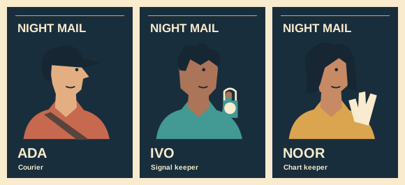
Character poster design
Assign character colours that still work as a cast
Ada’s rust jacket may read clearly alone but merge with a copper background on the ensemble sheet. Plan the colours as neighbouring pairs. The decision is about where two shapes meet as much as the individual swatches.
Start with shared paper
Use one dark blue ground for all three portraits. Reserve pale lettering for names. This lets the costumes vary while the floor under them stays visually consistent.
Paint three large patches
Try rust for Ada, teal for Ivo and gold for Noor. Place a smaller skin or costume accent inside each patch. Leave enough flat area to judge the main colour at a distance.
Test the neighbours
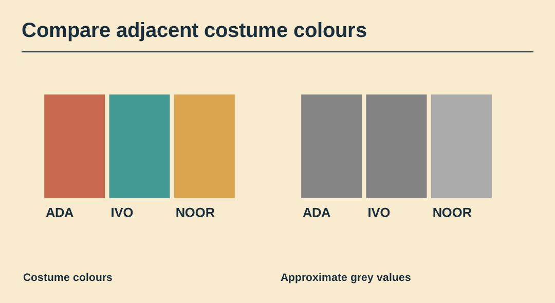
Put each costume beside the other two as they will appear on the group poster. Where two shapes have similar lightness, plan a sliver of background or a value change at the shared edge.
Remove the hue
View a grayscale copy and identify each character by outline and prop. Colour helps a returning viewer find Ada quickly, but a first-time viewer still needs a shape and written name.
Reserve the accent
Let the pale signal lens appear on Ivo’s portrait. If the same bright disc appears decoratively in every background, it stops pointing to his job. Try one fewer accent before increasing saturation.
Record the palette
Write down the working colour values with the names of their owners. Print a small test on the intended stock and keep the successful sheet with the digital master.
Work with the original cards
The SVG contains all three original cards as separate editable groups. Save a copy to try the layout yourself.