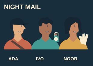
Ensemble poster layout
Give an ensemble equal visual billing without identical poses
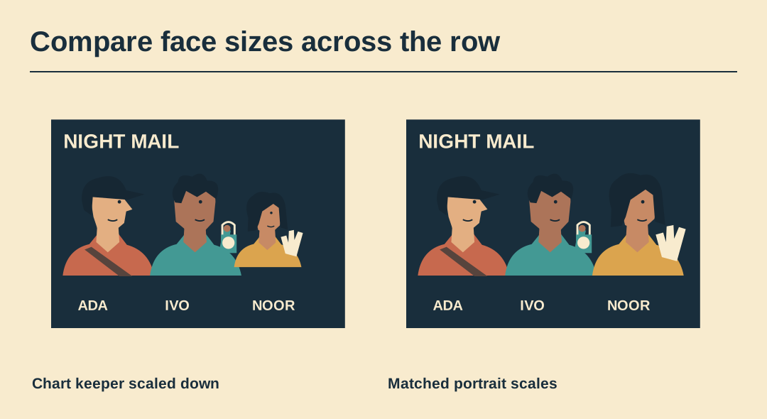
Noor carries a tall fan and Ada wears a short cap. Matching the bounding boxes makes Noor’s face smaller even if the names use the same font. Measure the faces and review visual emphasis separately.
Establish the agreement
Use the approved production billing as your starting point. Equal visual weight here is a design goal for a fictional trio. Keep any specified order and credit treatments visible beside the working file.
Measure comparable landmarks
Mark brow and chin on a straight view of each character. Bring those distances into the same range using proportional scaling. Avoid measuring from the highest point of a costume.
Review the centre position
Temporarily swap the middle portrait with one on the side. If the centre always looks like the lead, check whether it is larger, brighter or framed by more empty paper.
Balance the contrasts
Compare the bright lamp, pale chart fan and rust jacket against the shared ground. A small, brilliant white disc can outshine a larger face. Reduce the distracting accent before enlarging the other portraits.
Check the type as well
Set all three names beside the artwork and read them in the intended order. Retain matching type size where possible and solve long names through the available space.
Record the approved strip
Keep a small combined proof showing faces, names and props. Later social cards may crop differently, but the proof gives reviewers a reference for the original billing decision.
Inspect the ensemble master
The SVG retains the original lettering and portrait shapes. Use a copy to try a different size or arrangement.