Slides · Tested
One Illustrator for the Whole Deck: Consistent Slide Illustrations with AI
A deck looks professional when its pictures look like a set. Ask an image model for four slide illustrations one at a time and you often get four styles: different line weights, a new colour here, a photo-like shadow there. The audience may not name the problem, but they feel it.
On September 30, 2026 we made four illustrations for a fictional tutoring centre's parent evening in Ciyo. We wrote a style sheet first, used the first picture as a reference for the others, made one control picture without the reference, and measured all of them. The reference helped, the control drifted most, and one reference-based picture still needed a second try.
Why deck pictures drift
An image model starts each picture fresh. Words like “flat illustration, warm colours” describe a whole family of styles, so each new slide lands somewhere different in that family. Three things keep a set together: a written style sheet with exact colours, one approved picture that the model sees as a reference, and a check of each new picture against both.
The check matters because the eye adapts. After looking at four pictures for a while, a drift that an audience will notice on the big screen can look fine to you.
Step 1: a style sheet and one anchor picture
Brightwell Tutoring is a fictional tutoring centre preparing a 16:9 deck for a parent evening. It needs four pictures: a parent and child reading, a tutor at a whiteboard, a calendar and clock for the weekly schedule, and a child raising a hand in class. We asked the Ciyo Agent for a reusable style sheet and the first picture only.
The style sheet named five colours with hex values (Warm Cream #FBF4E6 for backgrounds, Deep Navy #1F3A5F for lines, Sunny Marigold #F2B33D as the main accent, Soft Teal #4FA3A5 and Coral Blush #E87A5D), “clean, slightly uneven hand-drawn navy outlines of medium weight”, flat fills with one soft shadow tone, a light grain, empty space on one side for slide titles, and a list of things to avoid, including readable text. The first picture cost 2 credits at the cheapest setting.
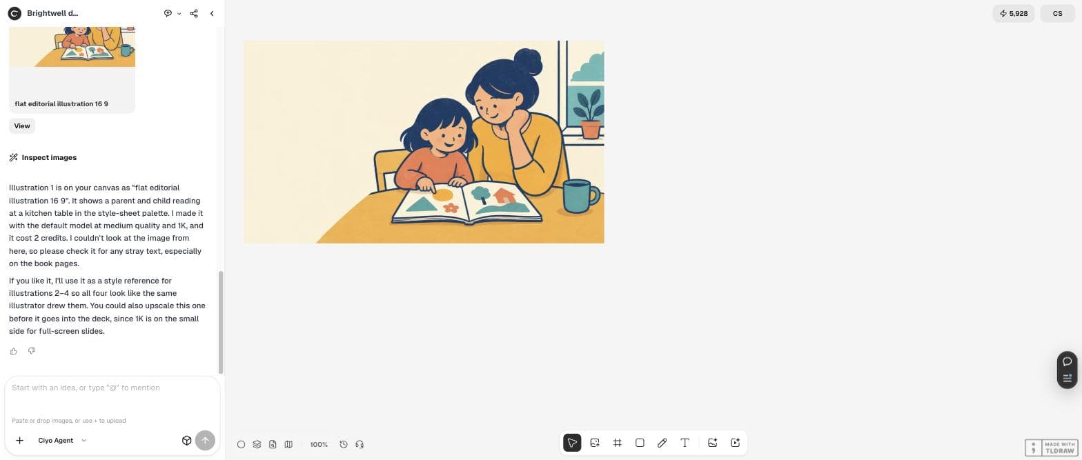
I'm building a 16:9 slide deck for Brightwell Tutoring's parent evening and need four illustrations that look like one illustrator drew them: (1) a parent and child reading at a kitchen table, (2) a tutor at a whiteboard with simple fraction shapes (no readable text), (3) a calendar and clock still life for the weekly schedule slide, (4) a child raising a hand in a small class. First write a short style sheet I can reuse (5 palette colours as hex, line style, shading, background, what to avoid), then make illustration 1 only, 16:9, with no text in the image. Use the cheapest image setting.Step 2: the other three, plus a control
We approved the anchor and asked for pictures 2 to 4 with picture 1 as the reference. To see what the reference was worth, we also asked for a second version of picture 3 from the text and style sheet alone. The four images cost 11 credits.
The agent then measured all five. It left out the cream background, because it fills 57 to 85% of each picture and would make every score look good, and counted how much of the remaining artwork matched the five colours.
It's good, no stray text. Now make illustrations 2, 3 and 4 with illustration 1 as the style reference plus your style sheet, same settings. As a control, also make one extra version of illustration 3 from the text prompt and style sheet only, without the reference image. Then compare all five against the style sheet: how much of each image uses the 5 palette colours, how thick the outlines are, and which one drifts most. Keep the control clearly labelled.What the numbers showed
Pictures 1 and 2 matched the palette best. The control lost the main accent almost completely (1% marigold) and used far too much coral (32%). But the reference was not a guarantee: the reference-based calendar was the weakest of the set, with about 29% of its artwork in light tan and peach tones that the style sheet never mentioned.
Outlines were about 5 pixels in pictures 1, 2 and 4. The calendars measured thinner, but the agent noted that grid lines and clock ticks pull the median down, so that number alone does not prove drift.
| Picture | Close match | With nearby tints | What stood out |
|---|---|---|---|
| 1 Reading (anchor) | 80% | 87% | Marigold 43%, navy 26% |
| 2 Whiteboard | 80% | 87% | The most even balance |
| 3 Calendar, with reference | 62% | 71% | About 29% tan and peach |
| 4 Classroom | 72% | 84% | Mix closest to the anchor |
| 3 Calendar, control (no reference) | 58% | 82% | Marigold 1%, coral 32% |
| 3 Calendar, remade | 84% | 92% | Outside the palette under 0.5% |

Step 3: fix the one that drifted
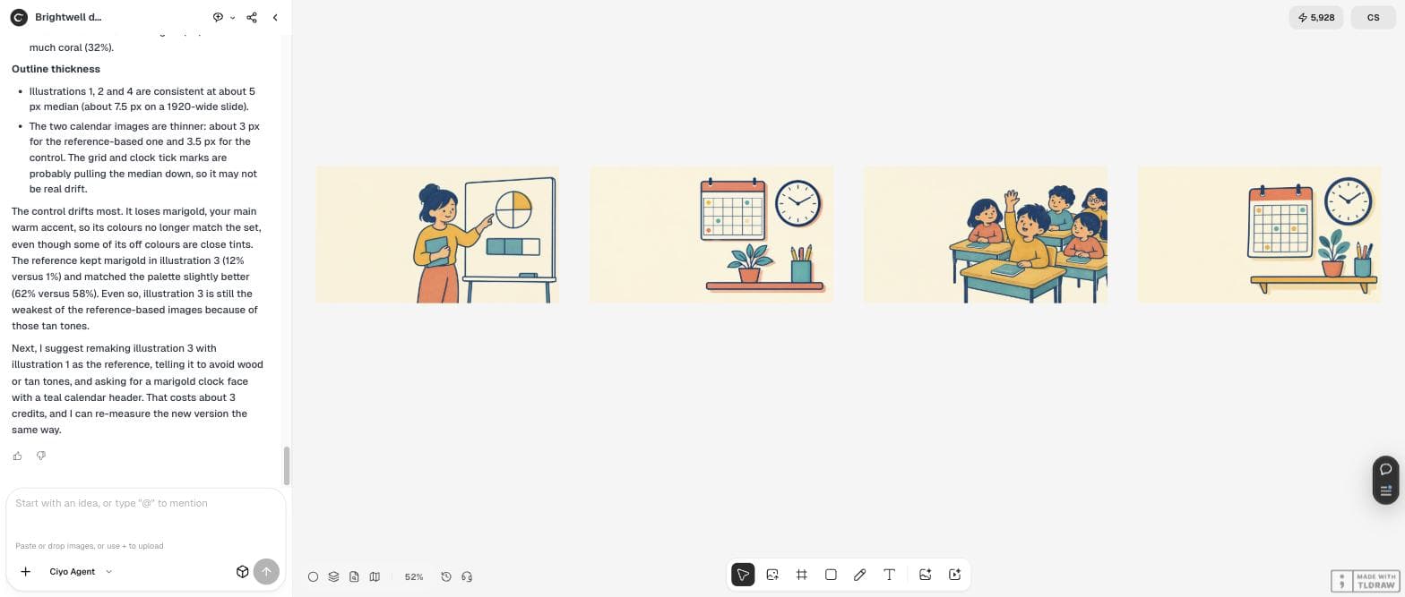
The agent proposed a specific fix rather than a vague “make it match”: no wood or tan tones, a marigold clock face, a teal calendar header. The remake cost 3 credits and became the best palette match of the set: 84% close match, marigold up from 12% to 25% of the artwork and teal from 10% to 25%.
Write the fix the same way yourself. Name the colour that crept in, say where the accent should go, and keep the anchor as the reference.
Yes, remake illustration 3 as you suggest (reference = illustration 1, no wood or tan tones, marigold clock face, teal calendar header) and re-measure it the same way. Then put the four final illustrations in one row, in slide order, so I can see the set.The final set, in slide order
The four finals share one palette, one line weight and one kind of empty space for titles. The first calendar and the control stay on the board below them, so you can show a colleague why the set was changed. The agent suggested one more look at the calendar's fine grid lines at slide size, and upscaling the four pictures from 1K before the deck goes on a large screen.

A style-sheet checklist you can reuse
Keep the style sheet in your deck's notes or brand folder and paste it into every request, together with the anchor picture. These are the parts that did the work in our test.
| Part | Example from our test |
|---|---|
| Palette with hex values and roles | Cream background, navy lines, marigold main accent |
| Line style | Slightly uneven navy outlines, medium weight |
| Shading | Flat fills, one soft shadow tone, light grain |
| Layout rule | Empty space on one side for the slide title |
| Avoid list | Readable text, photorealism, 3D, colours outside the palette |
| Anchor picture | Illustration 1, attached to every request |
Next steps for the deck
With the pictures in one style, match the icons and backgrounds to the same palette, then check how each slide reads from the back of the room.
Consistent illustrations for slides
Does a reference image make AI illustrations consistent?
It helps, but it is not enough on its own. In our test the pictures made with the reference matched the palette better than the control, yet one of them still drifted into tan tones and needed a second try.
How do I check whether a picture fits the set?
Measure the share of the artwork in your palette colours, leaving out the background, and compare outline thickness. Our agent did this in its workspace and reported each picture's numbers.
Should the pictures contain text?
No. Put titles and labels on the slide itself. Generated lettering is hard to edit and often wrong, and it cannot be translated with the deck.
What did the set cost?
16 credits at the cheapest setting on September 30, 2026: 2 for the anchor, 11 for three pictures plus the control, and 3 for the remade calendar.
Illustrate your next deck in Ciyo
Write the style sheet once, approve one anchor picture, and let the Ciyo Agent measure every new slide picture against both.