Presentations · Tested
Make a Presentation Background That Leaves Room for the Title
A good slide background carries mood and stays out of the way. The failure is familiar: a beautiful picture with the title sitting on its busiest part, unreadable from the back of the room.
On September 27, 2026 we made a title-slide background for Rook & Rabbit, a fictional board-game café presenting its first year to a landlord, in Ciyo. Then we measured where a white title stays readable.
Pick the size before the picture
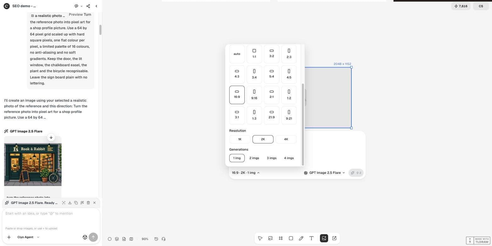
Slides are 16:9. In Ciyo's Image settings, 16:9 at 1K gives a 1,024 × 576 frame — too small for a 1,920 × 1,080 slide. We chose 2K, which showed a 2,048 × 1,152 frame for 2 credits. The file that came back was 2,560 × 1,440, more than enough.
Ask for an empty half, not “space for text”
“Leave space for text” is vague. Say which part is empty, what it looks like and what will sit there. We gave the left half one plain surface and one job: hold a large white title.
A background image for a presentation slide, 16:9. Right half: a warm, softly blurred view of shelves full of board-game boxes in a cosy cafe, lamp light, a few dice on a wooden table in the foreground. Left half: calm, dark and nearly empty deep green wall with no objects, so a large white title can sit there and stay readable. No text, no logos, no people.Place the title and look at the edges
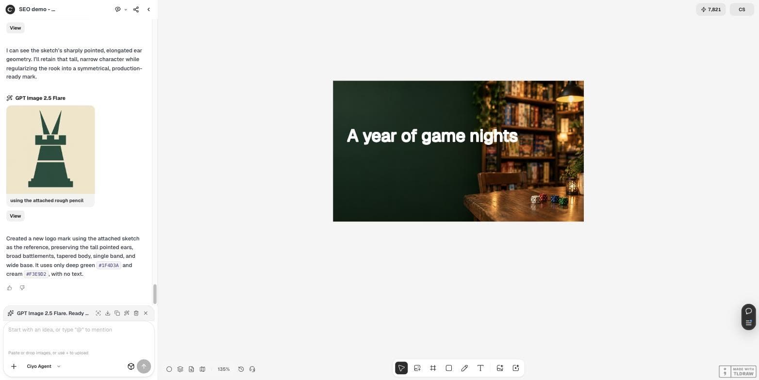
We put a white title on the background with Ciyo's Text tool, set in Inter at size 32. On screen it looked fine. The last word, though, ran up to the edge of the shelves — exactly where readability usually fails.
We measured where the title is safe
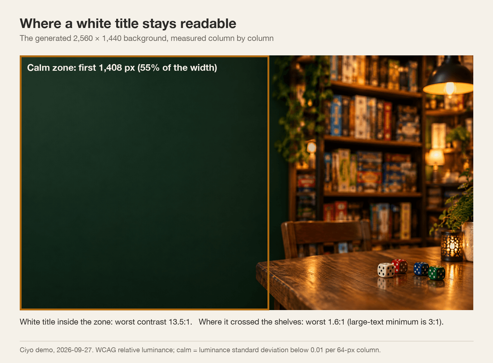
We measured the brightness of the background in 64-pixel columns. The left 1,408 of 2,560 pixels — 55% of the width — were calm: almost no change in brightness. The rest held shelves, lamps and highlights.
Inside the calm zone the worst contrast behind the white title was 13.5:1. Where the title crossed into the shelves, one lamp highlight dropped it to 1.6:1. The accessibility guideline for large text asks for at least 3:1.
| Where the title sits | Worst contrast | Large-text minimum |
|---|---|---|
| Inside the calm zone | 13.5:1 | 3:1 |
| Crossing into the shelves | 1.6:1 | 3:1 |
Keep the title in the calm zone
Two easy fixes: break the title onto two lines so it stays inside the left half, or keep it on one line at a smaller size. Keep the title as live text in your slide tool, not baked into the image, so you can edit it and translate it later.
Reuse one background for a whole section of the deck and change only the title. That keeps slides consistent and saves generations.
A two-minute check for any background
Put the real title on the real background at the real size, then view the slide at 25% zoom. If you can still read the title, so can the back row. If one word disappears, move it into the calm area.
AI slide backgrounds
What size should an AI slide background be?
At least 1,920 × 1,080 for a 16:9 slide. In Ciyo, 16:9 at 2K showed a 2,048 × 1,152 frame and our file came back at 2,560 × 1,440.
How do I leave room for the title?
Name the empty half and what it looks like in the prompt. Our left half stayed calm across 55% of the width.
Is white text readable on it?
Inside the calm zone, yes: worst contrast 13.5:1. Where our title crossed the shelves it fell to 1.6:1.
Should the title be part of the image?
No. Keep it as live text so you can edit, translate and reuse the background.
Make your next title slide
Generate a 16:9 background in Ciyo with a calm half for the title.