App launch artwork
Google Play Feature Graphic: Design Beyond the App Icon
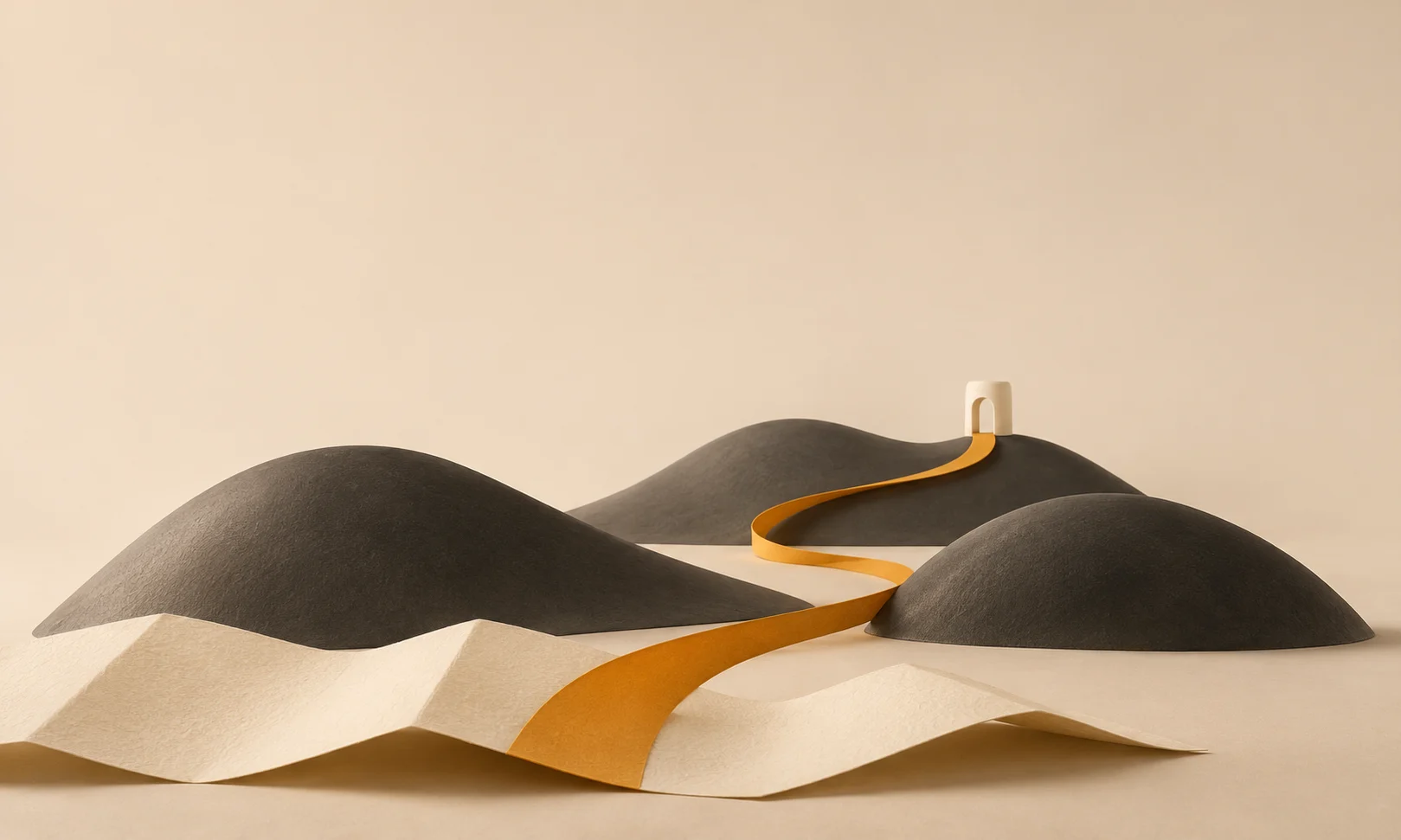
A square app icon and a wide feature graphic have different jobs. Enlarging the icon to fill the wider placement can repeat the same mark without showing anything more about the app’s purpose.
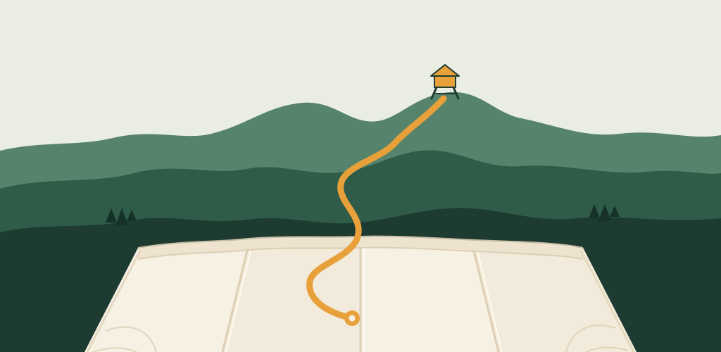
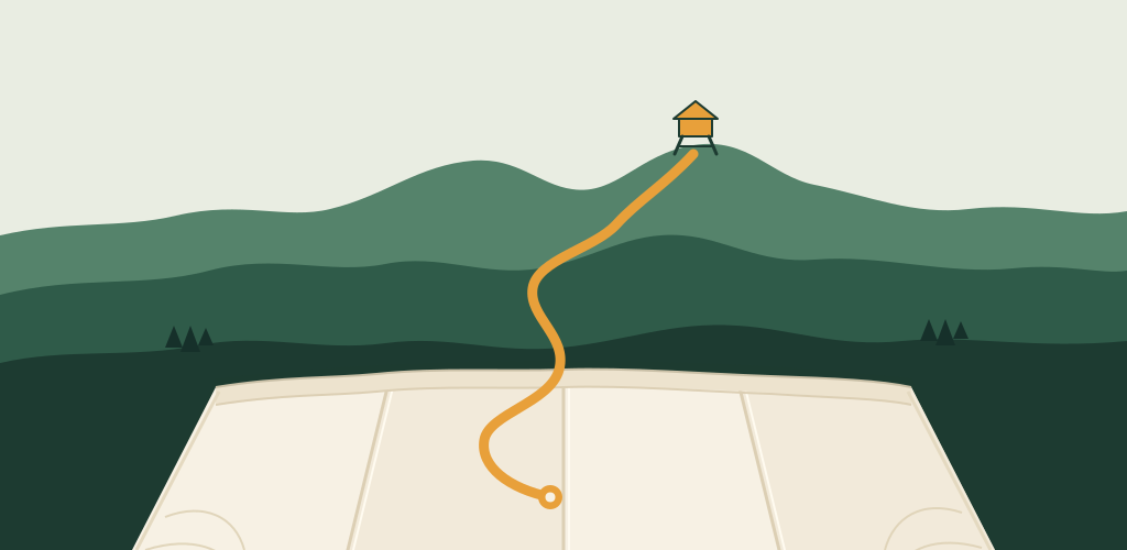
For this tutorial, we created original artwork for Trail Note, a fictional hiking-notebook app, in a live Ciyo production project. A folded map opens into a landscape, with one amber route connecting the foreground and a lookout. We inspected the clean file and a separate proof board. The example demonstrates artwork preparation; it does not demonstrate a working app, a Google Play upload or a change in installs.
Quick answer: add context, then inspect the actual export
Give the feature graphic one clear visual idea that extends the app’s identity. In Trail Note, that idea is a journey from a paper map into the hills. The app icon’s folded-map identity supplies a starting point, while the wide scene adds space and direction.
Follow the five steps below. Keep the clean artwork, editable source and annotated proof separate so the file intended for upload is easy to identify.
| Step | Action | Keep for review |
|---|---|---|
| 1 | Identify what the placement should communicate | A truthful visual idea beyond the app icon |
| 2 | Brief a clean image and a separate proof | Original composition and complete editable source |
| 3 | Inspect focus, reduced size and crops | A review decision with its assumptions labeled |
| 4 | Check the actual export | 1024 × 500, appropriate file format and no alpha |
| 5 | Prepare the handoff and current preview check | Named clean artwork, source and review notes |
1. Give the feature graphic a different job from the icon
Start with the app’s actual purpose and the visual material you can truthfully use. A feature graphic can suggest an experience or setting without pretending to be a screenshot. For Trail Note, the map, hills and route form concept artwork; no working interface is shown.
Google Play’s current preview-asset guidance specifies a 1024 × 500 feature graphic as JPEG or 24-bit PNG without alpha. It recommends avoiding prominent branding that duplicates the app icon, keeping the image simple and considering the different places where it may appear. Use the current platform guidance for your app rather than treating this example as the complete listing specification.
If your team has an approved icon, decide which part of its identity should carry across: a palette, a motif or a sense of material. You do not need to place the entire square icon inside the landscape. Conversely, an app with real interface material should keep artwork and screenshots clearly labeled in its asset list.
2. Brief a visual story with one dominant route
Create an isolated Ciyo project and describe the scene, its focal subject and the file you need. Request a guide-free artwork export and a separate annotated review. That separation helps you discuss composition without putting the discussion into the image itself.
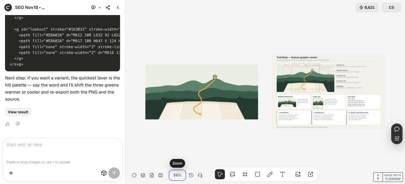
Our live Design agent run used editable vector geometry for the map and landscape. It revised the map after the first version read as a flat band, then placed the clean artwork and a separate review guide on the canvas. The complete SVG source was returned in the conversation and saved as the download below.
Keep the visual brief narrow enough to judge. Here, one amber route ties the foreground map to the lookout, while the hills provide context. Adding weather icons, a list of features and a large wordmark would introduce several competing things to read. The Design agent’s reasoning is billable LLM usage; using vector geometry does not establish a free total task.
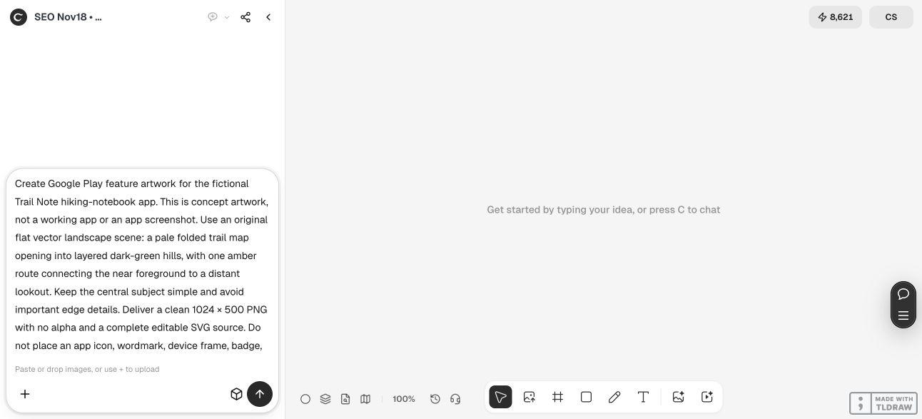
Create Google Play feature artwork for [app and truthful purpose]. Use [one clear visual story] and [approved palette]. Design a 1024 × 500 composition with a simple central subject and quiet edges. Deliver a clean PNG without alpha and complete editable source. Add context beyond the square app icon; do not duplicate the icon prominently or fabricate app UI. Keep store logos, rankings, device frames and promotional badges out of the example. Put composition notes and small-size checks on a separate clearly labeled review image, not in the clean artwork. Do not upload to Google Play or claim acceptance.3. Review the scene at small size without inventing a universal safe zone
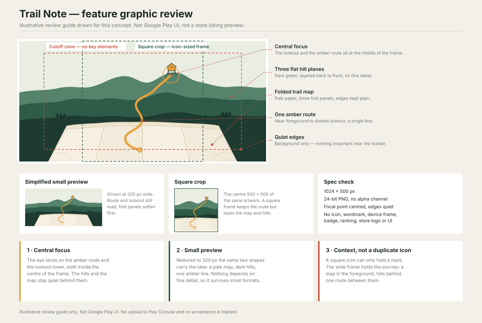
Compare the wide artwork and its reduced preview. Can you still follow the amber route and identify the lookout? Do the pale map and dark hills remain distinct without reading any labels? Those are concrete review questions tied to the intended scene.
The English demonstration board includes a small preview and a square crop to explain the composition. These are editorial review aids, not screenshots of Google Play. Its dashed boundaries are assumptions drawn for this concept; they do not establish a universal platform overlay or guarantee that every current placement crops the same way.
In our review, the route remains visible when the artwork is reduced, while the map’s fine fold details become less prominent. The square crop also loses some of the wider landscape. That comparison explains why the scene was designed for a wide placement rather than simply reused as an app icon.
Use a focused revision if the idea disappears at a smaller size. For example, simplify the background or improve the route’s separation from a hill while keeping the accepted palette and scene. Check the changed export again instead of assuming the original proof still describes it.
4. Inspect the PNG and save the editable source
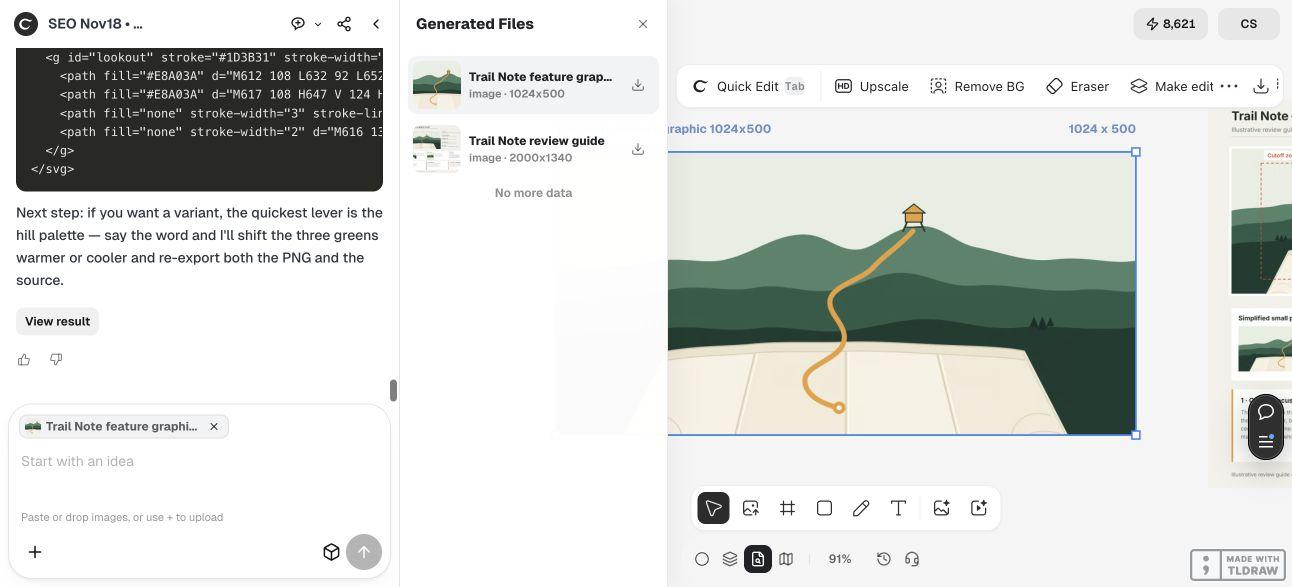
Select the clean artwork in Ciyo’s Generated Files panel before exporting. The live metadata identified the intended asset as 1024 × 500, separate from the 2000 × 1340 review guide. File names help, but inspect the file itself too.
Independent inspection of the downloaded clean PNG found 1024 × 500 pixels, 8-bit RGB color and no alpha channel. Its PNG color type was truecolor, rather than an indexed or transparent image. Those checks support the file-format handoff; they do not prove that an account’s upload will be accepted.
The supplied SVG has a matching 1024 × 500 viewBox, editable path geometry and a full background. We checked that it parses, its identifiers are unique and its local references resolve. Keep the SVG for revisions and the clean raster as a visual reference. Export and inspect a new PNG after making any source change.
Use distinct names for the clean graphic and the annotated proof. The larger review board is useful for discussion but is the wrong file for this placement. Renaming it does not remove its labels or change its dimensions.
5. Prepare a truthful listing handoff and check the current preview
Give the person managing the listing the clean file, editable source and a short note describing what the image represents. Keep the annotated guide in a separate review folder. A solo developer can maintain that distinction with filenames; a larger launch team should include placement, language and approved version in its asset list.
Before a real upload, confirm the current requirements in your Play Console workflow and inspect the available preview. If important artwork is hidden or cropped, revise the composition for that observed placement. A proof drawn outside the store cannot replace that final check.
Keep app screenshots tied to real app behavior. Trail Note is a fictional artwork scenario, so the example contains no screenshot of a working product and makes no claim about supported app features. If you are preparing screenshots for a real app, capture its actual interface and review those files separately.
This walkthrough ends with a checked artwork package. It does not change a store listing, establish recommendation eligibility or measure acquisition results. Treat publication and outcome measurement as later steps with their own evidence.
Google Play feature-graphic questions
Is a feature graphic the same as an app icon?
They are different assets. This example uses the wider artwork to add a map-and-landscape story instead of repeating a prominent square icon. Use the platform’s current instructions for each placement.
Which PNG was checked?
The clean artwork downloaded from the live Ciyo project. It measured 1024 × 500 pixels and used 8-bit RGB truecolor with no alpha. The separately annotated proof measured 2000 × 1340 and is not the intended upload file.
Are the dashed lines official Google Play guides?
No. They are illustrative composition checks on the demonstration board. Review the current platform guidance and the actual preview for your app rather than treating those lines as a universal safe zone.
Can I edit the artwork later?
The SVG download contains editable vector geometry. After a change, render and inspect a new clean PNG, including its dimensions, color format and composition. Keep the earlier approved reference so you can compare the revision.
Was the image uploaded to Google Play?
No. We created and inspected artwork in a live Ciyo project. No listing was changed, and no store acceptance, install result or conversion improvement is claimed.
Give the wider placement a clear visual purpose
Brief Ciyo with one truthful idea, the target file and the checks you need. Review the composition and actual export before handing the clean artwork to the listing manager.