Pixel art · Tested
Make a Pixel-Art Game UI Kit With AI: Buttons, Health Bar and a 9-Slice Panel
Game UI has rules that a picture does not. A dialog box is stretched to fit each line of text, so its corners must stay whole while its edges repeat. A button swaps between normal, hover and pressed, so the three states must be exactly the same size. If they are not, the text box shows seams and the button jumps.
On September 29, 2026 we asked the Ciyo Agent for a small UI kit for Mossfall, a fictional forest game, and measured it against those rules. The first sheet looked finished and failed two of them. The second passed.
Ask for the pieces and the rules together
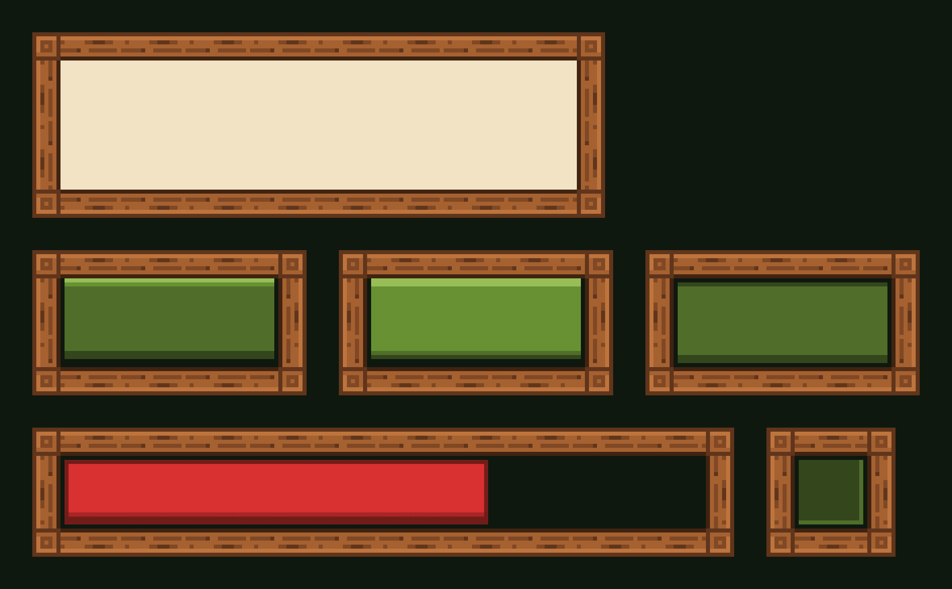
We asked for four pieces in one style: a dialog panel, a button in three states, a health bar and an inventory slot. We also wrote the engine's rules into the brief: identical corners for 9-slicing, a pressed state one pixel lower, a limited palette and no text.
The agent made one 1,152 × 864 sheet with GPT Image 2.5 Flare for 2 credits. The raw file had 25,696 colours, so the agent reduced it to 16 with no dithering and put both versions on the board.
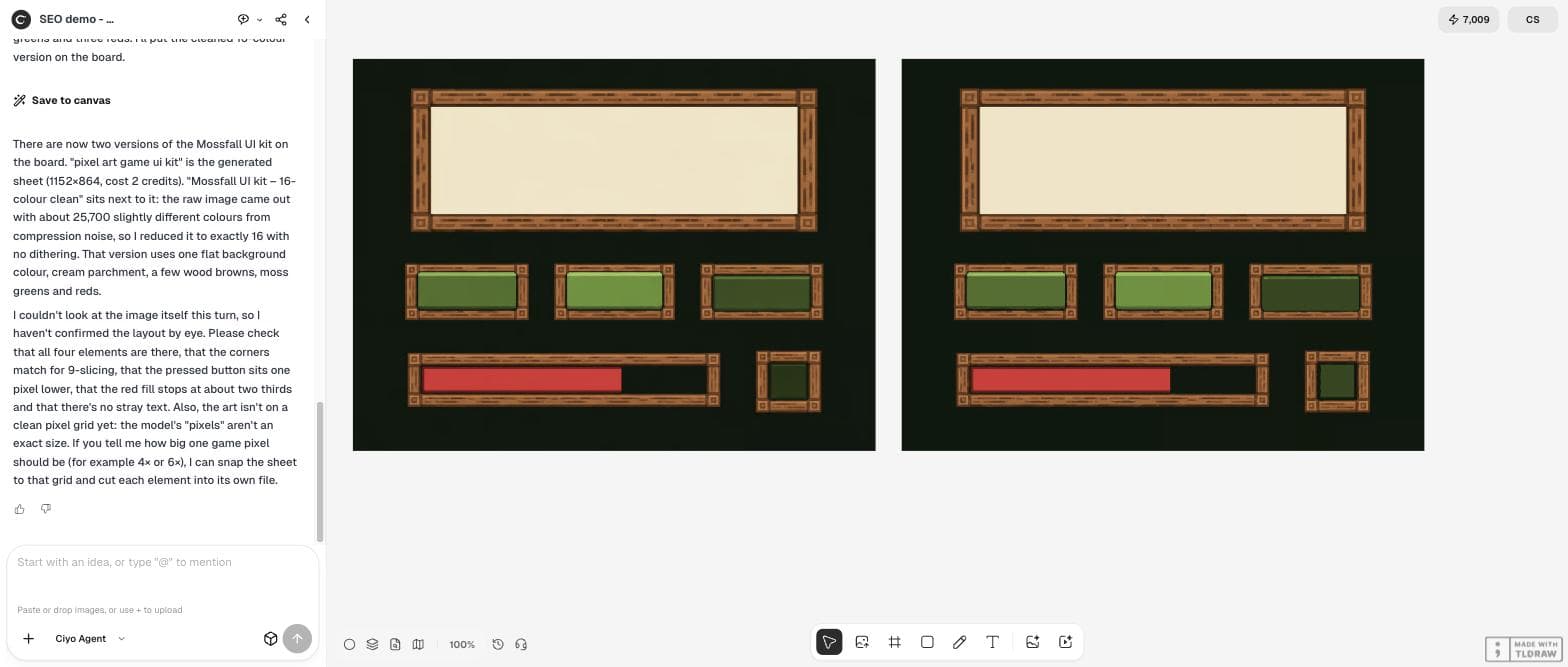
For my top-down pixel-art game Mossfall (forest setting: moss greens, warm wood browns, cream parchment), make a pixel-art UI kit on one sheet: 1) a dialog box panel with a wooden frame and parchment inside, with square corners, designed to be 9-sliced (all four corners identical, edges that repeat evenly); 2) one button in three states side by side: normal, hover (lighter) and pressed (moved down one pixel); 3) a horizontal health bar frame with a red fill at about two thirds; 4) a small square inventory slot. Style: crisp hard pixels on a strict pixel grid, no anti-aliasing, no blur, no gradients, at most 16 colours, flat dark background. No text or letters on any element.What we measured on the first sheet
One thing was right and one was close. The health bar's red fill covered 68.9% of its track, near the two thirds we asked for. The pressed button's face sat 7 source pixels lower than the normal one; at the roughly 3.5 source pixels per game pixel that the agent later measured, that is about two game pixels, not one.
Two more things would break in a game. The three button states were 273, 266 and 271 pixels wide, so the button would jump when it changes state. And the dialog panel's corners were not copies of each other: compared with a mirrored top-left corner, 13% of the top-right corner's pixels differed, and 23% and 25% of the bottom corners'.
| Rule | Asked for | Got |
|---|---|---|
| Button states | Same size | 273, 266 and 271 px wide |
| Panel corners | Four identical corners | 13–25% of pixels differ |
| Pressed state | One pixel lower | Face 7 px lower (about two game pixels) |
| Health fill | About two thirds | 68.9% |
| Colours | At most 16 | 25,696 raw; 16 after reduction |
Why corners and sizes matter more than looks
A 9-slice cuts a panel into a 3 × 3 grid. The four corners are drawn once and never stretched. The four edges repeat along their length, and the centre fills the rest. If the corners differ, the seams show at every size, and if an edge pattern does not repeat evenly, you get a visible join each time it tiles.
Buttons follow a similar rule. The engine swaps one picture for another in the same place, so any difference in size moves the button's outline when the player touches it.
Tell the agent what failed and what the engine needs
We sent our measurements back and asked for a game-ready kit. The agent found that the model's pixels were not a single size: about 4.0 × 3.5 source pixels per game pixel in the buttons, bar and slot, and about 6.3 × 5.6 in the panel. There was no clean grid to snap to.
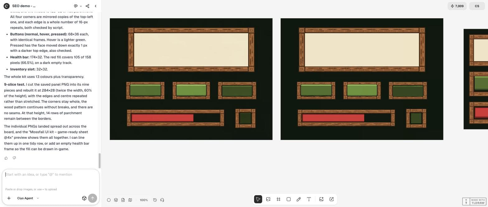
So it did something worth knowing about: it kept the design and redrew it cleanly in code, building every frame from one corner and one wood-grain edge piece that repeats every 16 pixels. The final kit is therefore a precise rebuild of the model's design, not the model's own pixels, and the wood grain is simpler than in the painting.
I measured the 16-colour sheet: the three button states are 273, 266 and 271 px wide, so they cannot swap in place, and the dialog panel's four corners differ from each other by 13 to 25% of their pixels, so 9-slicing will show seams. Please make it game-ready: measure the real game-pixel size and snap to that grid; make the three button states exactly the same size; make the four panel corners mirrored copies of one corner; cut each element into its own PNG with a transparent background; and add a 9-slice test that stretches the panel to twice its width and 60% of its height. Tell me the grid size and the final element sizes.The 9-slice test
The agent cut the 142 × 46 panel into nine pieces and rebuilt it at 284 × 28, twice the width and 60% of the height. The corners stayed whole and the wood grain ran on without a break. It also warned that at that height only 14 rows of parchment remain between the borders, which tells you the smallest panel your text can use.
We checked the files too. The three buttons are 68 × 36 each, their 5-pixel frames match pixel for pixel, and the pressed face sits exactly one pixel lower than the other two. The panel's four 7 × 7 corners are exact mirrors of each other. The kit uses 13 colours.

What sellers of UI packs promise
Paid UI packs list the same rules as selling points, which is a good sign that they are the ones to test. Use them as your checklist whether you buy a pack or make one.
Posted 2026-09-27. TaleTone announces its own paid “UI Window Frame Mega Pack” for fantasy games, in SVG and PNG, 16 types and 12 colours, “optimized for 9-slice layouts and resizing.” It is the seller's promotion of its own product and has no connection with Ciyo; we cite it for the checklist, not as a recommendation.
A checklist before you import
Check that every state of a control has the same size, that the corners of anything you stretch are mirrored copies, that edge patterns repeat in whole tiles, and that the smallest panel still fits one line of your text. Then export each element on its own at one file pixel per game pixel.
Pixel-art game UI
Can an AI image model make a 9-slice panel?
It can draw one that looks right, but in our test on September 29, 2026 the four corners differed by 13–25% of their pixels. We had the Ciyo Agent rebuild the panel from one mirrored corner, and then the 9-slice stretched cleanly.
Why do my button states have different sizes?
The model draws each state as its own picture. Ours came out 273, 266 and 271 pixels wide. Ask for one shared size and check it before you import.
What sizes did the final kit have?
Dialog panel 142 × 46, buttons 68 × 36, health bar 174 × 32 and inventory slot 32 × 32, all at one file pixel per game pixel.
What did it cost?
The sheet cost 2 credits. The measuring and rebuilding ran in the agent's workspace and added no image charge in our test.
Build your UI kit in Ciyo
Describe your game's style and your engine's rules, then check and rebuild the kit with the Ciyo Agent on one board.