Logo · Tested
See Your AI Logo on a Sign, a Cup and a Bag Before You Print
A logo that looks good on a white screen can fail on a wooden sign or a brown paper bag. A mockup shows it where customers will see it, before you pay a printer. AI image models now make mockups in one step, which raises a fair question: how much of your logo survives the trip?
On September 28, 2026 we asked the Ciyo Agent for a logo for Fernhollow Coffee, a fictional café, and then for three mockups built from that logo. We measured what stayed the same and what changed.
One message: the logo, then three mockups
We described the logo and the three places it has to work: a hanging sign outside the shop, a takeaway cup and a kraft paper bag. We also asked the agent to keep the logo's shape, spelling and colours the same in every mockup.
The agent first showed its plan: one master logo, then three mockups that use the master as their reference. After we accepted the plan it made all four images on the canvas.
First make our café logo as a 1:1 image: a flat vector logo with a simple fern frond inside a circle above the word "Fernhollow" in an elegant serif, and "COFFEE" in small spaced capitals below; two colours only, deep green #1F4D3A on plain cream #F3E9D2; no other text. Then, using that exact logo as the reference, make three realistic mockups so we can see it before we print: 1) a hanging wooden shop sign outside the café; 2) a white takeaway paper cup on a counter; 3) a kraft paper bag. Keep the logo's shape, spelling and colours exactly the same in every mockup.What stayed the same
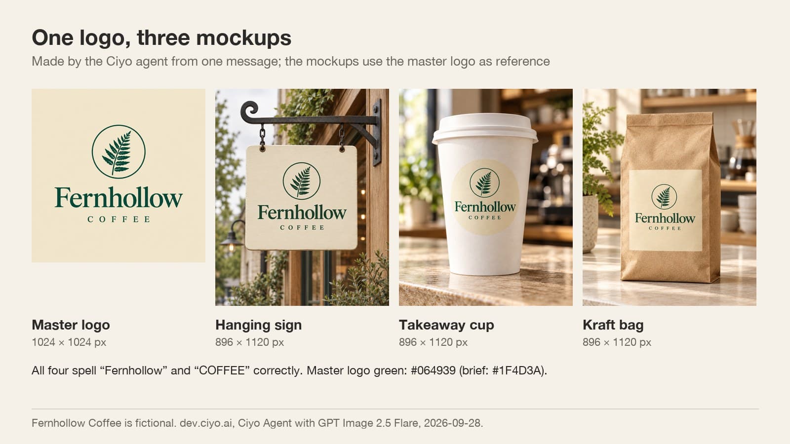
The words survived. All four images spell "Fernhollow" and "COFFEE" correctly, with the same serif and the same spacing. The layout survived too: the fern in a circle above the name, in every image.
That is what mockups are good for. At a glance you can see that the name reads at sign size, that the emblem is too small on the bag to show much detail, and that the cup leaves room around the logo.
What changed: the fern
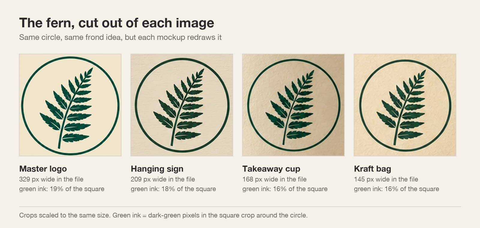
Each mockup redraws the logo rather than pasting it in. Cut out of each image and set side by side, the fern keeps the same idea but not the same drawing: the leaflets are thinner in the mockups, and the green ink covers 16 to 18% of the emblem's square against 19% on the master.
The emblems are also small. In the mockup files the whole circle is only 145 to 209 pixels wide. That is enough to judge placement, and far too little to print from.
What changed: the colour and the background
We asked for deep green #1F4D3A. The master logo came out darker, with a typical green of #064939, and only 0.5% of its green pixels were within 8 levels of the brief. The mockups add lighting on top of that, so their greens differ again. Never pick your print colour from a mockup.
All three mockups also kept the cream background as a shape: a cream sign board, a cream circle on the cup and a cream rectangle on the bag. If you plan to print straight onto kraft paper with no label, ask for that, and make a logo file with a transparent background.
A pre-print checklist
Use the mockups for the questions they can answer, and the master file for the rest.
| Question | Answer it with | What we found |
|---|---|---|
| Is the name readable at this size? | The mockup | Yes on the sign and the cup; small on the bag |
| Is the spelling right? | The mockup and the master | Correct in all four |
| Is the colour right? | The master file, with a colour picker | #064939, not the #1F4D3A we asked for |
| Is the drawing exact? | The master file | The mockups redraw the fern |
| Can I print from it? | A vector master | No: the emblem is 145–209 px in the mockups |
| Does it need a background? | The mockup | Every mockup kept a cream patch |
Finish the logo before the printer
Fix the colours on the flat master, turn it into a vector, and remove the background for the items you print directly. Then run the mockups again from the corrected file and compare them with the first set. The mockup is a preview; the master is the product.
If your printer asks for exact colour values, give them the hex values you checked in the vector file, not the colours you see in a photo of a sign.
AI logo mockups
Can AI put my logo on a sign, a cup and a bag?
Yes. The Ciyo Agent made a logo and three mockups from it in one message on September 28, 2026, and spelled the name correctly in all four.
Will the mockup keep my exact logo?
Not exactly. The fern was redrawn in each mockup and the colours changed with the lighting. Use mockups to judge placement and size.
Can I print from a mockup?
No. The emblem in our mockups was only 145 to 209 pixels wide. Print from a vector master with checked colours.
Why is my logo on a cream box in the mockup?
The mockup kept the master logo's background. Ask for a transparent logo, or say that you print directly on the material.
Design and test your logo in Ciyo
Generate the logo, see it on your sign, cup and bag, then fix the colours and make the vector on the same canvas.