Small business · Branding
A Profile Picture for Your Shop, Not Your Face
A business avatar has one job that no other piece of design has: it must still be recognisable at the size of a full stop. Instagram, Google Business, a WhatsApp thread, a review site — all of them shrink it to something between 32 and 48 pixels and put it next to nine competitors.
Most avatar advice is about photos of people. This is about the other kind: a mark for a shop, a café, a studio, a market stall. We made three for a fictional harbour coffee bar on September 21, 2026, then ran the only test that matters.
The brief that produces a usable mark
Almost every bad AI avatar comes from a brief that asked for a picture instead of a mark. The constraints below are what turn one into the other, and they are worth typing every time.
Make a square profile picture for Pier Six Coffee to use as its avatar on Instagram and Google Business. It must still read at 32 pixels: one simple mark, two colours at most, no thin lines, no words, plain background, generous margin. Make three different options so I can compare them.Why each constraint is there
One simple mark, because two objects become one smudge. Two colours at most, because a third colour usually arrives as a mid-tone that disappears. No thin lines, because a line under about three per cent of the width will vanish or alias into grey.
No words is the one people resist hardest. At 32 pixels a word is four pixels tall. Your name is already printed next to the avatar everywhere it appears, so the mark does not need to repeat it.
Generous margin matters because platforms crop avatars to a circle. Anything within about ten per cent of the edge will be cut, and a mark that fills its square becomes a mark with its corners shaved off.
The 32-pixel test
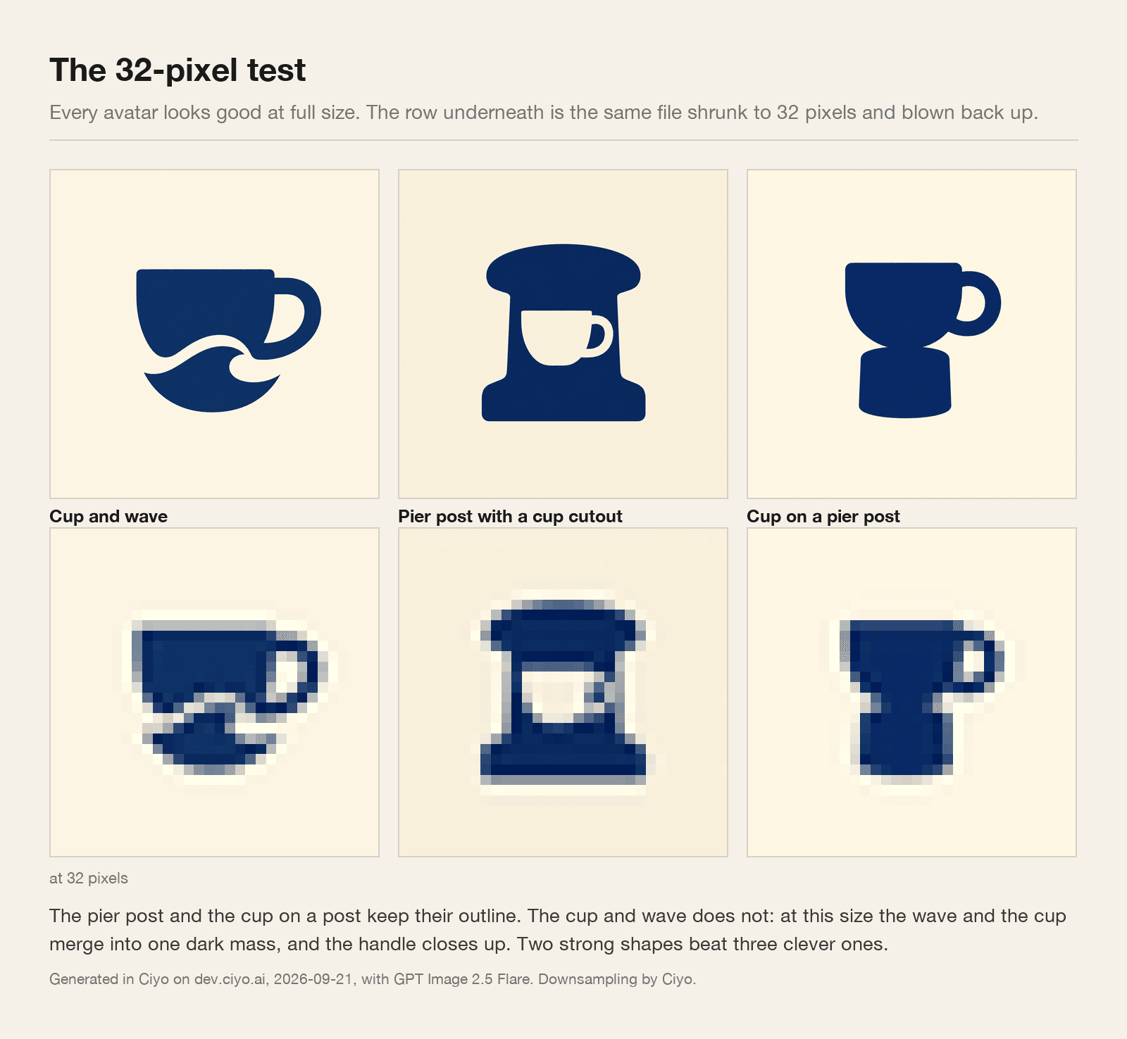
All three looked good at full size. That tells you nothing, because nobody will ever see them at full size.
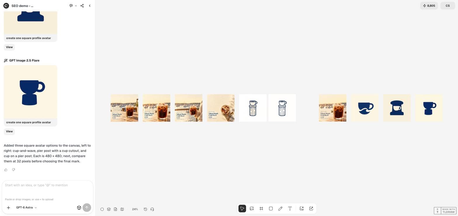
So we shrank each one to 32 pixels and blew it back up, which is the closest thing to what a phone actually shows a customer. Two survived. One did not.
The cup and wave, which was arguably the prettiest at full size, lost its wave: at that scale the wave and the cup merge into one dark mass and the handle closes up. The pier post with a cutout and the cup on a post both kept their outline, because each is one heavy silhouette with a single large interior shape.
How to run the test yourself
You do not need any tooling. Put the image on your phone, hold the phone at arm's length, and look at it as a thumbnail in your own photo library. If you cannot tell what it is, a customer scrolling past will not either.
The desktop version: drop the file into any image viewer and zoom out until it is about the size of a fingernail. Or upload it to a test account and look at it in a real feed, which is the only fully honest check.
The failure is always the same. Detail that reads as charming at full size reads as noise when there are 1,024 pixels to say it in.
| Element | At 32 pixels | What to do instead |
|---|---|---|
| One bold silhouette | Survives | Build the whole mark from it |
| A second object beside the first | Merges into the first | Choose one, or nest one inside the other |
| Thin outlines and fine handles | Disappear or go grey | Thicken them, or remove them |
| Lettering of any size | Becomes a smear | Leave it out; your name is printed alongside |
| A mid-tone third colour | Blends into one of the other two | Two colours with strong contrast |
| Detail near the edge | Cropped by the circle mask | Keep a tenth of the width clear all round |
Choosing between the survivors
Once two or three options pass the shrink, the remaining decision is not a technical one. Ask which mark still makes sense in two years, which one you can print on a cup, and which one somebody could describe over the phone.
That last question is a surprisingly good filter. “A coffee cup sitting on a harbour post” is a mark. “A sort of swirl with a cup and a wave and some texture” is a picture that happens to be square.
Keep the source file at full size. You will need it again at a larger size for a sign, a sticker or a cup, and regenerating will give you something subtly different.
One thing to avoid entirely
Do not generate a photorealistic face for a business avatar. If it resembles a real person you have a likeness problem, and if it does not, it will still read as a stock photo of nobody.
For a personal brand, use an actual photograph of yourself. For a business, use a mark. The two jobs look similar in a search box and are not similar at all.
Profile picture questions
What size should a business avatar be?
Generate it square and large, then judge it small. The files in our run were 1,024 × 1,024, and the test that mattered was shrinking them to 32 pixels.
Can I put my shop's name in the avatar?
You can, but at 32 pixels it will be unreadable, and the platform prints your name beside the avatar anyway. Use the space for the mark.
How many colours should it use?
Two with strong contrast. A third usually arrives as a mid-tone and disappears at small sizes.
Should I use a photo of myself?
For a personal brand, yes, a real photograph. For a business, a mark works better and avoids generating a face that resembles a real person.
Make three, then shrink them
Ask for three simple marks with the constraints above, then judge them at the size a customer will actually see.