Logos · Vector files
Why Your AI SVG Has Too Many Paths
You asked for a vector logo, got an SVG, opened it in an editor and found a file that will not open quickly, will not recolour cleanly, and has more anchor points than a city map.
The tracer is almost never the problem. What you fed it is. We ran both cases in one project on September 21, 2026 and measured them, and the gap is large enough to change how you brief the job.
What an image tracer is actually doing
A vectoriser does not understand your logo. It looks for regions of similar colour and draws an outline around each one. A flat two-colour mark has two or three such regions per shape, so it produces a handful of clean outlines. A photograph has thousands of them, because every gradient, shadow and piece of film grain is a region boundary as far as the tracer is concerned.
This is why the same tool can look brilliant on one image and useless on the next. It is not judging quality. It is counting colour regions, and you decided how many there were when you chose the picture.
The measurement
Two images from the same demo project, vectorised with the same tool, minutes apart. We then fetched each resulting SVG and counted its path elements directly rather than trusting an eyeball estimate.
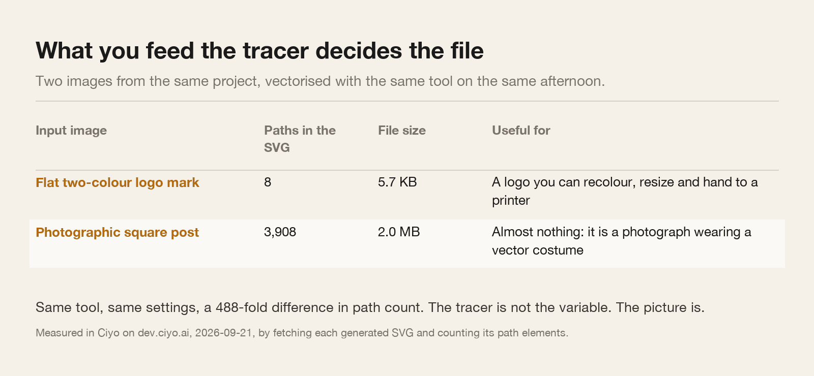
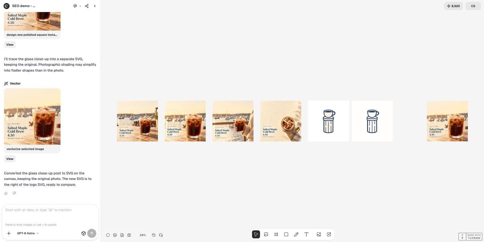
The flat logo mark — a two-colour line drawing of a cup on a pier post, plain white background — produced 8 paths in 5,851 bytes. The photographic square post — a cold brew on a harbour table, full tonal range — produced 3,908 paths in 2,104,374 bytes.
That is 488 times the path count and 360 times the file size, from a single change: what was in the picture.
What the two files look like on the canvas
Side by side the difference is invisible, which is the trap. The traced photograph looks like the photograph. It is a perfectly faithful vector file and a completely useless logo: you cannot recolour it, you cannot hand it to a sign maker, and dropping it into a document will make that document slow.
The traced logo mark is the opposite. Eight paths means eight things you can select, recolour and nudge. It is a file a printer will accept without a phone call.
How to brief the picture so the SVG is small
Everything that makes a picture look rich makes a trace worse. The prompt below is deliberately impoverished, and that is the point.
Make a simple flat logo mark: a minimal two-colour line drawing of a pier post with a coffee cup on it, navy and cream, flat vector look, plain white background, no text, square.The five words that do the work
Flat. No gradients, no soft shading, no ambient occlusion. Every gradient becomes a stack of nested outlines.
Two-colour. Name the colours. Each additional colour is another set of regions to outline, and a tracer will happily invent intermediate tones you never asked for.
Plain background. A textured or photographic background is traced too, and it is usually the single largest contributor to the path count.
No text. Rendered letters trace into outlines that only look like letters. Set real type in your editor afterwards, where it stays editable and selectable.
Line drawing. A drawing has edges. A render has light. You want edges.
Checking the file, and one thing the agent cannot do
Open the SVG in a text editor and search for `<path`. That count is your answer, and it takes ten seconds. Under about fifty paths you have a logo. Over a few hundred you have a picture pretending to be one.
We asked the agent to do the counting for us and it could not. It replied that the conversion tool returned an app-relative link with no accessible source or file-size metadata, so it could not verify the path count, and offered to count if we pasted the source in. That is the correct answer rather than a guessed number, but it does mean the check is yours to run.
If you have a large file and no way to regenerate, most vector editors have a simplify or reduce-nodes command. It helps a little. It will not turn a traced photograph into a logo, because the problem is not the anchor points; it is that the file is describing a photograph.
SVG questions
How many paths should a logo have?
Most workable marks land between five and fifty. Our flat two-colour mark traced to 8. Once you are in the hundreds, the file is describing shading rather than shapes.
Can I just simplify a huge SVG?
You can reduce nodes in a vector editor, and it will shrink the file. It will not make a traced photograph editable, because the paths describe tonal regions rather than parts of a design.
Why is my SVG bigger than the PNG it came from?
Because every traced region is stored as coordinates. Our traced photograph was 2.0 MB of path data describing an image a JPEG stores in a fraction of that.
Does the tracer setting matter at all?
It matters at the margin. In our run the same tool and the same settings produced 8 paths and 3,908 paths. The input was the variable that mattered.
Generate flat, then trace
Ask for a flat two-colour mark on a plain background, convert it to SVG, then open the file and count the paths before you send it anywhere.