Presentations · Measured
We Measured the Bars on an AI Chart Slide
The received wisdom is that image models cannot be trusted with numbers: they mangle digits, they draw bars at whatever height looks nice, and a chart from a renderer is decoration rather than data.
We went in expecting to prove that. We asked for one slide with four exact numbers, then measured the bar heights in the returned file rather than eyeballing them. The result was not what we expected, and the useful part of this article is the measurement, not the verdict.
The request
One slide, four weekends, four numbers we made up for a fictional coffee bar: 320, 410, 380 and 505. The instruction was deliberately strict about the thing we expected to fail.
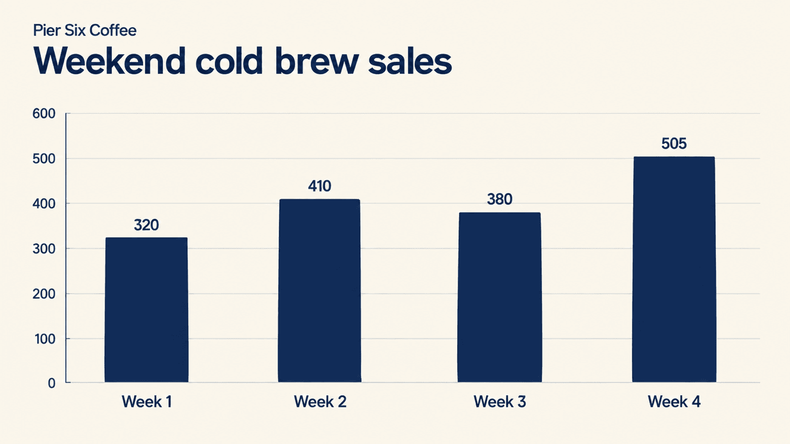
Make one 16:9 presentation slide for Pier Six Coffee titled "Weekend cold brew sales". It needs a simple bar chart of the last four weekends with these exact numbers: week 1 is 320, week 2 is 410, week 3 is 380, week 4 is 505. The bar heights and the printed labels must match those four numbers exactly.What came back
A clean slide with a title, an axis running to 600 in hundreds, four labelled bars and the value printed above each one. All four printed values were correct: 320, 410, 380, 505.
That alone is worth noting, because rendered digits are exactly where these models have historically gone wrong. But a correct label above a wrong bar is arguably worse than an obvious mistake, so the labels are not the test.
The measurement
So we measured. We read the pixel height of each bar from the returned image, took the tallest bar as the reference, and scaled the rest against it to see what value each bar's geometry actually implies.
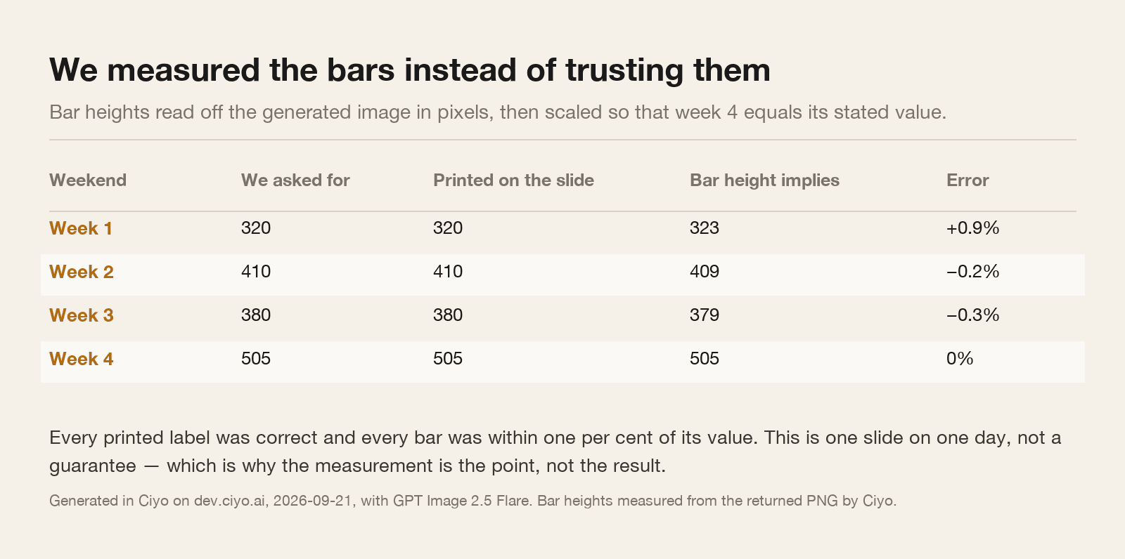
The implied values were 323, 409, 379 and 505, against the 320, 410, 380 and 505 we asked for. The largest error was nine-tenths of one per cent, which is smaller than the width of the drawn bar edge.
On this slide, on this day, the chart was honest. The bars meant what the labels said.
What this does and does not establish
It establishes that a renderer can get a simple four-bar chart right, which is more than the folklore allows.
It does not establish that it will. This is one chart, with four bars, round numbers, a wide value range, and an axis that suited them. Push any of those and the odds change: twelve bars, values within two per cent of each other, a broken axis, a second series, a legend, or a pie chart, which is a shape nobody should ask a renderer for.
The honest conclusion is not “it works”. It is that you can find out in ninety seconds instead of guessing, and that you should, every time it matters.
| Situation | Reasonable | Why |
|---|---|---|
| Four or five bars, clearly different values | Yes, after you check it | What we measured, and the shape most likely to survive |
| Values close together | No | A one per cent error is invisible and changes the story |
| Anything an auditor, an investor or a regulator reads | No | Make the chart in a spreadsheet and paste the picture in |
| A pie chart, or anything with angles | No | Angles are harder to get right and harder for you to check |
| A layout mock-up with placeholder data | Yes | Nobody is reading the numbers, so there is nothing to be wrong |
The ninety-second check
You do not need a script. Open the image, and compare the tallest bar with a gridline: if the axis says 500 and the bar sits on the 500 line, that is one point confirmed.
Then compare bars against each other. Week 4 should be a little over half again as tall as week 1, because 505 is a little over half again as much as 320. Hold a finger, or a sheet of paper, against the screen.
Finally read every digit out loud, including the axis. In our slide the axis ran cleanly in hundreds; a renderer inventing an axis of 0, 100, 250, 400 would be an obvious tell and easy to miss silently.
The approach worth taking anyway
For anything you actually present, make the chart where the numbers live. A spreadsheet chart exported as a picture is correct by construction, and no amount of checking beats not needing to check.
Then let the generator do what it is genuinely better at: the slide around the chart. Title treatment, background, section dividers, the photographic opener, the closing frame. Those have no numbers in them and no way to be wrong.
That is the division we would keep even after a result as good as this one. We measured a chart that passed, and we would still not put a generated one in front of a bank.
Chart slide questions
Did the AI get the numbers right?
On this slide, yes. All four printed labels were correct, and the measured bar heights implied 323, 409, 379 and 505 against the requested 320, 410, 380 and 505.
Does that mean I can trust generated charts?
No. It means one simple chart passed one test on one day. Values close together, more bars, or any chart with angles are all harder, and nothing here predicts them.
How do I check a chart quickly?
Compare the tallest bar against a gridline, compare bars against each other in proportion, and read every digit including the axis. It takes about ninety seconds.
What should I generate instead?
The slide around the chart: title treatments, backgrounds, dividers and openers. Make the chart itself where the numbers live and paste it in.
Build the slide, check the chart
Generate the deck's artwork in Ciyo, keep the numbers in your spreadsheet, and measure anything a renderer draws.