Shop-window design
Build a colourway key for a clothing launch poster
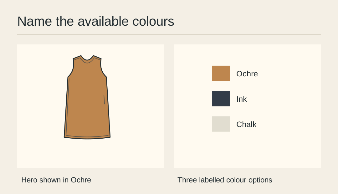
A row of coloured dots below a hero photograph is ambiguous if customers cannot tell what is actually available. Make a short named key from the shop’s confirmed stock list and label the colour worn by the hero.
Start from stock names
List the approved names for the launch, such as Ochre, Ink and Chalk. Match the spelling used by the shop and its listing. Remove any option that will not be stocked when the poster is displayed.
Identify the hero colour
Set “Shown in Ochre” close to the main photograph. Keep that phrase with the picture when it moves to a second layout. It saves shoppers from trying to infer the hero colour from an approximate screen rendering.
Take comparable swatches
Photograph all fabrics under the same light, using an equally sized area for each. If printing the key flattens two colours into similar dark patches, their names still need to distinguish them.
Pair each name and mark
Place each written name immediately next to its swatch. Try covering the swatches with a sheet of paper and reading the remaining labels. The set of options should still be understandable.
Check the shop lighting
Take a small print to the garment rail and compare it to the actual samples. Adjust a conspicuous mismatch, but avoid promising an exact match across paper, displays and textured cloth.
Version by availability
Record the stock list date on the working file. If Ink sells out and the poster needs replacing, remove its entire label-and-swatch pair before exporting the next version.
Review the colour choices
Group the named swatches with the approved hero before laying out the poster.